There is a moment between wanting to do something and actually doing it.
And another between doing it and knowing if it worked.
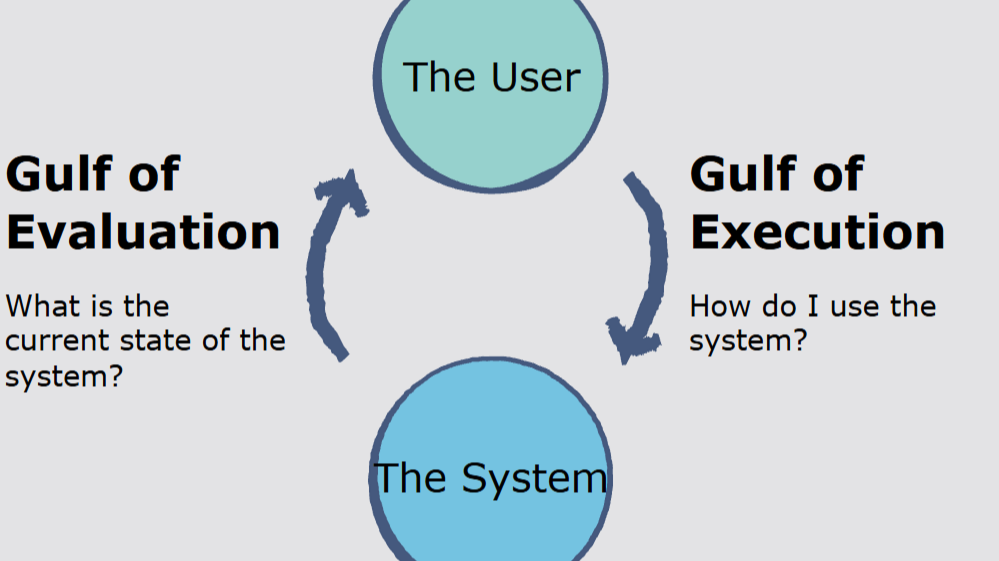
These are the two gulfs that define the usability of any product: the Gulf of Execution and the Gulf of Evaluation.
One measures how well users can translate intent into action.
The other, how easily they can interpret what happened after.
Most products collapse into one of these gaps. And most teams do not notice until it is too late.
📌 What’s Inside
- The two gaps that break everything
- Where the gaps hide
- Closing the Gulf of Execution
- Closing the Gulf of Evaluation
- Designing around these gaps
🚧 The two gaps that break everything
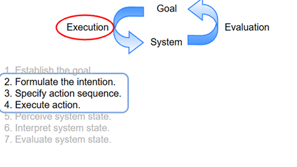
Don Norman first described these gulfs in The Design of Everyday Things. He called them the difference between intention and action (execution), and action and understanding (evaluation).
The Gulf of Execution appears when users do not know what action to take.
It is the space between what they want to do and what the system presents as possible. If you’ve ever hovered over a page unsure which button to click, or abandoned a form because it was unclear where to start, you’ve been inside the gulf.
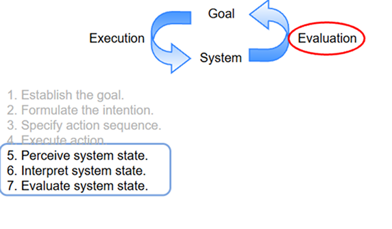
The Gulf of Evaluation emerges after the action. Did it work? Did the system respond? Is the outcome visible, trustworthy, and interpretable? If the interface does not make the result legible, the user remains stuck, even if their action was technically successful.
As NNG puts it,
“If the outcome of an action is not immediately obvious, users are left in a state of uncertainty.”
These gulfs are the reason so many interfaces feel unsteady.
🕳️Where the gaps hide
Execution gaps are especially dangerous because they rarely feel like bugs. They feel like second-guessing.
This is where users pause, not because the product is broken, but because the next move isn’t self-evident. Often, these issues are dismissed as minor friction, but they are moments where user intention collides with unclear system behaviour.
These misalignments compound, creating hesitation, drop-offs, or unnecessary workarounds.
Execution breakdowns show up in:
- Overwhelming navigation with too many equally weighted options
- Mislabelled buttons that require prior product knowledge
- Invisible affordances (like swipe gestures with no visual cue)
Evaluation gaps are harder to detect because they happen after the user acts, when designers assume the job is done.
But the interaction isn’t over until the user has confirmed, internally, that their intention was realised.
The feedback loop must be strong enough to eliminate uncertainty. When it’s not, users are left unsure whether their input had an effect, or worse, whether they caused an error. These gaps show up as frustration, repeated actions, or support tickets.
Without deliberate attention to post-action clarity, products risk becoming cognitively opaque and increasing business costs through elevated support queries, helpdesk strain, and unnecessary troubleshooting.
Evaluation breakdowns show up in:
- Subtle feedback (e.g. a tiny toast that disappears too fast)
- Inconsistent states (e.g. a button remains clickable after a successful action)
- Ambiguous language (e.g. “Error occurred” with no cause or fix)
The danger is that most teams only track surface metrics: task completion, bounce rate, clicks. These don’t tell you why a user struggled. Most of the pain happens in the gaps.
✅Closing the Gulf of Execution
To reduce the execution gap, you need to design affordances that match user intent. Not in theory, but in context.
Affordances are possibilities for action (a knob affords turning, a chair affords sitting etc).
In digital design it translates into making clickable elements look clickable and draggable areas feel draggable).
Execution gaps are rarely about users not knowing what they want. They’re about interfaces that fail to translate intention into actionable, visible options.
So when you look at a screen and try to assess whether the execution gulf has been bridged, you should be asking: does this interface make the next move obvious?
Are the right options surfaced at the right moment, or is the user left searching for what to do? Do the visuals and layout distinguish what matters now from what can wait?
If a user needs to pause and think, not about their task but about the interface itself, you’re in the middle of the gap.
As the Interaction Design Foundation explains,
“The Gulf of Execution represents the difference between a user’s goal and the means to execute that goal using the system.”
In other words, this gulf exists when a user knows what they want to do but cannot find a way to make the system carry it out.
IxDF notes that this gulf can be bridged by making systems more discoverable and mapping actions more closely to user goals.
This is about behavioural alignment. That means designing interactions that align with how people actually think, decide, and act (not how we hope they will).
Behavioural alignment considers the user’s prior knowledge, emotional state, and real-time decision-making cues.
It ensures the interface behaves in ways that feel expected, not just explained. It’s not about making things look intuitive but about reducing the cognitive negotiation users need to perform at every step.
✅Closing the Gulf of Evaluation
To reduce the evaluation gap, you need to surface clear, immediate, and meaningful feedback.
When evaluating whether you’ve closed the evaluation gap, consider what the user experiences in the seconds after they act.
Is the outcome clearly visible? Does the system confirm that something happened and was it the right thing?
Feedback needs to be immediate, noticeable, and interpretable.
It’s not enough to show a subtle animation or toast that fades before it’s read. If users are left asking themselves, “Did that work?” then the evaluation gap remains open. They should feel grounded.
We don’t have to throw more modals at the problem to achieve that. We have to align the product’s response with the user’s mental model.
If the user deletes something, do they see that it is gone? Do they know if it can be undone? Can they recover or confirm what they intended?
As NNG states: “Feedback must be both noticeable and comprehensible.”
Their 2021 study on system feedback found that even a 500ms delay in visual confirmation could negatively impact a user’s perception of system reliability.
This aligns with Don Norman’s view that evaluation gaps are often caused not by lack of response, but by feedback that fails to map to user expectations.
When systems delay, obscure, or minimise the result of an action, users begin to doubt not only the interface, but their own understanding of it.
And that uncertainty, once felt, is difficult to repair. Once a user begins to question whether their action produced the intended result, that doubt becomes sticky.
It breaks trust not only in the interface, but in the user’s own ability to operate within it. This creates a feedback loop: hesitation leads to less confident actions, which often result in more ambiguous outcomes.
Over time, that diminished confidence undermines the overall user relationship with the product.
It is not the action that damages the experience but often the silence that follows it.
🧠Designing around these gaps
Too many product teams treat these gulfs as theoretical or obvious. They are neither.
Execution and evaluation gaps are often what determine the success or failure of a feature. Not because users fail to understand technology but because the technology fails to represent itself in a human way.
Designing across these gaps means respecting the user’s cognitive state at every moment in the flow.
That means understanding not just what users want to achieve, but how they perceive their ability to act, how much uncertainty they can tolerate, and how they interpret system feedback.
What they know is shaped by prior experiences. What they expect is informed by mental models carried over from other tools. And what they fear is often a hesitation rooted in doubt, loss of control, or the potential for irreversible action.
The design must anticipate those tensions and reduce them before the user ever feels them.
“Users don’t fail to act because they lack ability. They fail to act when the system withholds clarity.”
A good product reduces both gulfs until action and understanding feel continuous. Not because users are unusually skilled or tech-savvy. But because the system respects their limits.
Subscribe on Substack⬇️
If you’ve found this content valuable, here’s how you can show your support.⬇️❤️

You might also like:
📚 Sources & Further Reading
- Don Norman, The Design of Everyday Things, 2013
- Nielsen Norman Group, “The Two UX Gulfs: Evaluation and Execution”
- Interaction Design Foundation, “Gulf of Evaluation and Gulf of Execution”
- NNGroup, “Response Times: The 3 Important Limits”
- Image credits: How.dev, educative.io
Share this article: