Shaped by research and testing, UI patterns are there to solve recurring design problems.
According to the Nielsen Norman Group, one of the leading authorities in usability research, patterns play a crucial role in helping users navigate interfaces intuitively. 🌟
Patterns like breadcrumbs, primary actions, and lazy registration make the difference between a product that users tolerate and one that they love to use.
Research shows that users prefer interfaces that feel familiar and predictable.
This predictability is often achieved through consistent use of UI patterns across platforms.
For instance, studies from the Baymard Institute, an organisation that specialises in large-scale UX research, have found that users are more likely to complete tasks and feel satisfied with their experience when they encounter familiar design patterns.
This isn’t surprising.
Our brains are wired to recognize patterns, and when we see something we’ve encountered before, it reduces cognitive load and makes the interaction feel easier.
This means users don’t have to learn how to use your interface.
Trust me, they will thank you for it.
And let’s be honest—patterns also make our lives easier.
They speed up the design process, allowing us to focus on refining the overall user experience rather than reinventing the wheel for each project.
🌟 10 Common UI Design Patterns 🌟
1️⃣ Breadcrumbs
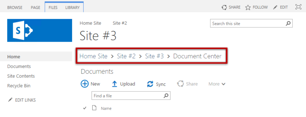
Breadcrumbs are lifesavers for large or complex sites.
They show users exactly where they are and give them a way to backtrack or explore without getting lost.
Ultimately, they give users a sense of control.
👉The Nielsen Norman Group often points out how breadcrumbs improve navigation by keeping users oriented.
If you’re designing a site with layers of content, breadcrumbs are pretty essential.

2️⃣ Lazy Registration
Nobody likes being forced to sign up before they’ve had a chance to see what you offer.
Lazy registration is a brilliant way to let users experience your product before committing.
When you let users interact first and then ask for registration when it’s necessary, you allow trust building.
👉 This often leads to higher conversion rates because users are more likely to register after they’ve seen the value for themselves.
3️⃣ Primary Action
This one is about directing user focus.
You’re guiding the user to the most important task on the page, may it be submitting a form or making a purchase, you name it.
This pattern cuts through the noise, making sure the user knows exactly what to do next.
👉 Research by the Baymard Institute has found that clear, prominent primary actions can significantly improve conversion rates, which is exactly what we’re aiming.
4️⃣ Forgiving Format
Forms are a notorious pain point for users, especially when they’re strict about formatting.
The forgiving format pattern addresses this by allowing for variations in user input—such as accepting phone numbers in different formats or automatically correcting common mistakes.
👉 Forgiving format pattern proves helpful in reducing form abandonment rates.
This way, you’re reducing frustration and making the interaction feel more human, showing users that you understand their experience and you’re making it easier for them.
5️⃣ Progressive Disclosure
Progressive disclosure is about keeping the interface clean and focused.
This pattern gradually reveals information or options as needed, reducing cognitive load by only presenting details that are immediately relevant.
It’s a way of managing complexity without overwhelming the user.
👉 The Nielsen Norman Group often discusses how this pattern reduces errors and keeps users focused on the task at hand.
It’s a subtle way to maintain clarity and reduce user errors while handling intricate interactions.
6️⃣ Steps Left
When users know what’s ahead, they’re more likely to finish what they started.
This small touch can make a big difference in reducing anxiety and encouraging further engagement.
Steps left is a pattern that visually shows users how many steps they have left in a process.
👉 The Baymard Institute has data to back this up—clear progress indicators boost completion rates by giving users a sense of control and predictability.
7️⃣ Subscription Plans
The subscription plans pattern helps users compare different pricing tiers by laying out options side by side.
A clear plan layout highlights the benefits and features of each option, guiding users toward the plan that best meets their needs.
This simplifies decision-making and can drive users to choose the most suitable or profitable option, depending on how the plans are presented.
👉 Well-designed subscription plans can reduce decision paralysis and increase conversions.
You’re not just showing options here—you’re helping users make a choice.
8️⃣ Hover Controls
Hover controls are great for saving space and keeping the interface clean.
They reveal options only when the user hovers over an element, which greatly reduces visual clutter.
👉 But don’t forget that hover controls don’t work on touch devices, so they should always be supplemented with accessible options.
9️⃣ Leaderboard
This pattern is popular in games, fitness apps, and learning platforms.
Leaderboards tap into users’ competitive spirit, ranking them based on performance or activity.
It’s motivating and can drive engagement, but it’s also a double-edged sword.
👉 While leaderboards can boost engagement, they need to be fair and inclusive to avoid alienating less competitive users.
It’s about creating healthy competition, not frustration.
🔟 Dark Patterns
Let’s be honest—despite their frequent appearance online, dark patterns are a definite no-go.
They’re manipulative tactics designed to trick users into actions they wouldn’t normally take, like hiding fees or making opt-outs difficult to find.
👉 While they might help to achieve short-term business goals, dark patterns a fast track to losing user trust and damaging a brand.
Backed by research and tested in real-world scenarios, User Interface (UI) design patterns are proven to work.
Use them thoughtfully and creatively, always with the user’s best interests in mind.
When you do, you’re crafting an experience that’s meaningful, enjoyable, and one that truly resonates with users.
Great design is about making connections—between the user and the product, the familiar and the new, the practical and the delightful.
And when you use UI patterns thoughtfully, you’re making those connections in ways that really matter.
Thanks for reading 😊
I hope you found it useful!
This space thrives because of YOU. ❤️
If the resources I share help you grow in your career, a small contribution from you could keep this community strong.
Together, we’re building a space to learn, grow, and support each other on this design journey.
Every bit helps, and by supporting me, you’re directly helping keep this space alive and growing.
Or simply scan this QR code ⬇️

Your support means a lot!
You might also like:
Share this article:


