“Users spend only 10-20 seconds on a page before deciding to leave.” — Nielsen Norman Group
Those few seconds? Crucial.
That’s why it’s imperative to make navigation as clear and straightforward as possible.
When navigation labels or category names are unclear, users often end up clicking on the wrong option, only to realise it’s not what they wanted. Then comes the tedious back-and-forth: clicking, going back, re-evaluating options, trying again.
It’s time-consuming, frustrating, and it disrupts the user’s experience.
On larger teams, there’s often a dedicated copywriter focused on getting these details right. But in smaller teams—or when working solo—that responsibility often falls on the designer. Ultimately, in any product or website, it’s not just the visuals and functionality we need to consider, but also the language that users can understand and relate to.
So, here are some tips for you—and a few common mistakes to watch out for.
1️⃣ Clarity over Creativity
The urge to be creative can be strong. But clarity wins every time. Stick to words your users already know.
👉What to Do:
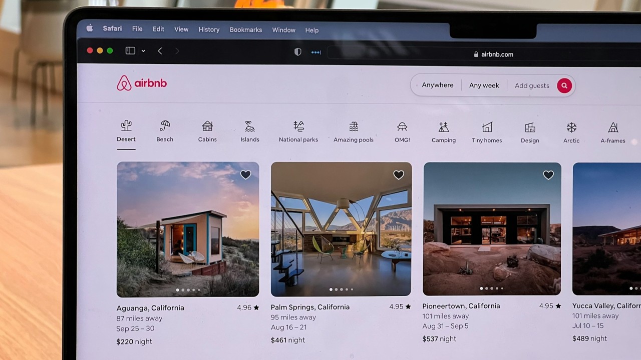
Use terms users are familiar with in your industry or context. For instance, use “Help” instead of “FAQs & Support”.
When in doubt, look at similar sites in your industry to see what’s working. Common terminology isn’t boring—it’s effective. That’s why it’s recurrent.
👉What to Avoid:
Internal jargon or words that you think users may understand just because you understand them (bias). If a user has to pause to figure out what a label means, you’ve missed the mark.
✨Remember: A/B testing can be helpful here. Test straightforward language against more unique terms to see which resonates best with your users.
2️⃣ Specifics, But Not Too Much Detail
Specific category names create a clear sense of purpose. But keep it concise as too many words can clutter the interface and overwhelm users instead of helping them.
👉What to Do:
Aim for one to two words per label when possible. For example, use “Blog” instead of “Company News and Insights.”
Make sure each name gives an immediate sense of the content or actions hidden within.
👉What to Avoid:
Overly detailed names like “Customer Success and Onboarding Resources”. Instead, break these down or simplify to something like “Getting Started”.
✨Remember: Less is often more. If users can’t quickly “get it” at a glance, the label may be too complex.
3️⃣ Scannability
Users often scan content as opposed to actually reading it word by word. Arrange and style your labels in a way that helps people find what they need quickly.
👉What to Do:
Arrange categories logically and use headings to group related items.
Limit each label to 1-3 words to maximise scannability.
Use a larger, bold font for category names to help them stand out from the rest of the text.
👉What to Avoid:
Crowding the navigation with too many items. Stick to the essentials only.
Mixing labels that are too different in length as this can create confusion visually.
4️⃣ Testing
Even the best design assumptions need to be validated. Testing your labels with users reveals whether they understand and find the information they need.
👉What to Do:
Use tree testing to evaluate your labels without any visual design influence. Tools like Optimal Workshop can help here.
Watch for hesitation or backtracking in user tests. These are often signs that category names need reworking.
👉What to Avoid:
Relying solely on team feedback or internal knowledge. Your team may be too familiar with the structure to notice usability issues.
5️⃣ Mobile Constraints
Category names need to be concise and tap-friendly. Think about how your navigation will adapt on smaller screens.
👉What to Do:
Use short, clear terms that fit neatly in a mobile menu.
Group related items to keep the menu simple on small screens.
👉What to Avoid:
Too many items on mobile as it can quickly become overwhelming. If necessary, group related links under one main label to keep it clean.
✨Remember: Simplicity in mobile navigation goes a long way in reducing bounce rates. The fewer taps a user needs to reach their goal, often equals better revenue for the business.
6️⃣ Familiar Terms
Trendy language can be fun, but it ages quickly and may confuse users. Stick to timeless, universally understood terms.
👉What to Do:
Use neutral, action-oriented words like “Explore,” “Shop,” or “Learn.”
Choose labels that will make sense across different user types.
👉What to Avoid:
Niche or slang terms like “Stuff We Love” or “Hacks & Tricks”. These can alienate users who don’t relate to that language.
When users can navigate without friction, they don’t waste precious time figuring things out. They simply find what they need and feel in control.
For us, especially those working in smaller teams or going solo, thinking about language is just as important as perfecting layouts or colour schemes.
After all, great design isn’t just about what users see but also about how they feel and interact with it.
When we put thought into the words we use, we empower users to make quick, confident choices.
In the end, designing clear, relatable labels shows that we understand our users’ needs—and respect their time.
This space thrives because of YOU. ❤️
If the resources I share help you grow in your career, a small contribution from you could keep this community strong.
Together, we’re building a space to learn, grow, and support each other on this design journey.
Every bit helps, and by supporting me, you’re directly helping keep this space alive and growing.

Or simply scan this QR code ⬇️
Your support means a lot!
You might also like:
Sources:
- How Long Do Users Stay on Web Pages? by Nielsen Norman Group.
- 5 Tips for Avoiding Confusing Category Names by Nielsen Norman Group.
Share this article: