
How do you think most design ideas fail?
Is it poor execution?
Is it a lack of skill?
Is it the wrong tools or resources?
No, not really.
More often, it’s due to poor explanation.
Why?
Because when it comes time to communicate why our work matters, we often stumble.
We’re conditioned to believe that impact is proven through numbers, and that metrics alone will validate our work.
But there’s a problem with this notion: the human brain doesn’t respond to raw data, it responds to context, emotion, and meaning.
Without a coherent story wrapped around those numbers, even the strongest metrics feel disconnected..
It’s not the data that drives belief but the narrative that gives that data relevance.
On top of this, there’s another factor to consider:
Stakeholders aren’t judging your design the same way you do. They’re asking: Can I trust this? Do I understand it fast enough? What does this mean for what I care about?
They’re not parsing your details. They’re looking for validation. And if you don’t provide it, their doubts will fill the silence.
After all, communicating design isn’t your accessory but the continuation of your work. The problem isn’t that people don’t “get design.”
It’s that we don’t present design in a way their minds are wired to understand.
📌 What’s Inside
- Design work isn’t self-explanatory because brains aren’t
- Presentations are psychological journeys
- Data doesn’t convince. Narrative does.
- Focus words and concept anchors
- Perceived value is shaped by clarity, not complexity
🧠Design work isn’t self-explanatory because brains aren’t
There’s a belief in some corners of the design world that great work should “speak for itself.” This is fantasy.
Human cognition doesn’t work that way.
According to research by cognitive psychologist Elizabeth Newton,
people consistently overestimate how clearly their ideas are communicated—a phenomenon called the “curse of knowledge.”
Once you’ve built something, it’s almost impossible to imagine what it’s like to not understand it. This phenomenon distorts our empathy for those who are new to the concept.
We subconsciously assume context is understood and skip steps our audience actually needs. Instead of framing the problem space, we default to detailing our solution. As a result, we unintentionally leave stakeholders behind. And it’s not because they’re not capable, but because we failed in giving them a fair chance to catch up.
Before presenting anything, understand who you’re speaking to.
This isn’t just good etiquette but rather an essential psychology.
Each stakeholder enters the room with different cognitive loads, priorities, and concerns. They may be juggling multiple decisions, or carry risk-aversion rooted in previous failures.
If you don’t take the time to anticipate their likely questions and anxieties, your presentation will land flat, no matter how great.
People disengage when they feel overwhelmed. So, your first task isn’t to show the design. It’s to make them feel like their concerns are already understood.
According to Sweller’s Cognitive Load Theory, we have a finite working memory capacity.
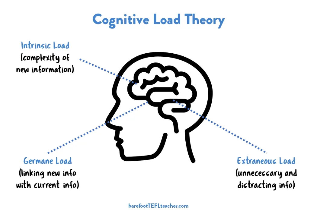
You’ll overload that capacity quickly, unless you guide with structure and story. Your stakeholders need relief, not more overload. The easier you make understanding feel, the more competent you’ll seem and the more credible your work will appear.
This ties to the first principle in any effective presentation: validation (showing that you understand what your audience might be worried about before they even voice it).
This is about creating psychological safety right from the start.
When people feel heard and seen, they stop bracing for problems and start opening up to new ideas. Validation is therefore the doorway to engagement.
🛣️Presentations are psychological journeys
When you step into a presentation, you’re not delivering a report.
You’re managing perception in real time.
This is neurobiological. People’s confidence in your design is shaped in the first few minutes by how well you reduce their uncertainty. If they feel unclear early on, everything that follows will be filtered through a lens of skepticism.
This is where validation becomes essential. And not just as a closing slide as it often is but as a continuous strategy.
And this is exactly why acknowledging the concerns and mental models your stakeholders carry is so important.
A good idea is to start with naming any possible tensions upfront, e.g., “We know the existing flow looks simple, but it creates dead ends we can’t track.”
That kind of framing softens any potential resistance, because it shows you’re thinking with them, not at them.
It also shows that you’re forward-thinking and have anticipated their concerns, which builds mutual respect.
Their brains stop scanning for red flags, which means they’re more likely to actually listen.
Validation acts as a precondition for receptivity. Without it, even the most rational arguments will be filtered through a fog of skepticism. With it, you turn your audience into collaborators instead of critics because you’re speaking to what they feel, not just what they know.
This is supported by neuroscientist Antonio Damasio’s research, which found that decision-making is primarily driven by emotion, not logic.
This has huge implications for presenting design work. And it’s exactly why presenting raw data doesn’t work.
📖Data doesn’t convince. Narrative does.
We often assume that logical arguments and data will make our point.
But that’s not how people absorb information. Our brains evolved to process stories, not spreadsheets.
Cognitive psychologist Jerome Bruner estimated that facts are 22 times more likely to be remembered if they are part of a story.
Why? Because stories create mental simulations.
When you hear a narrative, your brain mirrors it, activating sensory, motor, and emotional regions as if you’re experiencing it firsthand.
This neurological process is called ‘neural coupling,’ where the listener’s brain activity begins to synchronize with the speaker’s.
You’re not passively receiving information; you’re mentally simulating the events, tensions, and emotions described. It creates a deeper level of engagement, comprehension, and memory retention.
By contrast, facts, when isolated from context, trigger only language-processing centers. They remain abstract, detached, and cognitively shallow. Without story, data fails to stick.
So when you present your work, don’t just list the “what.” Describe the before state. Show the friction. Let stakeholders feel the unresolved tension, then walk them through the resolution your design creates.
Align your presentation with how people are wired to care.
🎯Focus words and concept anchors
People don’t remember everything you say. They remember how they made sense of it.
Listeners subconsciously scan for linguistic cues that help them construct meaning: focus words, emotional triggers, and conceptual anchors. We all do it.
These are the key terms that help them form a mental model of what you’re saying: words like confident, hidden risk, intentional path, clean exit, moment of relief, could be your bridges to understanding.
Research in neurolinguistics supports this, showing that concrete language activates imagery.
If your words let people picture what you mean, they’re far more likely to grasp and retain your concept.
This is especially critical in abstract systems or complex UX logic. Words that create a mental picture become anchors, points stakeholders return to when making decisions later.
Your goal isn’t to oversimplify. It’s to reduce interpretive friction.
That means deliberately choosing words, metaphors, and framing that accelerate mental clarity for your audience. When someone can quickly build a mental model of what you’re saying, they free up cognitive bandwidth to engage with your ideas, ask sharper questions, and ultimately feel invested.
This is where cognitive empathy comes in. And that means not just understanding what your users need, but understanding how your stakeholders think, what language resonates with them, and what conceptual shortcuts they rely on.
It’s the UX of explanation. And it’s every bit as important as the design itself.
💡Perceived value is shaped by clarity, not complexity
One of the more sobering truths in design is this: the amount of work you did doesn’t correlate with how much value people see.
The clarity with which you explain it does.
In psychology, the fluency heuristic refers to how easily something can be understood and processed.
The more fluently people process information, the more they assume it’s trustworthy and high-quality. This means if your design presentation is clean, logically structured, and easy to follow, stakeholders will assume the work behind it is thoughtful, even if they can’t grasp all the details.
This is where many designers sabotage themselves: by over-explaining. By showing every iteration. By flooding the room with “proof” instead of confidence.
It’s not needed as validation doesn’t come from overload but from precision.
Your job isn’t to display your labour. It’s to present reasoning behind choices you made in a way that is easily understood by others.
Design lives in the minds of those who decide whether it moves forward.
If you want your work to matter, you must present it in a way that aligns with how people hear, process, and believe.
There’s no glory in being misunderstood. And there’s no reward for a perfect design that never ships.
A simple formula to present well is : Know your audience ➡️ Validate their concerns ➡️ Use mental imagery ➡️ frame it within a story ➡️ end with confident value.
So don’t defend your work. Frame it.
Because ultimately if people walk away unsure, it’s not the design that failed.
It’s the communication that didn’t finish the job.
Subscribe on Substack⬇️
If you’ve found this content valuable, here’s how you can show your support.⬇️❤️

You might also like:
📚 Sources & Further Reading
- Elizabeth Newton. “The Illusion of Transparency” (1989)
- The Society for Education and Training (SET) : The importance of cognitive load theory (CLT)
- Antonio Damasio. “Descartes’ Error: Emotion, Reason, and the Human Brain” (1994)
- Jerome Bruner. “The Narrative Construction of Reality” (1991)
- Uri Hasson et al. “Neural Coupling Between Speaker and Listener” (2010)
- Richard E. Nisbett & Timothy D. Wilson. “Telling More Than We Can Know: Verbal Reports on Mental Processes” (1977)
- R.F. Alter & Daniel M. Oppenheimer. “Unpacking the ‘Ease of Processing’ Heuristic: Fluency Effects on Judgments of Truth” (2009)
- Image sources: NNG, Barefoot TEFL Teacher
Share this article:


