Have you ever thought about how impactful a simple success message can be?
They might seem like a small addition, but they’re crucial for celebrating achievements and guiding users to the next steps.
When done right, they leave users feeling satisfied and accomplished.
But if you miss the mark, you’re letting a golden opportunity slip away to enhance the user experience.
Why Success Messages Matter
Success messages are just as vital as error messages.
When something goes wrong, users need clear guidance on what happened and how to fix it. But what if everything goes smoothly?
That’s where success messages come in—they let users know their actions were successful, providing a small boost of confidence.
Without success messages, users might be left wondering, “Did that work? Did I do it right? Is something wrong?”
This uncertainty can quickly turn into frustration and erode trust in the system.
A well-designed success state removes that doubt, providing the reassurance that everything went just as expected.
Success messages tie directly into Jakob Nielsen’s concept of “visibility of system status”- the principle which emphasises the need to keep users informed about what the system is doing at all times.
When users are informed about what’s going on, they feel more confident and are far more likely to have a good experience.
And let’s not forget that humans are emotional beings, and this applies to our interactions with digital products as well.
We tend to remember how we felt during pivotal moments, especially when we were either delighted or frustrated.
Creating positive moments helps users remember our products better and success messages are a great way to make these memorable experiences happen.
Types of Success Feedback Patterns
Success messages come in different scents, depending on the scenario.
Each pattern has its place depending on the action and the context.
1️⃣ Full Page Success Pattern
Use this when people complete something major, such as signing up for a service or completing a purchase.
A full-page success message is highly noticeable and gives you the opportunity to add more information and point the user in the right direction after they have reached their successful milestone.
👉 Example: After completing a purchase online, users are often redirected to a full-page success message.
This is where you thank them for their order, provide a summary of the purchase details, and include further options, such as how to track their order, etc.
💡 Bonus Tip: Use this pattern to acknowledge critical actions where a pause in the user flow is necessary and appropriate.
2️⃣ Toast Notifications
Toasts are subtle notifications appearing briefly at the bottom or top of the screen.
They’re perfect for smaller actions like saving settings or uploading a file.
They don’t interrupt the user’s flow but still provide instant feedback.
👉 Example: After saving the settings in an application, a small toast pops up saying, “Settings saved successfully,” enables you to move further without distracting your tasks.
💡 Bonus Tip: Use toasts for background actions where no user action is needed. Make sure that the message is available long enough to be read, but not so long as to be annoying.
3️⃣ Inline Success Indicator
These are great for when you’re submitting forms or making edits.
You’ll see success indicators pop up right next to the field or button that caused them, so it’s very clear what worked, giving users instant peace of mind.
👉 Example: When someone updates their email in a form, they’ll often see a little checkmark and the words “Email updated” pop up right next to it.
💡 Bonus Tip: Combine inline success indicators with animations or colour changes to draw attention without overwhelming the user.
4️⃣ Modals
Modals are great when you need a user’s undivided attention, but don’t want to take them off the page they’re on.
They’re a bit in-your-face, so use them when the action is important, but doesn’t require a whole new page.
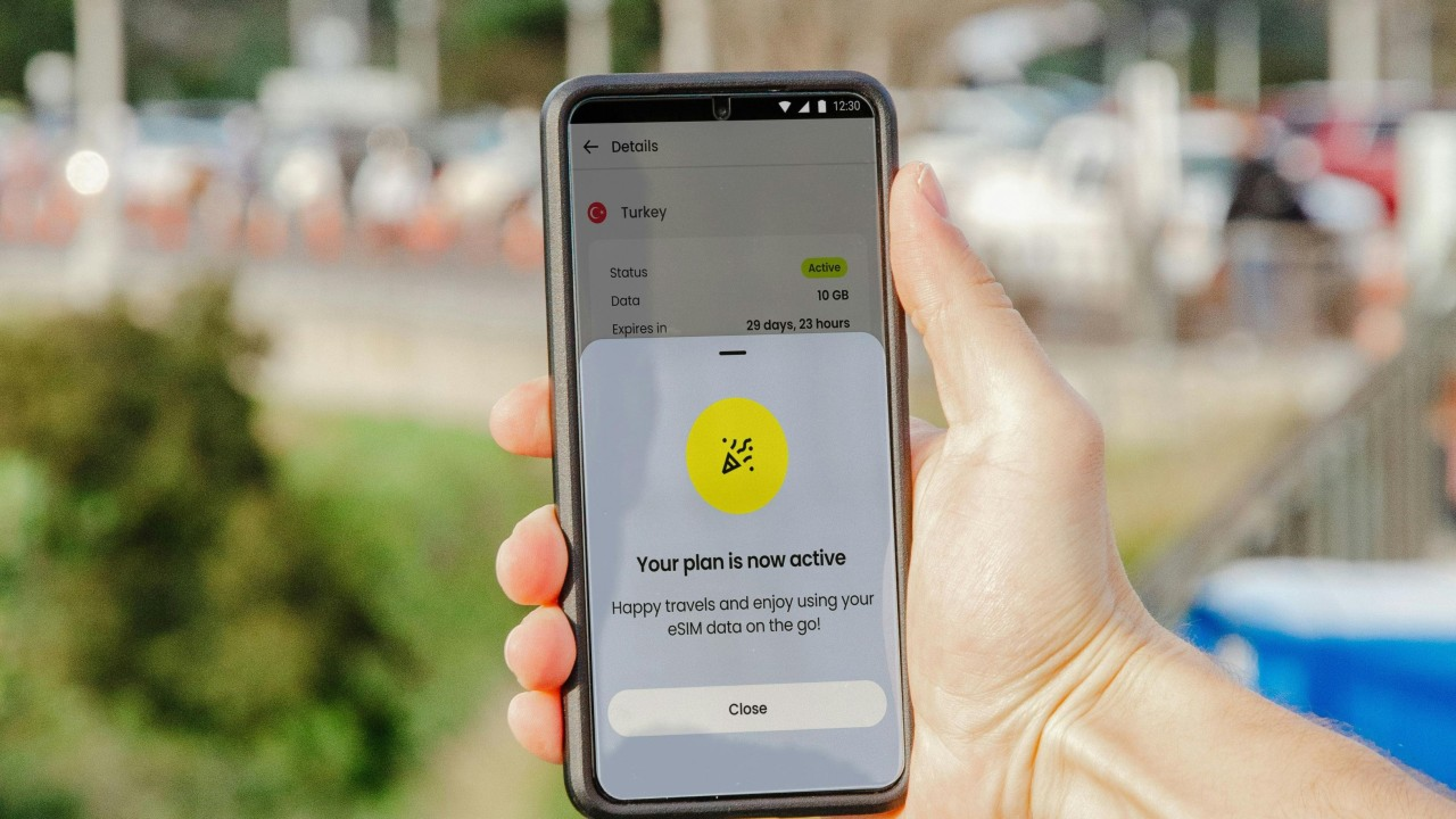
👉 Example: After completing a multi-step setup process, a modal appears saying, “All steps completed! Ready to start using the app?”
💡 Bonus Tip: Try not to use modals too much so you don’t annoy users. But when you do, make sure to give clear next steps or options, like closing the modal to go back to the main page or suggesting other actions tied to the success.
✨ System Success Patterns
System-level success messages show automated process notifications or background tasks that users do not control but still should know.
They need to be informative and let people know what to expect next.
👉 Example: After a file is automatically backed up to the cloud, a system success message might appear saying, “Your files were successfully backed up.”
Messages like this inform users that their data has been securely saved, without interrupting their workflow.
💡 Bonus Tip: Keep system success messages clear and reassuring.
Let users know what’s happening in the background and offer them an easy way to see more details if they want.
✨ Next Steps
Success states are a chance to guide users on what to do next.
After a successful action, use this opportunity to help users continue their journey.
For example, after a purchase, suggest related products they might like.
If a user finishes a form, provide links to additional resources or next steps they might find useful.
Success messages are an important component of user experience, but too many folks don’t give them the attention they deserve.
They’re so much more than random notifications; they delight users and instruct them on what’s happening with their actions.
A success message celebrates wins and sends users on their way over to what they should do next.
Remember, every successful interaction is an opportunity to reinforce positive behaviour and maintain further engagement.
Thanks for reading ✨
I hope you found it useful!
This space thrives because of YOU. ❤️
If the resources I share help you grow in your career, a small contribution from you could keep this community strong.
Together, we’re building a space to learn, grow, and support each other on this design journey.
Every bit helps, and by supporting me, you’re directly helping keep this space alive and growing.
Or simply scan this QR code ⬇️

Your support means a lot!
You might also like:
Share this article:


