Humans are natural completionists.
We open loops, and we look for ways to close them. It’s how our brains make sense of the world.
In UX, every interaction is a loop: The user takes an action. The system responds.
When it works, the user knows what happened and walks off satisfied of having completed a task.
When it doesn’t work, that’s when doubt creeps in.
Uncertainty, friction and a bit of anxiety.
That’s where design really matters.
I’m guessing you’ve experienced this before: You’ve filled out a long form. Checked every detail. Maybe even started over once or twice.
Then, finally you hit Submit.
And then… nothing.
No success message. No green tick. Just silence.
How did you feel?
Frustrated? Unsure? A little anxious?
That flicker of doubt shows up fast.
Did it go through? Should I refresh?
In that moment of uncertainty, all the effort and positive feelings you had can evaporate.
The final step, the confirmation state, might be a tiny fragment of the user journey, but it carries outsized importance. ⬇️
📌What’s Inside
- The Psychology of Confirmation: Why Our Brains Love Closure
- Designing Confirmation States That Work
- Practical Tips
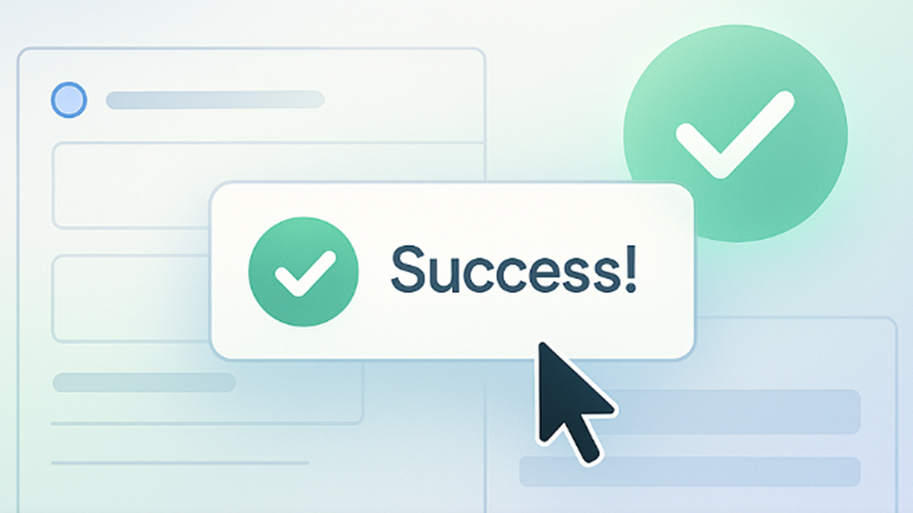
A confirmation state is any feedback that reassures people their action was successful.
Yet far too often, we pour our energy into preventing and handling errors while treating success feedback with much less attention.
Neglecting these positive moments means missing a huge opportunity to build trust and delight users.
After all, in the absence of clear success signals, users are liable to assume the worst. It’s human nature to worry when we don’t get confirmation.
Conversely, a thoughtful confirmation state can turn a routine interaction into a memorable moment of accomplishment.
It reassures users that “yes, what you did worked”, closing the loop on their effort and reinforcing that your product has their back.
This article (the first in a four-part series) dives into the psychology behind confirmation states: why they matter so much to our brains and how to design them for maximum positive impact.
We’ll explore a few psychological principles that come into play here, and our innate drive for completion to understand how the end of an interaction shapes user feelings.
The Psychology of Confirmation: Why Our Brains Love Closure
Have you ever had an unfinished task nag at your mind?
Psychologists have long observed that unfinished business preoccupies us - an observation known as the Zeigarnik Effect.
People tend to remember and fixate on uncompleted or interrupted tasks more than completed ones.
Unfinished tasks create a kind of mental tension, a cognitive burden that weighs on the mind until we get closure.
In simple terms, humans hate leaving things hanging.
“Humans are natural completionists. If we’ve started a task but not finished it, that hanging thread stays in the back of our heads until it’s finally taken care of”.
Our brains naturally itch to close the gaps.
Now, consider what happens when a user does complete a task.
That lingering tension needs a release.
A confirmation state is the psychological payoff that resolves the cognitive suspense.
This closure isn’t just emotionally satisfying but it’s chemically rewarding too.
Even small successes trigger our brains to release a bit of dopamine, the feel-good neurotransmitter linked to pleasure and motivation.
That subtle “ding” of achievement gives users a brief high, reinforcing the positive action they just took.
In UX terms, the friendly checkmark or “Success!” message isn’t only conveying information but delivering a momentary emotional reward for the user too.
Not only do they understand that things went well, they actually feel good about it.
This positive reinforcement encourages users to engage again, creating a virtuous cycle where completing tasks becomes inherently satisfying.
There’s another psychological principle at play in confirmation moments: the Peak–End Rule.
This rule suggests that people judge an experience largely by two points: the peak moment and the ending.
No matter how long or complex a user journey is, what they remember most is the highlight (good or bad) and the final impression.
Final moments of any interaction can be powerful.
For our purposes, the confirmation state is often the end of a user’s interaction cycle (at least for that task), and sometimes it can also serve as a “peak” of positive emotion. A well-designed confirmation can thus lift the entire experience in retrospect.
A confirmation state that acknowledges the completion (scratching that Zeigarnik itch), rewards the user’s effort (a hit of dopamine-fueled satisfaction), and leaves a strong final impression (leveraging the Peak-End bias) will elevate your user experience from merely functional to truly fulfilling.
Designing Confirmation States That Work
Understanding the psychology is one thing, now how do we apply it to design?
The goal is to align our confirmation states with human instincts, ensuring that users get the closure and positivity they subconsciously seek.
Here are a few principles when designing these moments:
1️⃣First and foremost, provide feedback quickly and clearly.
The instant a user completes an action, the interface should respond with an unmistakable confirmation.
This can be a message (“Your changes have been saved”), a visual change (a checkmark appearing), or a combination of both. The faster and clearer the feedback, the faster that lingering doubt in the user’s mind evaporates.
Always close the loop: if the user is left wondering, the confirmation isn’t doing its job.
2️⃣Match the tone to the moment.
The significance of the user’s action should guide the level of celebration in the UI.
For smaller, frequent actions (like toggling a setting or saving a field), a subtle inline confirmation or icon could do the job.
For example, Google Docs simply shows a tiny “✔ All changes saved” note in the header, which is a gentle confirmation that everything is up to date.
It doesn’t interrupt your flow, but it’s there when you glance up, constantly reassuring.
On the other hand, if a user has completed a major milestone, say, submitting a big project, placing an order, or finishing an onboarding, that’s a great time to inject some celebration.
You can then use a dedicated success screen and playful visuals to acknowledge the accomplishment. This not only provides closure but also creates a positive emotional peak at the end of the journey.
A celebratory success screen in a financial app confirms a money transfer with a cheerful graphic and a clear “All Sent” message.
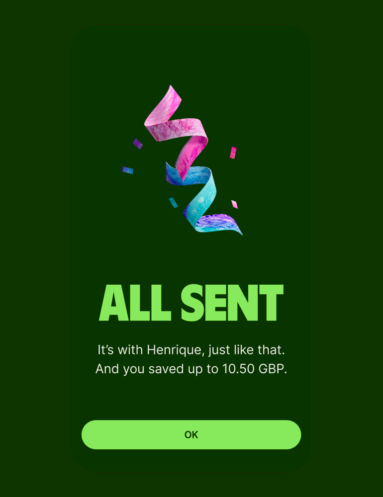
Notice in the example above: the design makes the completion unmissable (“All Sent” in big text), reinforces it with a friendly illustration, and provides a single next step.
This is a fitting response for a significant action (sending money, in this case). It feels like a mini celebration, which leaves the user feeling rewarded.
Imagine if the app had just quietly said “Done” in a small corner…functionally the same information, but emotionally far less impactful.
3️⃣That said, balance celebration with efficiency.
Users appreciate a fun surprise or a warm message, but they don’t want to be slowed down. Use animations, congratulatory copy, or visuals when it truly adds value to the user’s experience (for big milestones).
But avoid it for every trivial action, which can annoy users instead.
Aim for a tone that feels appropriate to the context and your product’s personality.
4️⃣Another crucial aspect is what comes after the confirmation.
A great confirmation state not only pats the user on the back, it also guides them to the next step.
Providing a path forward keeps the momentum going.
This could be as simple as offering a button to view the results of their action, or a suggestion to perform a related task.
For instance, e-commerce sites sometimes suggest sharing the purchase on social media or invite the user to browse related products.
I like to think about the confirmation state as a transitional moment: the end of one journey and the gateway to another.
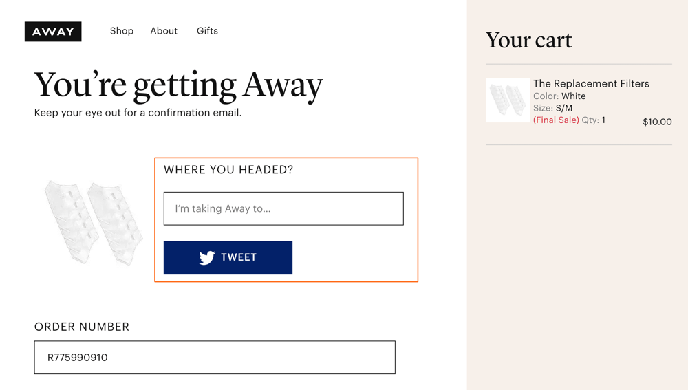
In the example above, the confirmation screen carries the brand’s personality and provides a clear next step. It transforms a standard receipt page into an opportunity for extended engagement.
When designing your own confirmation states, think about your user’s mindset at that moment: they’ve accomplished what they needed, is there something helpful or joyful they’d like to do next?
5️⃣Finally, make sure your patterns are consistent.
Users learn to expect that when they complete an action, the system will respond with a confirmation. If some parts of your UX provide success feedback and others don’t, users get confused and lose confidence in your product.
Make it a design principle that every meaningful action has a meaningful confirmation.
What’s important is that users feel taken care of: the system communicates both bad news and good news.
Over time, this consistency forms a reassuring pattern.
Users stop worrying “Did that work?” because they know they’ll be told explicitly. This sense of predictability greatly enhances usability and user trust.
Here’s a quick checklist of practical tips summarising the above concepts:
Practical Tips
✅Confirm immediately: The moment an action is completed, provide a clear confirmation message or visual indicator.
For example, change a button to a “✓ Done” state or show a toast notification saying the action was successful. Quick, explicit feedback prevents doubt from creeping in.
🥳Match the celebration to the task: Tune the level of celebration to the importance of the action.
Save big, celebratory screens or animations for significant milestones. For routine actions that happen often, keep confirmations subtle. This way, you’re ensuring that special moments feel special, while everyday tasks remain efficient.
✨Use positive visuals and language: A friendly tone goes a long way in a confirmation state. Consider using reassuring icons (✓ checkmarks are universally recognised) and wording that reinforces success.
Positive microcopy, such as “You’re all set!”, “Success!”, or “That’s taken care of!” celebrate the user’s accomplishment.
👉Offer details or next steps (when relevant): If there’s pertinent info the user might need, or a logical next action they can take, include it in the confirmation.
For instance, after a user schedules a meeting, the confirmation might show the meeting details and offer options to “Add to Calendar”. After a purchase, you might provide a “Track Order” link.
Guiding users on what to do next keeps them engaged and builds on their momentum. Even a simple “Back to Home” or “View your profile” suggestion can be helpful right after a success state.
🔁Stay consistent across the experience: Establish a consistent style for success feedback so users learn to recognise it.
This could mean using the same colour (e.g. green for success), same iconography, or same placement for confirmation messages throughout your app.
🤯Don’t overload or confuse with multiples: Be mindful of scenarios where several success messages might appear around the same time (for example, if a user triggers multiple quick actions in succession).
If you use toast notifications or banners, design them so they don’t stack up in a baffling way. Differentiate the messages (“Saved profile”, “Password updated”) or combine them if appropriate (“3 changes saved successfully”).
↩️Provide an “Undo” if possible: This might sound counterintuitive for a success state, but offering a way to reverse an action can actually enhance user confidence at the moment of confirmation.
Services like Gmail do this well, after you send an email, a little “Message sent. Undo” toast appears. Including an undo option within a success alert gives users a safety net. It tells them that they are still in control. I
f your context allows an undo (e.g. undo a deletion or edit within a short timeframe), consider incorporating it into the confirmation UI. It can turn a nervous moment into a empowered one (“It’s done but and I can change my mind if needed”).
Each of these ties back to the core psychological needs we discussed: certainty, closure, and positive reinforcement.
Well-designed confirmation states might even become little highlights of your product, moments users look forward to, however small, because it feels good to achieve something and be acknowledged for it.
As designers and product creators, it’s our job to ensure users never feel lost or doubtful about the actions they take.
A well-designed confirmation state is deceptively simple: it tells the user what just happened, but on a deeper level it says “you succeeded, you’re safe, and we’re here with you.”
This small slice of the experience can have an outsized impact on user satisfaction and trust.
It sets the tone for how users feel when they use your product: do they walk away anxious and uncertain, or confident and accomplished?
Reflect on this: How does your product currently say “Success” to your users?
Are those final moments after a user completes a task created as carefully as the first ones?
As you continue to explore the next parts of this series, consider the emotional journey you’re creating.
Every ending is a chance to reinforce a positive memory.
What will your users remember about the way your product congratulates them, guides them, and completes their story?
The best designs not only meet users’ needs but also acknowledge their efforts.
Because it is not only the destination that matters, but the journey too.
This space thrives because of YOU. ❤️
If the resources I share help you grow, a small contribution from you could keep this community strong.
Every bit helps, and by supporting me, you’re directly helping keep this space alive and growing.❤️⬇️

You might also like:
📚 Sources & Further Reading
- Nielsen Norman Group - Visibility of System Status
- Britannica - Zeigarnik Effect
- Kahneman, D. - Thinking, Fast and Slow (Peak-End Rule)
- UX Planet - Success States Design
- UXD World - How to Write Effective Success Messages
- NN/g - Visibility of System Status Heuristic
- Google Docs UI Example
- Away Luggage - Purchase Confirmation Page
- Gmail - Undo Send Pattern (Case Study)
- Asana - Celebratory UX Patterns
Share this article:


