What happens when you try to navigate a long menu?
Your eyes dart back and forth.
You hover uncertainly.
You scan the same area twice.
Sometimes you give up entirely and look for another way.
It’s a classic design failure.
Here’s what’s happening: every item in your menu demands attention.
Every option creates a micro-decision.
Stack enough of these decisions together, and you’ve built a cognitive obstacle course.
Users end up spending more time, experiencing more frustration, and feeling less confident about their choices.
But before you say that the problem is in your menu being too complex, it’s what you’re going to do about it that counts.
📌 What’s Inside
- The simplest fix
- Smart design patterns for complex navigation
- The hover effect
- Why this matters
The simplest fix ✂️
Want to improve your menu immediately? Remove items. Not redesign them. Not reorganise them. Just delete them (if possible).
A menu with twelve items is significantly harder to use than one with six.
Not twice as hard-exponentially harder. Each additional item increases the cognitive load for every single user, every single time.
Question what actually needs to be there.
Can items be consolidated?
Are there actions that 95% of users never touch?
Is this item solving a real problem or just taking up space?
The fastest way to simplify a menu requires no design work at all. You just need to rethink what belongs and what doesn’t.
Smart design patterns for complex navigation 🧠
Sometimes you genuinely need those menu items. Your product is complex. Your users need access to multiple functions. Cutting isn’t an option.
Fine. But that doesn’t mean you’re stuck with a cognitive mess.
When you can’t reduce the number of items, you need to reduce the complexity of finding them.
That’s where smart design patterns come in.
Pattern 1: Group by relationship 🗂️
Look at a long menu list and ask if any of these actions are related.
They usually are. And when related items sit scattered throughout a list, users work harder to build a mental model of what’s available.
Grouping solves this. Cluster related actions together. Separate the groups with subtle dividers. That’s it.
Say you have a menu with actions like “Open File,” “Open Recent,” “Open Location,” “Copy Text,” “Copy Link,” “Copy Image,” “Delete Item,” “Move Item,” and “Add Bookmark.”
That’s nine items fighting for attention.
Now group them: Open actions together. Copy actions together. Item actions together. Add actions together.
Same nine items, but suddenly the menu has structure. Users can think in categories instead of scanning linearly through every single option.
The cognitive shift is significant. Instead of processing nine individual choices, users process four groups. They can skip entire sections that don’t match their intent.
Groups create shortcuts for the brain.
Pattern 2: One icon per group, not per item 🎯
Icons are often helpful. They add visual distinction. They aid recognition. So naturally, we add them to every menu item.
This is a classic mistake.
When every item has a different icon, your menu becomes visual noise.
Users can’t distinguish the groups anymore because every line is competing for attention with its own graphic.
The icons stop helping and start interfering.
Use one icon per group, not per item.
If you’ve grouped your “Open” actions together, put one icon at the start of that group.
Same for “Copy” actions, “Item” actions, and so on.
This creates visual anchors that help users identify groups faster.
The whitespace around the icon gives your menu room to breathe.
The groups become visually distinct without competing for attention. Scanning gets faster because there’s less to process.
Most designers resist this approach. They want that icon next to every action. It feels incomplete without it.
But design isn’t about decoration—it’s about reducing cognitive friction. And sometimes less is genuinely more effective.
One caveat: the icon should represent the group theme, not just the first item.
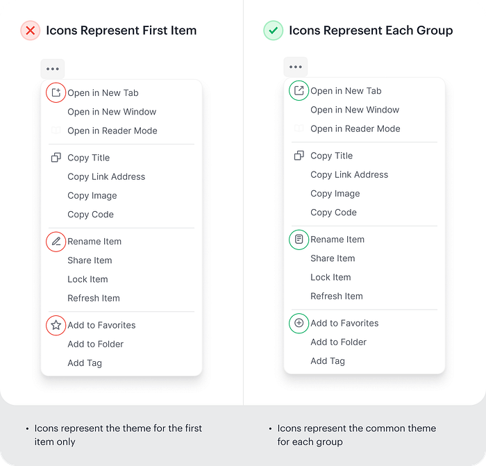
Users are scanning for categories first, specific actions second.
Your icon needs to communicate the group’s purpose, not just illustrate one option within it.
Pattern 3: Progressive disclosure 🔽
When menus get long, consider hiding secondary actions under primary ones.
For example, “Export” could expand to show “Export as PDF,” “Export as CSV,” etc.
This keeps the initial menu scannable while making related actions discoverable.
Users see fewer choices upfront but can drill down when needed.
Pattern 4: Search before scroll 🔍
Once your menu exceeds 8-10 items, add a search field at the top.
This is especially effective for menus with technical terms or when users know exactly what they want but not where to find it.
Pattern 5: Frequent actions at top ⬆️
Track which menu items users access most often and surface them at the top. This creates a dynamic “shortcuts” section that adapts to individual usage patterns.
Adobe products do this well—your most-used tools become more accessible over time without you configuring anything.
The hover effect ↗️
How your menu responds to hover states is of equal importance.
A common approach is to change the text colour when users hover over an item. Maybe underline it. Done.
This isn’t enough.
When a user hovers over a menu item, they need clear visual feedback about what they’re about to select.
Text colour change alone is too subtle. It leaves doubt.
Change the background colour of the entire menu item container, not just the text.
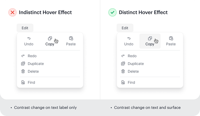
Give users a clear visual boundary around their selection. Make it obvious what they’re about to click.
This seems like a minor detail. It’s not.
Clear hover states reduce hesitation. They build confidence.
They confirm that the interface is responding to user input.
Users shouldn’t have to wonder if they’re selecting the right thing.
Your hover effect should eliminate that doubt completely.
Why this matters 💡
Every menu interaction is a test.
Users are asking: “Can I find what I need quickly? Does this interface make sense? Am I confident in my choices?”
When menus are complex, users fail these tests.
They spend longer on tasks. They feel less satisfied. They start doubting their ability to use your product effectively.
The cognitive load isn’t just about speed. It’s about confidence, satisfaction, and the cumulative frustration of interfaces that make simple tasks feel hard.
Menu complexity is one of those UX problems that seems small until you watch real users struggle with it.
Then it becomes obvious: this isn’t a minor detail.
It’s a fundamental part of how users experience your product.
None of these patterns are complicated. But they require you to think about menus differently, not as lists of features, but as tools for reducing cognitive load.
Because when navigation feels hard, everything else in your product feels harder too.
Users don’t separate “I couldn’t find the menu item” from “This product is confusing.” It all blends together into one experience.
Make that experience simpler.
Your users will notice, even if they can’t articulate why things suddenly feel easier.
That’s what good design does—it solves problems invisibly.
Subscribe on Substack⬇️
You might also like:
📚 Sources
Share this article: