Summary
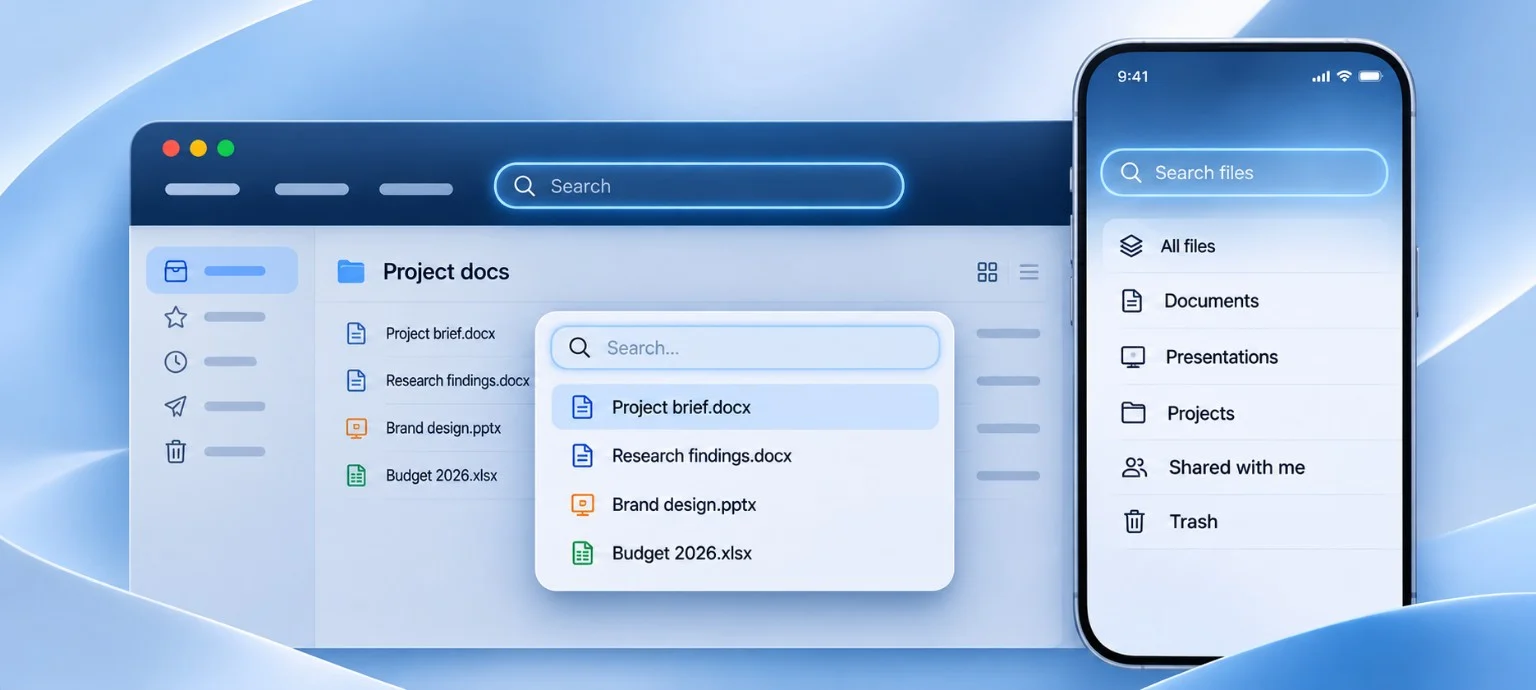
You search for something you know exists and get no results. So, you try another search field, type exactly the same words, and suddenly there it is. One field searched a specific section, while the other searched the whole product. Nothing was technically broken. But why did we have to discover the difference by failing first?
The same query can return “No results” in one search field and a matching file in another. One searches a specific section, while the other searches the whole product. The difference is obvious to the people who designed it, but less obvious when the interface provides no clues. So, how do we make it clear what someone is actually searching?
Does a search field in the header mean everything?
On desktop, a search field beside the main nav feels like a way into the whole system. It follows us between pages, so we might expect it to search beyond the section we're currently viewing.
Baymard Institute’s guidance, from October this year, drawing on ecommerce usability research, recommends keeping search prominent when finding products is central to the experience. This is why global search fields are often given a highly prominent position on ecommerce sites. [1]
That visibility of course matters. But finding the field is only half the problem. We also need to understand what it searches.
If we type “returns” on a shopping website, should we expect products, help articles or previous orders?
The field might be perfectly visible while its scope still remains unclear.
When does search become a filter?
Now place another field above a list of files.
Does it search that list, the entire project or every file in the workspace?
We can see how these interactions differ in Linear, a product development tool for managing projects and tasks.
Linear lets us search across the entire workspace for tasks, projects and documents. But within a particular board or list, it searches only the task titles in that view. [2]
One search asks, “Does this exist somewhere in my workspace?” The other asks, “Is it among the items I'm looking at?”
Imagine this: You're working in a document building system.
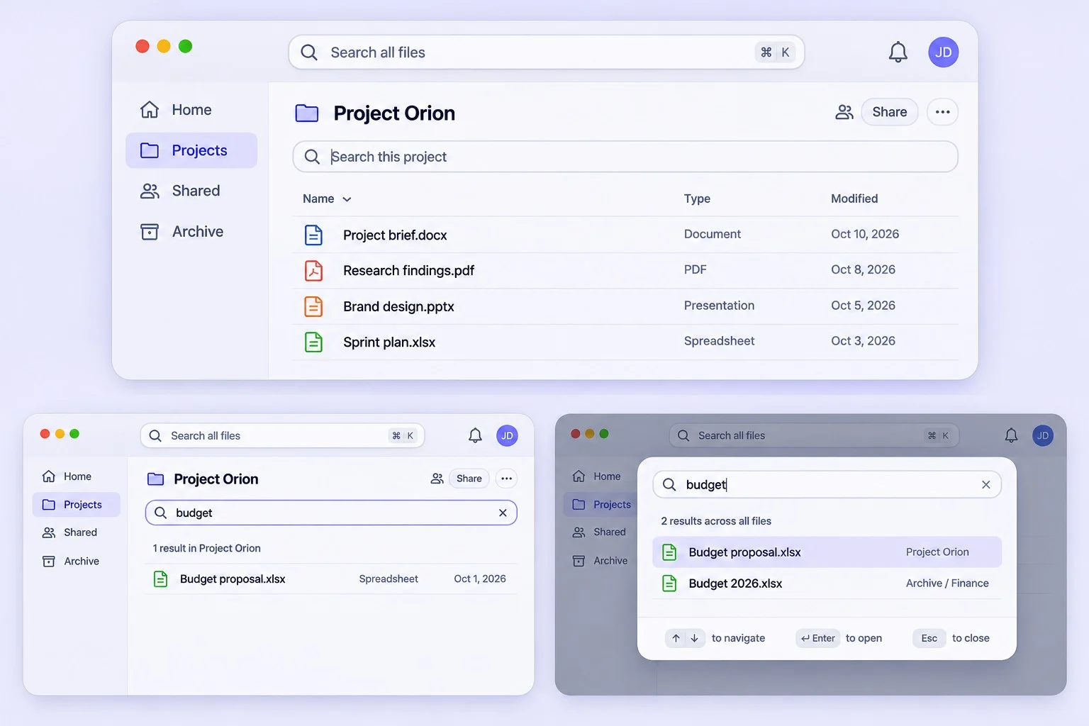
A file called “Budget 2026” lives in an archived project. We search for it using the field above our current project's files.
“No results.”
There are no matching files in the current project. But without knowing that restriction, we might conclude the document doesn't exist anywhere at all.
We've given someone an answer without explaining what was actually searched.
Does a bigger search window promise a wider search?
Search can also open in an overlay, replacing part of the interface with a dedicated space for typing and reviewing results.
Sourcegraph, a code search platform, introduced a command palette in March this year. Opened with a keyboard shortcut, it allows us to find files and repositories or navigate to different parts of the product. [3]
Search can therefore become a way of navigating an entire application, rather than finding something within the current view.
But what happens when an overlay covers the folder name or selected category that previously gave search its context?
That is also something to consider.
If search still applies only to that folder, what tells us so?
A larger interface might suggest a wider search, even when the underlying scope remains unchanged.
A label such as “Search this project” or an option to switch to “All files” could perhaps make that boundary clearer.
What changes when search takes over a mobile screen?
In a messaging app, a magnifying glass inside an open conversation might suggest searching that conversation. But a search field on the main conversations screen suggests searching across all chats.
Both placements give us clues about what will be searched.
But if either field opens a full screen search view, the surrounding context can disappear.
Are we still searching one conversation or all of them?
Android's search components support expanded views for suggestions and results. [4] Apple's 2026 iOS guidance also distinguishes dedicated Search tabs for broader discovery from inline fields for specific collections. [5]
These patterns offer different ways to access search. But when the interface changes after we tap, the distinction between local and global search needs to remain clear.
Are we testing what search finds or what people expect?
Before asking someone to find a document, I'd start by showing them the available search fields.
Which would they use to find something in another project? What do they believe each field searches?
Then let them search for a document that exists outside the current section.
Do they switch to a broader search? Or do they keep rewriting the query because they think they've typed something wrong?
If someone believes they're searching everywhere, improving the search algorithm won't address their misunderstanding.
We could keep the selected scope visible alongside results, use more specific field labels or offer a broader search when nothing matches.
For example, instead of “No results”, an empty state could say “No matching files in this project”, followed by an option to “Search all files”.
That gives someone a clearer explanation of the result and a way forward.
We spend time making search easier to reach and improving what it returns. But are we putting the same care into what we lead people to believe will happen when they use it?