Every so often, a new feature or product release prompts our industry to pause…
Many of us would argue that Apple’s iOS 26 Liquid Glass update might be the latest example.
An interface design that is as deliberate as it is divisive.
So, let’s take a look at what’s unfolding in front of us.
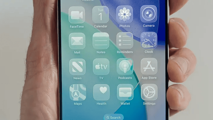
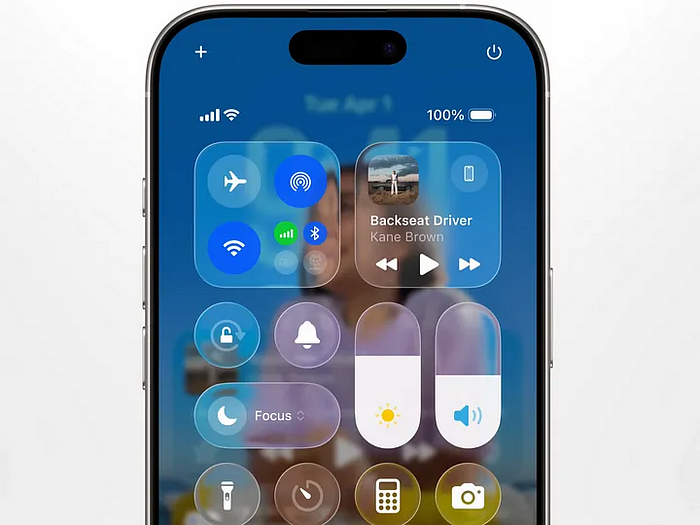
Translucency, motion, and fluidity are becoming the default.
And there is no inherent problem with this shift.
The nature of digital experience is clearly evolving, and demands for richer, more adaptive interaction patterns are legitimate. A move away from static, conventional approaches may even be overdue.
Yet the question persists…
Can progress in aesthetics justify friction in use?
Read on Medium➡️
The answer is not straightforward, but it is consequential.
This isn’t a critique of Apple’s ambition.
They’ve put serious effort into reworking a pattern, which many considered finished, adding fluid motion, soft highlights, and a dimensional feel that reacts as you move through the interface.
In some ways, that level of rigour is commendable.
But public feedback has been loud (and mostly negative).
For many, the update misses the mark on both usability and accessibility.
So, it raises a fundamental question for the industry: is this the direction we want to pursue, or is it time to recalibrate?
Apple has long been a reference point in UX.
Their track record has shaped how we define quality and coherence in digital products.
Yet, as we reflect on this release, there is an underlying tension.
Perhaps we are approaching a moment where the meaning of good UX, and what we prioritise in it, deserves closer inspection.
The public reactions have oscillated between admiration and confusion but the essential question lingers beneath the surface: when a product’s appearance is the loudest signal, how much function is lost in the noise?
And how much compromise are we prepared to accept before core interaction begins to fade?
📌 What’s Inside
- Why today’s interfaces often promise more than they deliver
- What we’re actually learning from research and user behaviour
- Where accessibility stands when looks dominate the agenda
- How visual choices direct trust, meaning, and practical use
- What matters most for the future of product design
📉Why today’s interfaces often promise more than they deliver
Beyond the stylistic update, on a deeper level, Apple’s move reflects a climate where ‘experience’ is increasingly synonymous with visual system.
But as this approach spreads, it exposes a new tension in our field: surface appeal is not a surrogate for substance.
Since the launch, public feedback has highlighted a range of challenges: controls and actions blending into the background, difficulty finding guidance, and navigation that occasionally feels less direct than before.
These are not isolated findings.
Many leading platforms, including Samsung’s One UI and Google’s Material Design, have introduced ambitious visual systems in recent years.
Meanwhile, designers and users have been voicing concerns about potential trade-offs of implementing similar approaches.
Most notably, we’re seeing discussions around increased complexity and the risk of key actions becoming less immediately accessible.
At their best, these discussions are shifting from questions of novelty to questions of effectiveness.
What actually works, and what falls short when tested in use.
🔍What we’re actually learning from research and user behaviour
We know by now, that users often avoid unnecessary cognitive effort, and as interfaces grow more visually complex, usage friction naturally increases.
This mirrors observations in UX research: surfaces that are too decorative or overly animated can drive up mental workload without providing corresponding value.
The energy spent parsing aesthetics can exceed the benefit of the aesthetic itself.
“Field reports and user studies continue to show that excessive visual layering can slow down task completion and increase requests for help — outcomes that can easily be overlooked in the pursuit of a more sophisticated visual system.”
Don’t get me wrong, this is not a critique of progress.
The tools are more powerful than ever.
But the role of the UX leaders now includes resisting the assumption that visual polish guarantees good outcomes.
⚖️Where accessibility stands when looks dominate the agenda
Accessibility in digital products often depends NOT on the availability of features, but on whether those features are present by DEFAULT.
In Apple’s case, transparency settings such as ‘Reduce Transparency’ and ‘Increase Contrast’ are available, but remain hidden in settings, leaving the majority of users with the defaults.
And most people will not seek out or activate options that are not surfaced upfront.
This is based on years of behavioural research, which prove that when settings are buried, most people never discover or enable them.
As Jared Spool observed, less than five percent of users change default configurations.
UX Collective’s summary of multiple studies echoes this, finding over 95 percent of users keep initial settings unchanged in tools as ubiquitous as Microsoft Word.
Features that require extra effort or awareness are, for most, invisible.
Settings like ‘Reduce Transparency’ or ‘Increase Contrast’ can only have real impact when they are surfaced in the primary user journey, not relegated to secondary flows.
As visual layering and interface complexity increase, the burden on users with diverse needs grows, especially if access remains opt-in rather than integral.
In practice, inclusion cannot be relegated to settings or secondary menus.
It must be present by default, in every primary flow.
The numbers are unequivocal: when accessibility is buried, access drops.
🛠️How visual choices direct trust, meaning, and practical use
Interfaces have become the most widely read language in the world.
Each decision in their construction directs not only how the product is perceived, but also the degree of control and understanding extended to the user.
The industry’s pursuit of visual gratification sometimes overlooks the reality that meaning is always shaped by context.
And yes, the aesthetic-usability effect is at work here as well: visual polish can make an interface seem more approachable, even in the face of small usability issues.
Yet still, visual appeal cannot compensate for substantial functional gaps.
Users arrive with goals, not to admire surfaces, but to accomplish something.
When aesthetics begin to interfere with those intentions, even the most elegant interface loses its value.
This tension is central to the field: visual attraction can easily outweigh performance, unless we pay deliberate attention to outcomes over appearances.
The evolution of our discipline rests on recognising this distinction.
Ultimately, what defines a product is not how it looks, but how confidently and intuitively people can use it.
🌱What matters most for the future of product design
Meanwhile, it seems that the teams making the most meaningful progress in 2025 are not those reacting to shifts in visual trends at all.
For instance, let’s look at brands like Stripe and Airbnb who are showing that the real gains come from removing visual noise, not adding it.
Reduction in error rates, shorter time-to-task, and improved satisfaction have emerged not from doubling down on surface, but from recentering interaction and intention.
“By eliminating visual noise, Stripe makes transactions and API documentation easy to navigate, reinforcing trust and reliability among both developers and end users.”
Similarly, Airbnb’s simplified search interface boosted click-through by 27 % and reduced abandoned searches by 15 % after removing excessive visual elements.
Of course, there are nuances depending on the type of system and its context.
Still, across domains, users consistently seek the most direct path to achieving their goals (call it a path of least resistance if you may) whether they are completing something critical, such as financial transactions, or casually browsing social feeds.
The balance between visual engagement and practical usability is not a binary.
The real challenge is finding where those qualities meet, rather than choosing one at the expense of the other.
This remains an open, and ongoing, question for us all.
Liquid Glass may, or may not be a mistake.
But it definitely is a marker in the ongoing negotiation between progress and principle.
The next era for UX will be led by those who treat these moments as prompts for dialogue, not templates for replication.
The field’s highest calling is not applause for spectacle, but utility and integrity for the people on the other side of the screen.
The most successful products are those that respect the reasons people turn to them in the first place.
If the industry is to advance, it will not be by outpacing itself in visual novelty, but by sustaining the moments of ease, reliability, and confidence that build genuine affinity.
Of course, the temptation to prioritise appearance will always be there.
But what matters is whether we let it define the substance of what we make or not.
At the end of the day…
“People ignore design that ignores people”.
Subscribe on Substack⬇️
If you’ve found this content valuable, here’s how you can show your support.⬇️❤️

You might also like:
📚 Sources & Further Reading
- Liquid Glass or UX Mirage? What WWDC25’s Boldest Design Gets Right — and Worryingly Wrong
- Liquid Glass: Appearing Innovative vs. Being Innovative
- American Psychological Association: The cognitive brain processes for representing form/design innovation and function innovation product designs
- UX Collective: The UX of Default Settings in a Product
- Why Default Settings Matter More Than You Think
- UX Planet: The Power of Defaults
- Jared Spool’s UIE blog Do users change their settings?
- Apple WWDC25: Official Accessibility Sessions
- The Future of Fintech Branding: Key Trends Shaping 2025 and Beyond
- How does Negative Space enhance User Experience?
- Human Digital: People ignore design that ignores people
Share this article:


