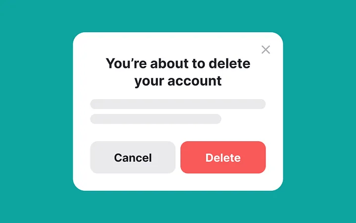
9 min 0 Blog Critical confirmation: The language and logic of destructive modals Aleksandra Smith 16 June 2025 How clearly should a product speak when asking a user to let something go? If… Read More
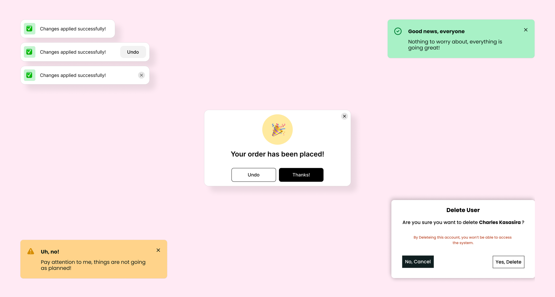
9 min 3 Blog Designing Success (Part 2): Do’s, Don’ts, and Use Cases of Confirmation Patterns Aleksandra Smith 28 May 2025 Read on Medium 🅼➡️ Users crave clarity. Not just feedback, but meaningful feedback. That means… Read More
12 min 0 Blog Designing Success: The Emotional Power of Confirmation States Aleksandra Smith 26 May 2025 Humans are natural completionists. We open loops, and we look for ways to close them.… Read More
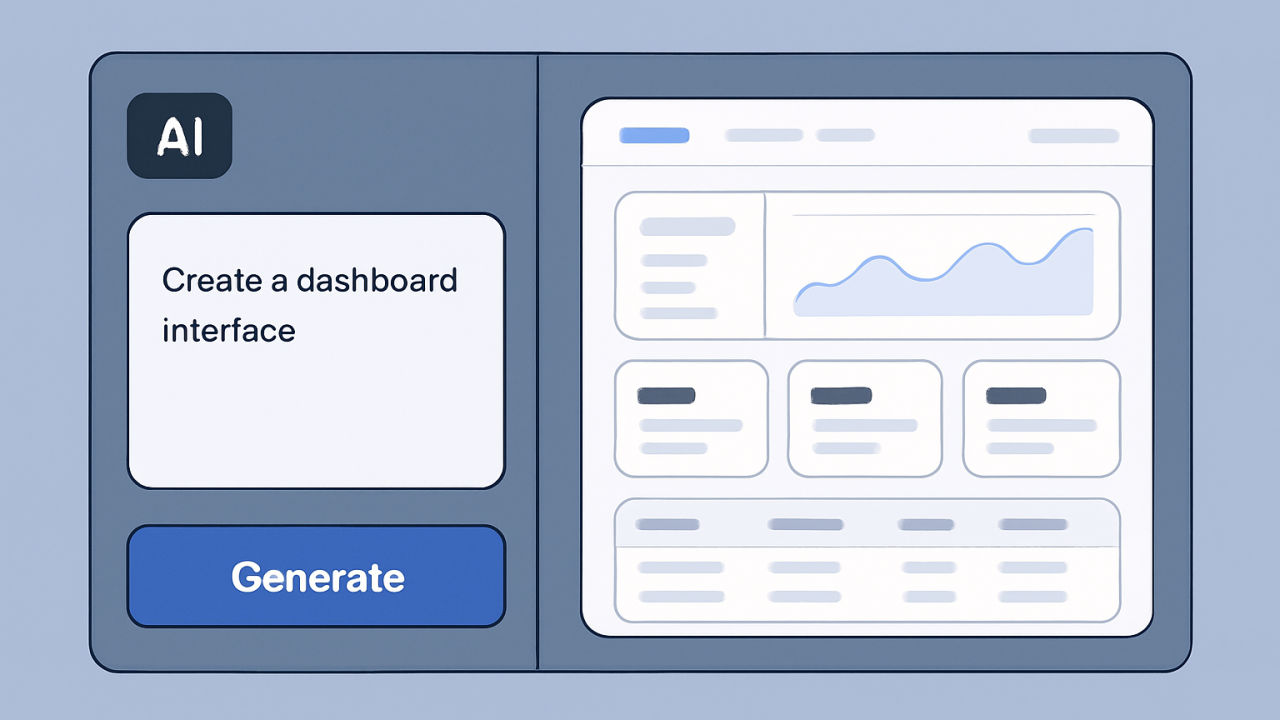
9 min 0 Blog AI in UX: Are Designers Still in Control? (Top Prompt-to-UI Tools) Aleksandra Smith 26 May 2025 If an AI tool can draft a full interface in 30 seconds, does that mean… Read More
9 min 0 Blog Dark Patterns Uncovered (Part 2): Ethics, Transparency, and User Trust Aleksandra Smith 7 May 2025 “When profit is at stake, content and interaction designers put ethics aside all too often.… Read More
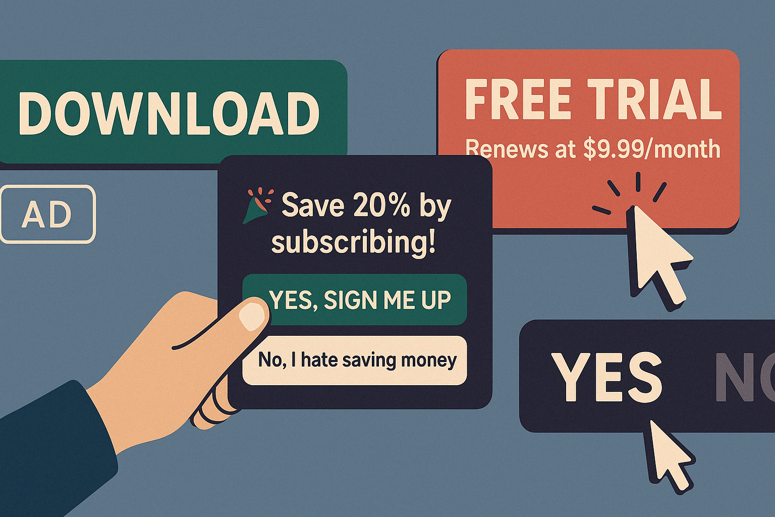
4 min 3 Blog Dark Patterns Uncovered: A Critical Look at Deceptive Design Tactics Aleksandra Smith 27 April 2025 Let me begin by asking you this: Is a quick business win ever worth losing… Read More
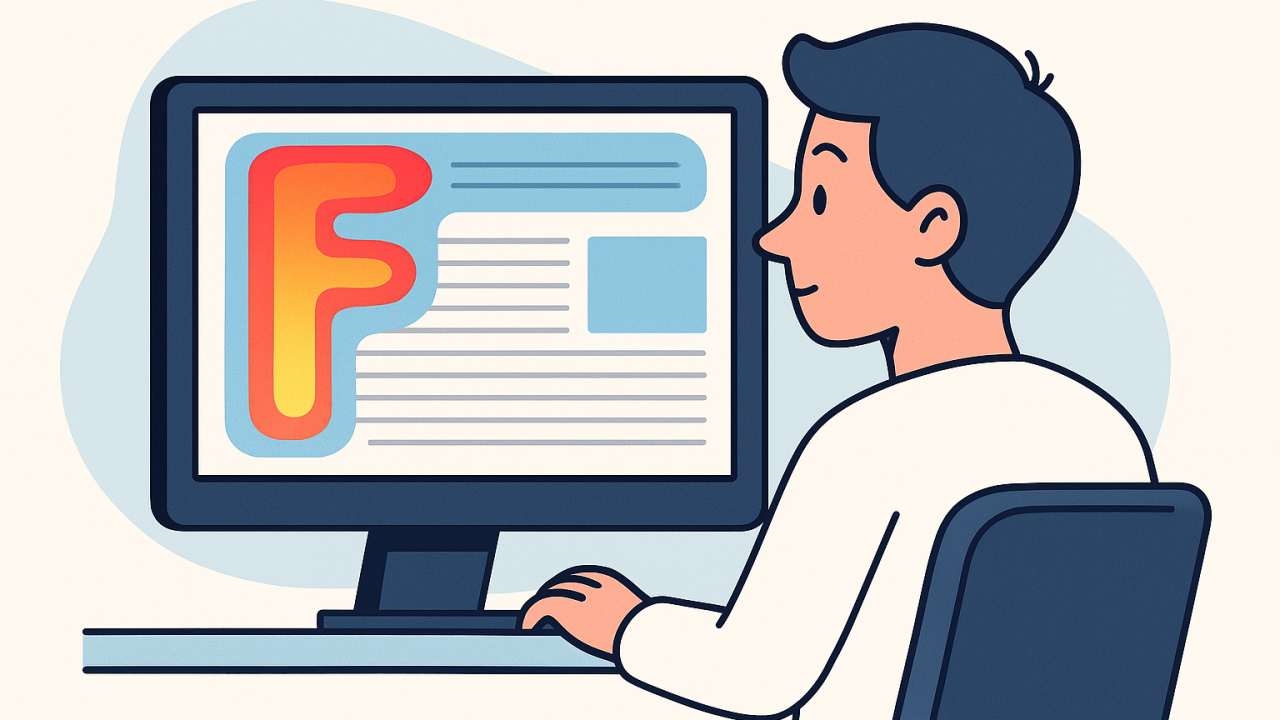
5 min 0 Blog F-Pattern Thinking: UX for the Way People Read Aleksandra Smith 16 April 2025 On an average web page, people read at most 28% of the words — 20% is more likely.… Read More
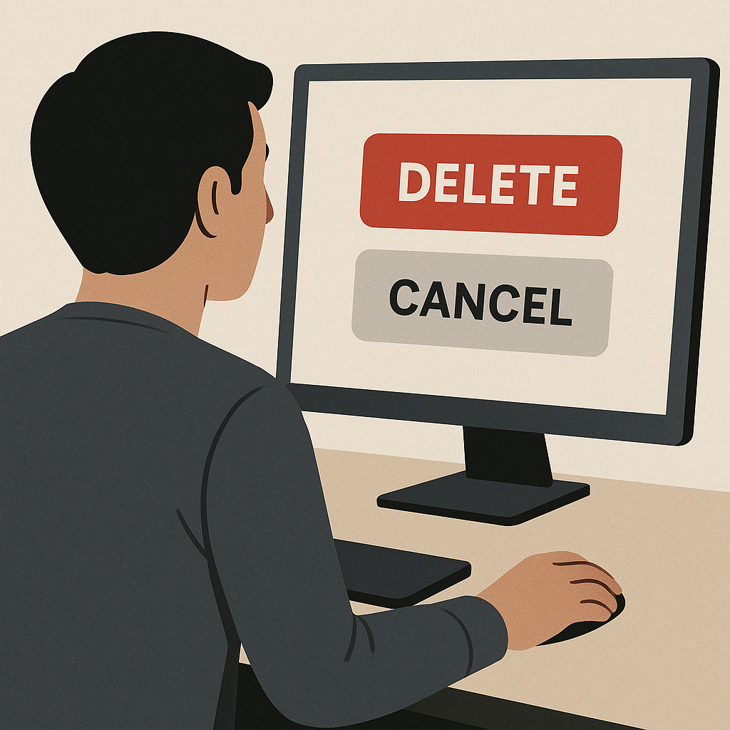
13 min 0 Blog Designing Better Buttons: How To Handle Destructive Actions Aleksandra Smith 8 April 2025 “To err is human; to forgive, design.” Destructive actions – those that delete data, erase… Read More
4 min 0 Blog Designing Better Buttons: Consistency, Hierarchy & Buttons vs Links Aleksandra Smith 31 March 2025 Hey, welcome back! After a comprehensive look into some of the most common UX psychology… Read More
3 min 0 Blog Designing for Lasting Impressions: The Peak‑End Rule Aleksandra Smith 11 March 2025 “We don’t choose between experiences, we choose between memories of experiences.” – Daniel Kahneman Think… Read More