I used to run at events.
Whenever I spotted the finish line, I always found this weird burst of speed.
My legs would push harder, faster, like I had fuel left I didn’t know about.
I never really questioned it, until recently.
Turns out, that feeling has a name.
And it applies to UX too.
It’s called the Goal-Gradient Effect.
What’s Inside: ⬇️
- Definition.
- Origin.
- Application in design.
What is it?
The Goal-Gradient Effect is this psychological quirk where we work harder as we get closer to completing a goal.
It taps into our innate drive to finish what we started, making the final stretch feel more urgent and rewarding.
Where does it come from?
Research from behaviourist Clark Hull back in 1932.
He found that rats ran faster as they neared a food reward, concluding that the perceived proximity to the goal increased their motivation.
This highlights that progress itself becomes a motivator.
Then, more recently, in 2006, Kivetz, Urminsky, & Zheng, explored this effect in human behaviour. [1]
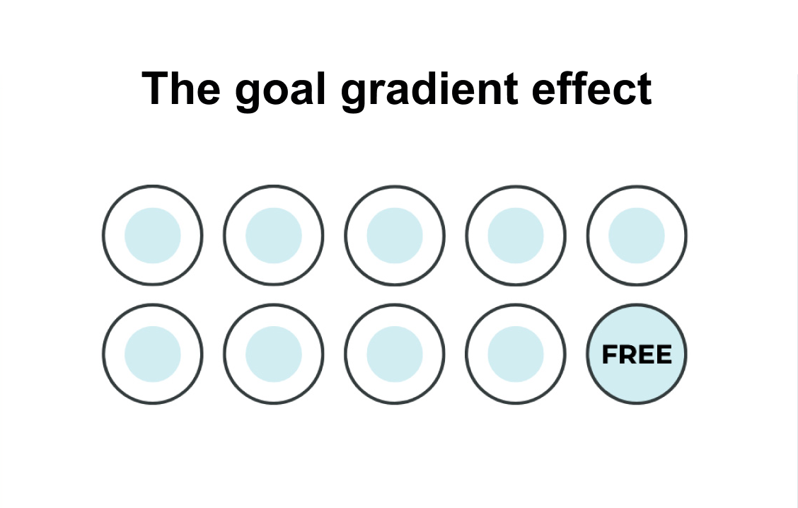
The authors discovered that participants in a cafe reward program tend to purchase coffee more frequently as they get closer to earning a free drink.
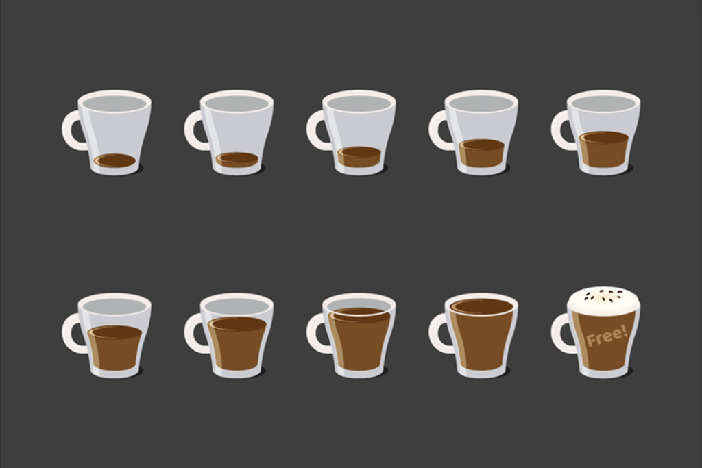
Similarly, internet users who rate songs in exchange for gift certificates visit the rating site more often, rate more songs, and continue longer with the task as they approach the reward.
This sense of progress toward a goal leads to an acceleration in purchases, and a stronger drive to reach the goal is linked to greater retention.
“One reason that goal gradient patterns occur, at least in humans, is that people judge late-state events to have greater value than equivalent early-stage events. In many situations, this makes perfect sense because the ratio of benefit to (remaining) cost increases as one approaches a goal. For example, when someone must rate 10 more songs to receive $10, the expected value of rating the next song is $1. In contrast, when the person advances and must rate only 2 more songs to receive $10, the expected value of rating the next song is $5.” [2]
Why does it matter in UX?
Because every product journey has a finish line.
Checking out. Signing up. Completing a profile.
When users feel like they’re almost there, they’re more likely to complete their journey.
But they need to feel close.
If the end feels far away, they might bail.
This is why frictionless design and progress visibility are so powerful.
How to use it in UX design
⏳ Progress Indicators

Showing users how far they’ve come and how little is left can be a powerful motivator.
Use progress bars, step-by-step forms, or profile completion indicators.
Things feel good when we can see the progress.
You see the end line, and you push through.
🏁 Artificial Head Starts
Make users feel like they’re making progress right away.
If you’re using a progress bar, start it at 20%, not zero.
The first step could be something easy, like confirming their email or signing up—just enough to make them feel like they’re already halfway there and the finish line is in sight.
⚡ Reduce Steps Near the End

The closer users get, the easier it should feel.
The last stretch needs to be the smoothest.
Amazon’s one-click checkout is the “prime” example.
There are no forms, no friction, just an easy completion.
🎊 Celebrate Completion
Crossing the line should feel like winning.
Whether it’s confetti animations, a cheerful “You did it!” pop-up, or a progress ring turning gold, it’s important to celebrate the user’s progress in a way that feels rewarding.
It tells users their effort was seen.
That final dopamine hit seals the experience.
We all love progress.
We crave that sense of moving forward.
And in UX, helping users see that progress is often the difference between sticking around and giving up.
Everyone wants to cross the finish line, our job is to make it easier for them to achieve it.
When users can track their journey, it motivates them to push through obstacles and continue engaging.
When we guide them with small wins, smooth experiences, and clear milestones, we not only enhance their satisfaction but also build long-term loyalty and success.
Thoughts on this post? 💭 Join the conversation by commenting!
👉🏻 Don’t forget to hit subscribe for fresh content weekly. 📰
👉🏻 Follow me on LinkedIn.
This space thrives because of YOU. ❤️
If the resources I share help you grow in your career, a small contribution from you could keep this community strong.
Together, we’re building a space to learn, grow, and support each other.
Every bit helps, and by supporting me, you’re directly helping keep this space alive and growing.❤️⬇️

Or simply scan this QR code ⬇️

Your support means a lot!
You might also like:
Sources:
- The Goal-Gradient Hypothesis Resurrected: Purchase Acceleration, Illusionary Goal Progress, and Customer Retention — Kivetz, Urminsky, & Zheng
- Goal gradient in helping behavior by Journal of Experimental Social Psychology
Join UX conversations here too:
💬 Threads
🌐 Blog
Share this article:


