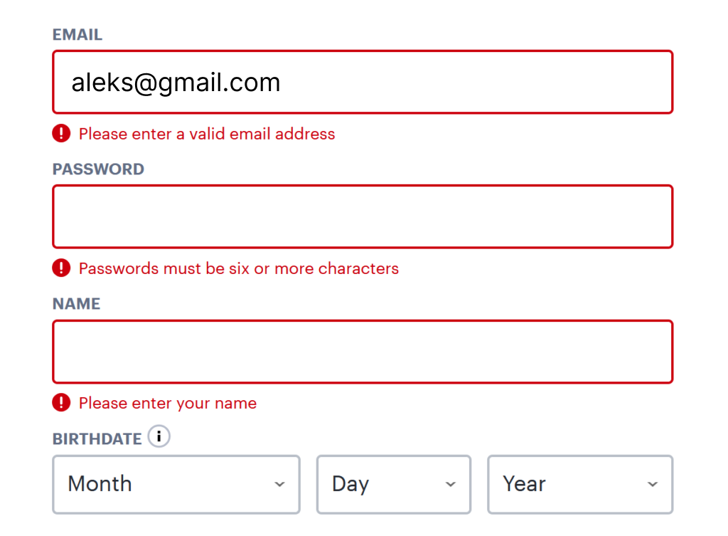
We’ve all experienced the focused intensity of tackling an online task, fingers flying across the keyboard in pursuit of swift completion.
Then, it hits you: a glaring error message. Confusion sets in – a typo on your end, a system hiccup, or some cryptic code only machines understand?
Error messages can make or break a user’s experience. In fact, a well-crafted error message can transform a frustrated user on the verge of giving up into a delighted one, guided back on track.
Because let’s face it, even the most tech-savvy among us make mistakes. That’s what makes us human.
So, let’s put the cold, unhelpful error messages aside and instead of cryptic codes and dead ends, let’s create messages that are helpful, clear, and even a little friendly.
The Cognitive Impact of Poor Error Messages
Human cognition, specifically the limitations of working memory, plays a crucial role in user experience. Working memory, responsible for short-term information processing, has a finite capacity.
Poorly designed interfaces, characterised by unclear instructions and illogical layouts, overload users’ working memory.
When users encounter cryptic error messages, they experience a similar cognitive strain as they attempt to decipher the message’s meaning.
This strain can lead to:
- Increased Task Abandonment Rates
Research by Nielsen Norman Group (2023) conducted eye-tracking studies and usability tests to analyse user behaviour when encountering error messages. 1
The results indicated that users encountering unclear error messages were more likely to abandon the task altogether. This translates to decreased productivity and unfulfilled user goals.
- Negative User Emotions
A study by Matz et al. (2004) investigated the emotional impact of website usability on users. The study involved participants navigating a variety of websites with varying levels of usability.
The results demonstrated that users encountering confusing interfaces and unclear error messages reported feelings of frustration and confusion. These negative emotions can damage trust in the interface and the brand it represents, potentially leading to customer churn.
The Science of Effective Error Messages
Effective error messages are grounded in cognitive science principles and user research. Here are key principles for fostering positive user experiences:
- Clarity and Concision
Error messages should be formulated using plain English that is free of technical jargon.
Users process clear and concise messages more efficiently, minimising cognitive strain. The message’s purpose should be self-evident and easily understood by the target audience.
Technical terms should be avoided or explained in a clear and concise manner. This ensures users can grasp the error message’s meaning without getting bogged down in technical jargon.
Microsoft Design offers clear guidelines for crafting effective error messages, emphasising the importance of using everyday language that users can understand. 2
- Solution-Oriented Approach
Shift the focus from simply identifying the error to offering actionable steps for rectification.
Studies by Carroll (1998) 3 explored user behaviour when encountering interface errors. The research involved participants attempting tasks within a software program that deliberately introduced errors.
The results suggested that users were more likely to persist with a task if they were provided with clear pathways to resolve the issue, such as step-by-step instructions or suggested solutions.
This approach empowers users and fosters a sense of agency.

- Specificity Matters
Avoid generic messages like “Invalid Input.” These vague pronouncements leave users frustrated and lost, unsure of what went wrong or how to fix it.
Imagine encountering this message while trying to create a password. It offers no guidance on what exactly is “invalid” about your input.
In contrast, effective error messages pinpoint the issue precisely. Clarity empowers users. If they understand the cause of the error (for instance, password length and complexity requirements) and can take immediate corrective action (creating a stronger password).
This specificity minimises wasted time and frustration, allowing users to progress easily through the task.
- Visual Cues for Enhanced Understanding
Humans are drawn to visual stimuli in their environment, therefore visual cues in error messages can effectively grab user attention.
Complement text with icons or colour-coding to visually represent the severity of the error (e.g., red for critical errors, yellow for warnings).
These visual cues act like flags, grabbing user attention and allowing them to grasp the situation at a glance. This translates to faster problem-solving and a smoother user experience.
- Real-Time Feedback
Implement features like inline validation to identify errors early in the process, preventing users from completing a form with multiple issues.
Nielsen Norman Group discusses the benefits of inline validation, demonstrating how it helps users identify and correct errors as they go, preventing frustration and wasted time spent submitting forms with errors. 4

Clear and concise error messages reduce cognitive strain, allowing users to focus on resolving the issue rather than deciphering cryptic wording.
Solution-oriented messages empower users by providing actionable steps for rectification, increasing their sense of agency and promoting task completion.
Effective error messages are not merely functional; they represent an investment in user trust.
When users encounter clear and helpful messages, they are more likely to perceive the interface, and by extension the brand it represents, as user-friendly and supportive.
This fosters a positive relationship between users and the product, ultimately contributing to its success.
Thanks for reading 😊
I hope you found it useful!
This space thrives because of YOU. ❤️
If the resources I share help you grow in your career, a small contribution from you could keep this community strong.
Together, we’re building a space to learn, grow, and support each other on this design journey.
Every bit helps, and by supporting me, you’re directly helping keep this space alive and growing.
Or simply scan this QR code ⬇️

Your support means a lot!
You might also like:
Share this article:


Reading this was like listening to a song that fills you with both peace and a desire for deeper understanding.
Thanks for the lovely feedback glad you enjoyed reading