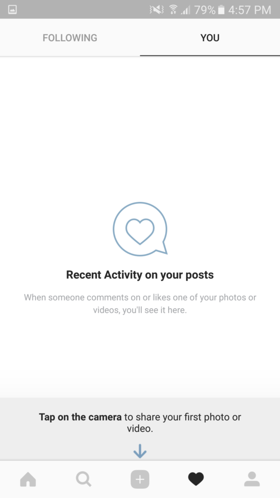
Empty states, once relegated to the realm of afterthoughts in the realm of UX design, have undergone a reevaluation.
Now recognised as critical touchpoints within the user journey, these seemingly blank spaces hold immense power to shape user perception and behaviour.
Scientific research across various disciplines informs our understanding of how empty states can influence us.
Studies in Gestalt psychology demonstrate our inherent desire for closure, a principle that empty states can violate when devoid of context. (1)
Behavioural psychology, through the work of BJ Fogg, highlights the power of positive reinforcement in shaping user behaviour. (2)
Well-designed empty states can leverage this by offering encouraging messages or celebrating completed tasks, intrinsically motivating users to continue interacting with the product.
Furthermore, research on first impressions underscores their lasting impact, making a well-designed first-use empty state crucial for establishing a positive brand association. (3)
Effective empty states should function as communicative tools aligned with user expectations.
Well-designed empty states can foster positive emotions, provide valuable guidance, and ultimately enhance user satisfaction.
Conversely, poorly designed empty states can trigger confusion, frustration, and disengagement.
By understanding these well-established psychological principles, UX designers can craft empty states that go beyond simply conveying the absence of content.
The Psychology Behind the Absence: Why Empty States Matter
The human brain exhibits a well-documented propensity for closure and meaning-seeking.
Studies conducted by proponents of Gestalt psychology demonstrate the principle of closure, where incomplete information triggers a desire for resolution. (1)
In the context of UX design, empty states lacking context can leave users feeling disoriented and unsatisfied.
For instance, presenting a blank screen after a user completes a task can lead to uncertainty regarding the action’s success or subsequent steps. By incorporating clear explanations and the next steps, empty states can fulfil this need for closure, guiding users forward without confusion.
Furthermore, behavioural psychology emphasises the power of positive reinforcement in shaping behaviour.
Research by BJ Fogg, a renowned behavioural scientist at Stanford University, shows that positive reinforcement, such as rewards or encouraging messages, triggers dopamine release, a neurotransmitter associated with motivation and pleasure. (2)
Empty states that celebrate completed tasks or offer words of encouragement can leverage this principle, motivating users to continue interacting with the product.
Additionally, first impressions are paramount in the digital world, and empty states are no exception.
A well-designed empty state on first use can establish a positive brand association, leaving a lasting impression that sets the tone for future interactions.
For instance, an app like Dropbox might utilise a friendly illustration alongside a clear call to action like “Upload your first file” on its first-use empty state.
This welcoming and informative design can establish a positive brand perception and encourage users to explore the app’s functionalities.
A Framework for Success
There are four primary types of empty states:
First Use
These appear when users first launch an app or encounter a new feature. Consider the user’s initial expectations and provide a clear introduction to the functionality, adhering to Jakob Nielsen’s ten heuristics for user interface design (4).
For instance, a first-use empty state for a note-taking app might showcase a sample note and a prominent button labelled “Create your first note.” This aligns with Nielsen’s heuristic of visibility of system status, keeping users informed about the app’s capabilities and how to get started.
User Cleared
These appear when users have completed a task or deleted content. Acknowledge their accomplishment and offer suggestions for further engagement, promoting continued use of the product. This acknowledges the user’s action and encourages them to continue using the app’s note-taking functionality.
No Data/Results
These appear when a search yields no results or when a user has no content. Provide helpful guidance to refine searches or initiate content creation, helping users achieve their goals within the application.
For instance, an e-commerce app with an empty search result page could offer suggestions for alternative keywords based on the user’s search history or display popular categories to browse. This aligns with the Gestalt principle of closure, psychologically supporting users in finding what they’re looking for even if their initial search yielded no exact matches.
Error
These appear when something goes wrong. Offer clear explanations, troubleshooting steps, and alternative actions to minimize frustration, following best practices for error handling. (5)
For example, an error message due to a lost internet connection should provide clear instructions on how to refresh the page or retry the action. Additionally, it could offer alternative functionalities within the app that don’t require an internet connection.
This approach ensures a smooth user experience even when technical issues arise.

Understanding the type of empty state allows you to tailor the content and message for a more relevant and user-centric experience.
Communicate with Clarity and Concision
Empty states should be free of jargon and technical terms. Leverage the power of clear, simple language that explains the situation and guides users on the next steps, adhering to best practices for UX writing. This aligns with Nielsen’s heuristic of the match between the system and the real world, ensuring users understand the information presented and can easily navigate the application.
Embrace Visual Storytelling
A compelling illustration or animation can elevate an empty state. However, visuals should be relevant to the context and avoid being overly decorative or distracting, as suggested by the Gestalt principles for visual design.
For instance, an empty state for a music streaming app might display a charming illustration of headphones without music notes. This visually communicates the absence of music while remaining relevant and aesthetically pleasing.
Offer a Call to Action
Empty states are an opportunity to nudge users towards desired actions. This could be a button to add content, initiate a search, start a new task, or explore other features. The call to action should be clear, visually prominent, and actionable.
Maintain Brand Consistency
Empty states should reflect the overall brand voice and tone. Use consistent typography, colour palettes, and visual language to ensure a seamless user experience.
Consider Humor (Sparingly)
A touch of humour can lighten the mood and make empty states more engaging, especially for first-use scenarios. However, avoid humour that might be offensive or culturally insensitive.
Empty states can play a significant role in fostering user motivation and engagement.
Positive reinforcement strategies and clear calls to action can encourage users to continue interacting with the product and exploring its functionalities.
Ultimately, investing in the design of empty states is an investment in the overall user experience.
From the very first interaction, well-designed empty states can set the tone for a smooth, satisfying, and ultimately successful user journey.
Thanks for being here!
I hope you found it useful!
This space thrives because of YOU. ❤️
If the resources I share help you grow in your career, a small contribution from you could keep this community strong.
Together, we’re building a space to learn, grow, and support each other on this design journey.
Every bit helps, and by supporting me, you’re directly helping keep this space alive and growing.
Or simply scan this QR code ⬇️

Your support means a lot!
You might also like:
Share this article:


