“To err is human; to forgive, design.”
Destructive actions – those that delete data, erase progress, or have other irreversible consequences – require special care in design.
When a user clicks a button that could cause data loss or a major change, the UX must prevent accidents and ensure intent.
Two key principles come into play here: introducing friction for safety and clear differentiation of destructive options from regular actions. ⬇️
First, it may sound counterintuitive to add friction, but for destructive actions a bit of resistance is desirable.
“Rather than reducing friction and making it easy, destructive actions should introduce friction to make the user pause before continuing”
In practice, this means requiring an extra confirmation or step when a destructive button is pressed.
For example, if the user hits “Delete Account,” you shouldn’t immediately obliterate the account.
Instead, you might open a confirmation dialogue: “Are you sure you want to delete your account? This action cannot be undone.” with options to confirm or cancel.
This extra step gives users a moment to reconsider and ensures that an accidental click isn’t fatal.
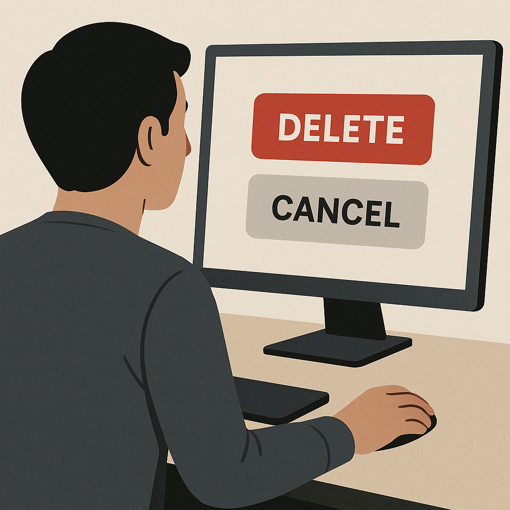
Visual differentiation
Destructive action buttons should look dangerous – typically by using the colour red or another warning colour and possibly an icon like a trash can or warning symbol.
Red, in many cultures, is associated with stop, danger, or caution, and studies show it captures attention quickly.
By colouring a delete or destructive button red, you alert users that this is not a routine action.
Just as importantly, reserve the red styling only for destructive actions.
If your primary “Submit” or “Send” actions are also red, you’ve diluted the warning effect and could even cause alarm for normal actions.
Many design systems recommend a distinct “danger” style for such buttons (often red background for a primary destructive action or red text for a less-emphasized destructive link).
For instance, Apple’s Human Interface Guidelines and Google’s Material Design both use red for destructive choices in dialogues.
Consider the scenario of deleting a project in a collaboration app.
Balsamiq mentioned that in their app, deleting a project is a big deal, so they “make users take the extra step of typing the word DELETE to ensure they really want to delete”.
This is a great example of adding deliberate friction: requiring the user to type a confirmation (or sometimes to hold down a button for a few seconds, in other designs) to perform an irreversible action.
Typing a specific word is a strong confirmation because it’s unlikely to happen by accident or muscle memory.
It forces a moment of conscious decision… (“Do I really want to do this?”).
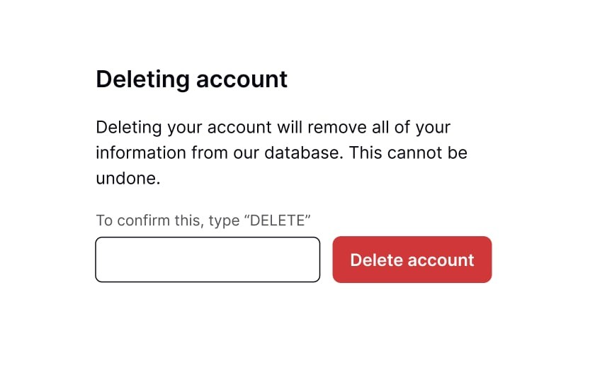
Similarly, the screenshot above, from Uxcel (affiliate link) illustrates this concept well.
The account can only be deleted once the user types “delete”.
It’s serious. It can’t be undone. So the interaction reflects that.
Now, not every destructive action needs such extreme measures; it depends on the severity.
For deleting a single email or removing a minor item, a simpler “Confirm delete?” prompt might suffice.
But for account deletion, large data wipes, or sending an irrevocable message, stronger confirmation patterns (typing a phrase, entering your password again, etc.) can be warranted.
Another important factor to consider when designing destructive buttons is where we place them.
We need to separate the destructive button from primary actions.
For instance, in a settings page, a “Delete Account” button might be isolated at the bottom or in its own section, not placed next to the “Save Changes” button for editing profile info.
This spatial separation further reduces the chance of clicking it inadvertently.
If the destructive action is one of several dialogue options (say “Yes, delete” vs. “Cancel”), some design systems (like Android) place the destructive choice on the right, away from the natural flow of the primary action on the left – again to make sure a user doesn’t click it out of habit.
However, platform conventions differ (on iOS, the destructive action in action sheets is usually highlighted in red and often listed last).
It’s also worth noting the language for destructive actions: make sure the consequence is clear in the label itself.
“Delete Account” is clearer than just “Delete” if multiple things could be deleted. (I talked about how to design effective button labels in the article here.)
Using explicit wording like “Remove from Library” vs “Delete” (when the latter might imply permanent deletion from disk) as mentioned earlier, helps users pick the right option and understand the impact.
Designing for destructive actions ties closely to Nielsen’s heuristic of error prevention and user control.
👉Error prevention can be achieved by confirmations and by smart defaults (e.g., not auto-selecting a dangerous option).
👉While user control and freedom is addressed by giving users a chance to back out (confirm dialogues) or recover options (undo, which I’ll cover next).
“Users often choose system functions by mistake and will need a clearly marked ‘emergency exit’”
In the context of destructive actions, that emergency exit is typically the Cancel button on a confirm dialogue or an Undo afterward.
A good example of combining these practices is the design of the “Trash” in many operating systems and apps.
Deleting a file doesn’t immediately destroy it; it moves to a Trash or Recycle Bin, which is a sort of soft-confirmation – the user can later confirm permanent deletion or undo it by retrieving the file.
While not a button per se, it’s a design pattern acknowledging that destructive acts should usually have a buffer.
Another everyday example: when you attempt to delete a repository on GitHub, the interface requires you to type the repository name to confirm.
This ensures you seriously mean it and recognizes the irreversibility.
The confirm button remains disabled until you type the correct name.
All of this ritual is to avoid a catastrophe from a stray click.
So, to summarise, here are some best practices for destructive buttons:
1️⃣ Use Warning Visuals
Colour them differently (commonly red) and perhaps include warning icons.
2️⃣Ask for Confirmation
A second step, like a modal asking “Are you sure?” with clear options.
Design this confirmation dialogue to be unambiguous – the action button within it should reiterate the action (e.g., “Yes, delete my account” in red).
3️⃣Require Extra Steps for Highly Critical Actions
Such as typing a confirmation word, re-entering a password, or long-press to confirm.
4️⃣Place and Group Thoughtfully
Don’t put destructive controls where they can be clicked accidentally instead of a safe action. Group them separately or isolate them.
5️⃣Wording
Be explicit about what will happen (and perhaps what will be lost) to prevent any misunderstanding.
And for those times when mistakes still happen, the following section on undo and recovery becomes the final safety net. ⬇️
Undo and Recovery Options: Designing for Error Forgiveness
No matter how well we design our buttons and confirmations, human errors are inevitable.
That’s where undo and recovery mechanisms come in.
A hallmark of a forgiving interface is that it allows users to easily reverse their mistakes or unexpected outcomes.
In fact, offering an “undo” or similar fallback drastically reduces the fear users have when taking actions, thereby improving their confidence and overall user experience.
👉Jakob Nielsen’s list of usability heuristics explicitly highlights “User control and freedom” – users should be able to escape from errors or unwanted states without severe consequences.
In practice, this often means providing a clearly marked way to undo actions or at least to stop a process before it completes.
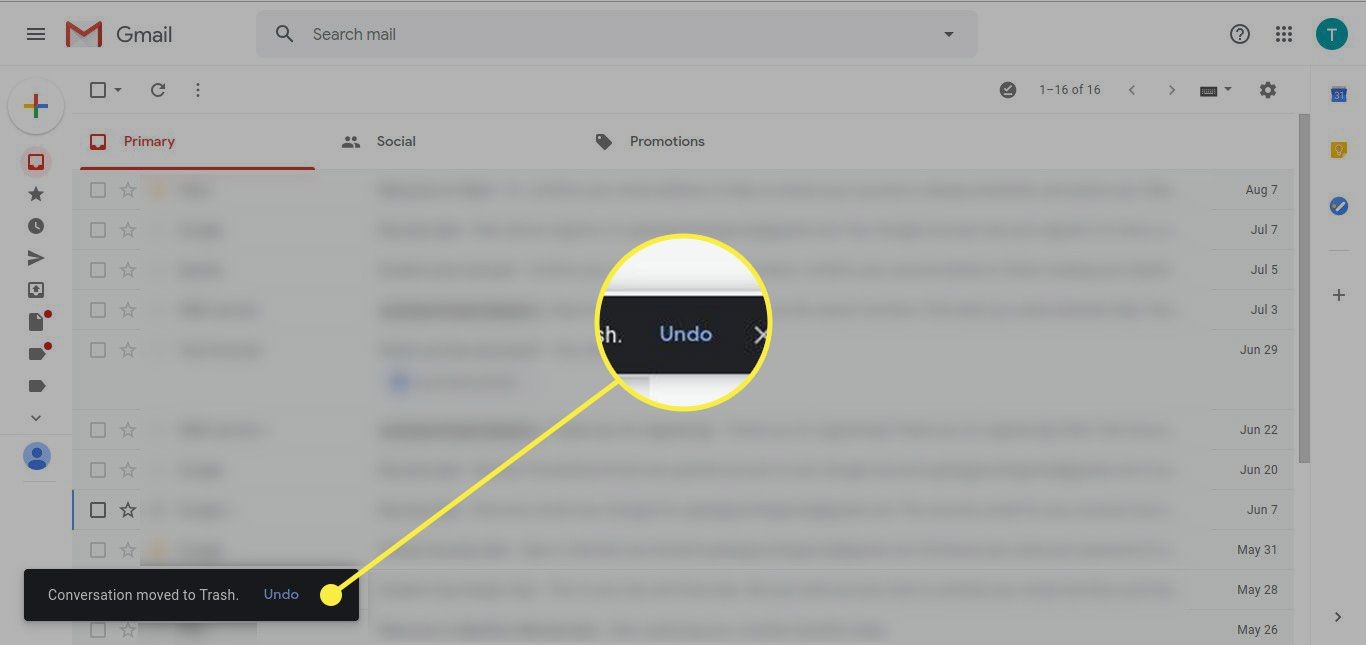
Modern interfaces have embraced this: from Gmail’s “Undo Send” feature to Photoshop’s multiple undo levels, the ability to step back is seen as fundamental.
So, why is undo so powerful?
Psychologically, it gives users a safety net.
👉Knowing that an action isn’t final lets users explore and use the system more freely, which is especially important in creative software and complex tools.
But even in simple contexts like filling a form, an undo or cancel option can alleviate the stress of making a wrong choice.
One UX practitioner noted,
“Undo increases the user’s feeling of being in control. They feel more confident to use your application when they know they can undo mistakes.”
This was said in the context of Gmail’s undo send – users might click Send more readily, with less second-guessing, because they know they have a brief window to change their mind anyway.
Implementing undo can vary in complexity:
1️⃣ Simple Undo for Deletes
The easiest case is after a user deletes something, don’t actually purge it permanently right away.
Instead, provide an “Undo Delete” prompt.
Many apps do this via a transient notification or “snackbar” (e.g., Android’s Material Design snackbars: “Item deleted – UNDO” on the bottom of the screen for a few seconds).
If the user clicks “UNDO,” the item is restored; if not, the deletion proceeds.
This approach is common in email clients (archive or delete an email, then undo) and other list management UIs.
It’s relatively easy to implement since you just delay the final step.
2️⃣ Multi-step Undo/History
In more complex software, a stack of undo (like Ctrl+Z multiple times) is provided.
This is expected in things like document editors, graphic design tools, etc.
For web apps, a full multi-level undo might be overkill, but consider at least a single-level undo for key actions.
3️⃣Cancellation of in-progress actions
Sometimes “undo” is more about stopping something.
For example, if a user initiates a file upload or a data fetch they regret, providing a “Cancel” button or an “x” progress cancel can serve a similar purpose.
It’s not exactly undoing a done action, but preventing completion.
4️⃣Revert settings
In settings dialogues, some interfaces have “Restore defaults” or “Undo changes” if the user hasn’t applied them yet.
If settings are immediately applied, having a quick way to revert to the last configuration or default is user-friendly.
5️⃣ Trash/Recycle Bin patterns
As mentioned, moving items to a trash bin that can be recovered later is a form of delayed commitment deletion which effectively gives the user time to undo (by retrieving from trash).
It’s a longer-term undo, not just immediate.
6️⃣ Versioning
In contexts like wiki pages or docs, version history is an undo of sorts, allowing rollback to previous states.
That’s more advanced and context-specific.
From the user’s perspective, what matters is the knowledge that errors aren’t fatal.
This ties into reducing anxiety.
A user who accidentally hits the wrong button but then sees an “Undo” option experiences relief and regains trust in the system.
Without that, the same user might panic and get frustrated (“Oh no, I just lost all that text!”).
It’s instructive to look at Gmail’s “Undo Send” as a case study.
For years, email was an anxiety-prone action: once you hit send, that’s it, the email is out in the world.
Gmail introduced an optional Labs feature to delay sending by a few seconds, effectively creating an undo window.
This became so popular that Google made it a standard feature.
The UX benefit was huge: users could now correct that last-minute “oops I forgot the attachment” or retract a misdirected message.
The presence of “Undo Send” likely changed user behaviour; as one UX writer put it, it “eases the classic email anxiety” and might even encourage more use because users feel safer.
Of course, it has limits (short time window), but it’s a perfect example of trading a tiny delay in execution for vastly improved user peace of mind.
👉One important thing to remember is that users should seldom be in a position where a single mistaken click irrevocably ruins their work or data.
That being said, if implementing an undo functionality, make sure to communicate it clearly.
If an undo is available, make the option obvious (the user shouldn’t have to hunt through menus to find “undo” after a major action).
A toast message like “Your post has been published” might include an “Undo” link if you support retracting it immediately, for instance.
Also, confirm when an undo has been applied (“Post reverted to draft”).
This is part of feedback, users need confirmation that their corrective action worked.
But sometimes, not everything can be undone.
In such cases, be upfront.
For example, maybe you allow undo of a delete, but if the user closes the app or after 24 hours, it’s permanent.
That’s okay, but it might be worth mentioning in the documentation or UI (“Items can be restored from Trash within 30 days”).
If an undo isn’t feasible (like sending a message to an external system or financial transactions), then double down on confirmations and clarity.
Always design with the assumption that mistakes will happen because they will.
This is called Forgiving Design.
👉A forgiving design prevents mistakes before they happen, and if they do occur, it helps the user to minimise damage.
Catch them either before they happen (confirm dialogues as discussed for destructive actions) or after they happen (through undo, edit, or recovery options).
By doing so, you adhere to robust UX principles and human cognitive realities as we all slip up, but a well-designed system is forgiving, not punishing.
As a result, users feel more control and freedom in the interface, knowing that even if they slip, the system offers a handrail to grab onto and get back on track.
Buttons are the linchpin of interaction in digital interfaces …seemingly simple, yet their design requires a thoughtful blend of visual design, psychology, and usability engineering.
For experienced UX/UI professionals, many of the principles I covered in this series may feel like second nature, yet it’s remarkable how often we still encounter UIs that violate them.
Buttons that blend in as plain text, overly clever labels that confuse, or critical actions without a safety net….
The difference between a mediocre interface and an excellent one often lies in these details.
So, create buttons that are not only usable but a joy to use: buttons that “just work” as the user expects, that guide without constraining, and that forgive the user when things go wrong.
It requires empathy for the user’s perspective, an understanding of human cognition and behaviour, and a command of visual and interaction design techniques.
When you’ve done a good job, buttons become quiet facilitators of action.
And when users can do that, they succeed and so do our products.
Thoughts on this post? 💭 Join the conversation by commenting!
This space thrives because of YOU. ❤️
If the resources I share help you grow, a small contribution from you could keep this community strong.
Every bit helps, and by supporting me, you’re directly helping keep this space alive and growing.❤️⬇️

Or simply scan this QR code ⬇️

Your support means a lot!
You might also like:
Sources:
- Quote-Andrew Dillon (1992)
- Designing for action: Best practices for effective buttons by Balsamiq
- How to Design Destructive Actions That Prevent Data Loss by UX Movement
- Gmail’s Undo send and other UX design patterns for reversing actions/transactions
- Google Gives Gmail Users the Ability to ‘Undo Send’ by The Wall Street Journal
- An underrated UX: Gmail’s undo send by UX Collective
- Design Principles: Forgiveness by Research Collective
Share this article: