How clearly should a product speak when asking a user to let something go?
If a single click can erase hours of effort, what does ethical interface design demand in that moment?
Should the system echo the seriousness of the action or leave the user navigating a void of uncertainty?
It’s a moment of hesitation where every word, label, and layout choice either supports their understanding or causes hesitation.
And hesitation sets in when direction is missing from the very moment users need it most.
We talk about destructive actions like they’re inherently risky.
But the real risk isn’t the action. It’s how we confirm it.
Read on Medium➡️
So, how much ambiguity is acceptable when you’re about to delete something permanently?
Often, we rely too heavily on minimalism and generic structures without questioning what users actually need in such moments.
The result is a systemic issue: vague, overly generic, or structurally ambiguous confirmation dialogs that force users to second-guess themselves.
This isn’t friction designed to protect the user (as it should be), it’s friction caused by a missed consideration.
Instead of guiding, it distracts. And in that ambiguity, users lose confidence.
For the past two weeks, our focus has been on success states — those reassuring moments that confirm an action went as planned.
Today, we turn our attention to their counterpart: destructive confirmations.
What happens when the stakes are higher, the consequences permanent, and the interface must not just respond, but pause and guide the user?
It’s a question of whether the system builds confidence or leaves users to stumble in silence.
📌 What’s Inside
- The importance of good copy
- The anatomy of a destructive modal
- The cancel button dilemma
🧭 The importance of good copy
Before layout and interaction come into play, it’s the words that guide the user.
According to Nielsen Norman Group (2023):
“Users often read only the headline of a dialog box before acting. If the headline doesn’t clearly communicate the consequences of the action, users may make mistakes or hesitate unnecessarily.”
Hesitation is risky.
When users don’t understand what they’re doing, their confidence drops, and mistakes follow.
That’s why our copy must be undeniably clear, guiding users from the very first word.
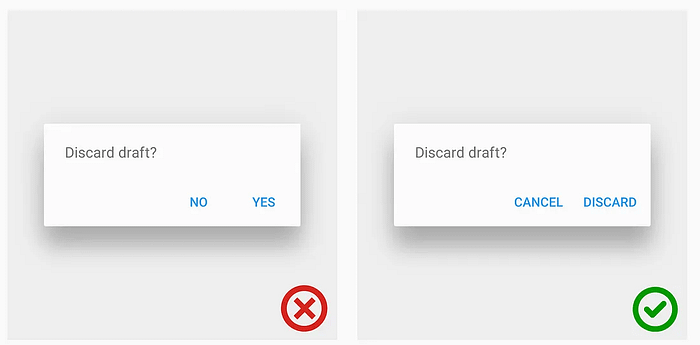
Take Google Drive, for instance:
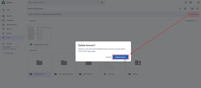
The modal says: “Delete forever? All items in the trash will be deleted forever and you won’t be able to restore them.”
It skips the soft language, gets straight to the point, and names both the action and its consequence.
The use of “forever” appears twice . Arguably redundant, but emotionally intentional. It anchors the moment as irreversible.
It also reinforces that deletion is not abstract.
There’s no soft metaphor of a bin or archive. The consequence is irreversible loss, and the user is told so clearly.
This kind of copy can be powerful in the right context.
When the user is about to take an irreversible step, clarity earns their trust. Now contrast that with the fallback line many of us reach for under time pressure or inherited patterns:
“Are you sure you want to proceed?”
Sorry…Proceed with what, exactly?
That single word — “proceed” — carries no state, no context, and no consequence.
It shifts the responsibility of recall back onto the user, who may have already clicked three steps prior.
And in high-impact interactions, that gap is unforgiving.
As Nielsen Norman Group’s 2023 study found, users often decide based on the dialog title alone. When that title fails to name the action and outcome, hesitation spikes, and errors increase.
The confirmation modal should never leave a user wondering what they’re confirming.
It should affirm what’s about to happen, and why it matters.
Not with drama, but with directness.
So, if you’re going to use the “Are you sure…” message, make sure to pair it with a clear statement of what the action will do.
Figma does this well:
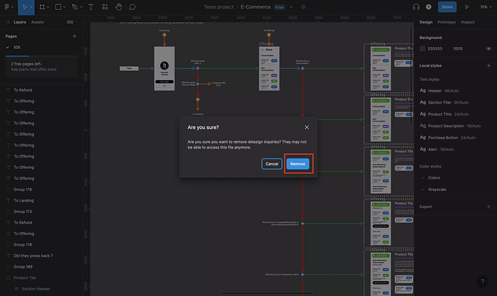
It doesn’t just ask if the user is sure. It specifies the action and outlines the consequence.
Some products speak clearly.
Some retreat behind a generic prompt.
When a modal affirms what the user already suspects (“yes, this is the right message, here’s what will happen”), it validates their intention.
It comforts, reassures and closes the loop.
But when the system stays silent or vague, it hands that uncertainty back to the user.
And in high-impact interactions, that handoff is a liability.
🔍 The anatomy of a destructive modal
Each component of a destructive modal is a response to how users think and behave in moments of risk.
Behavioural economics teaches us that users are highly influenced by factors like loss aversion, ambiguity aversion, and default bias, especially when facing irreversible actions.
When a user hesitates before deletion, it’s thus not just a cognitive pause but an emotional checkpoint too.
That pause needs directness, precision and closure.
The headline, for instance, should answer the user’s silent question: ‘Am I really deleting the right thing?’
A title like “Delete document ‘Q3 Sales Report’?” confirms that yes, this is the action and the object.
It brings cognitive alignment.
The description reinforces that alignment.
Instead of abstract warnings, such as “This cannot be undone”, a more helpful message might be, “This will remove all tasks assigned to this project.”
That concreteness anchors the user’s decision in context.
Even the buttons serve as behavioural cues.
When the affirmative button reads “Delete” instead of “OK”, it reaffirms intent.
And when the cancel option is present, secondary, but visible, it tells the user: there is still an out.
All of these components function as cognitive bridges between system logic and user reasoning:
📢Headline
This is the first and often only piece of text that gets read.
It should contain a clear verb and the object of the action.
For example: “Delete document ‘Q3 Sales Report’?” is far better than “Are you sure?” because it reinforces the action and what’s affected.
📝Description
This line clarifies what deletion entails.
Rather than warning that the action is “irreversible”, it should describe what will be lost exactly.
For instance: “This will remove all tasks assigned to this project.”
Notion’s dialog offers a strong reference:
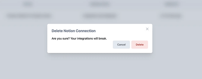
The modal reads: “Are you sure? Your integrations will break.”
It’s succinct but effective.
It doesn’t over-explain or minimise the consequence.
Through stating exactly what will happen (broken integrations), it meets the user’s mental model at the moment of risk.
It contains direct context and consequence, it’s factual, and it respects the user’s intent without patronising them.
✅Buttons
Button labels must match the action: “Delete”, “Remove”, “Archive” etc.
Avoid ambiguous affirmations like “OK” or “Yes/No” that don’t reflect what the user is agreeing to or rejecting, exactly.
↔️The cancel button dilemma
The cancel option should be present, distinct, but visually secondary.
Now, in terms of placement, standard patterns position the primary action on the right, cancel on the left.
This mirrors longstanding OS-level conventions across macOS, Windows, and GNOME, designed for predictability and muscle memory.
But real-world user behaviour complicates this convention.
So, let’s look at this from another angle:
When users click habitually, driven more by motor memory than conscious decision-making, the rightmost button becomes a risk vector in high-impact moments.
And since items placed on the right often indicate continuation, some design teams invert this placement intentionally, to reduce unwanted clicks.
The rationale is rooted in behavioural design: studies on choice architecture, like Thaler and Sunstein’s work on nudge theory, show that interface layout can serve as a behavioural intervention.
When the cancel button is placed on the right, it introduces a moment of interruption, forcing the user to reprocess the action instead of reflexively confirming it.
This is not theoretical.
In a 2019 internal A/B test by a major cloud storage provider (not publicly named), moving the destructive action to the left led to a 17% drop in accidental deletions, while task completion remained stable.
It was a subtle UI change with measurable impact.
But many companies still retain the conventional layout.
Why? Because consistency within a shared ecosystem supports learnability.
In environments where users expect predictability across applications, disruption, even if beneficial in theory, can backfire.
As UX researcher Susan Weinschenk notes,
“Users rely on patterns not because they are optimal, but because they reduce decision fatigue.”
Disrupting such patterns needs to be weighed against cognitive cost.
SO, there is no universal rule.
There are only contextual decisions informed by user experience, risk tolerance, and behavioural goals.
Thus, the question becomes:
How experienced are our users? How fast do they typically move through modals? Is this a point in the flow where friction protects or frustrates?
The answers (not the conventions) should drive the placement strategy.
We don’t have to prevent every possible error.
But we do need to ensure users feel certain in the choices they make, especially when those choices cannot be reversed.
There’s a difference between asking a question and providing reassurance.
And in moments that involve destruction, data loss, or loss of access, it’s not enough to prompt.
The system must contextualise the decision.
It must provide information that reinforces (not just permits) user action.
When something is about to be lost, the interface should not posture as neutral.
Precision here is not only helpful, but it’s also a responsibility embedded in design integrity.
It allows the user to proceed with purpose. That’s the obligation of design under its most critical conditions.
So, the same question lingers:
when certainty matters most, do our designs provide it, or bypass it?
Because every destructive modal reflects whether we, as product makers, are willing to meet users where their hesitation lives.
Until we are, the question remains:
Are we helping users understand what’s next, or asking them to shoulder the risk alone?
Subscribe on Substack⬇️
If you’ve found this content valuable, here’s how you can show your support.⬇️❤️

You might also like:
📚 Sources & Further Reading
- Nielsen Norman Group — Confirmation Dialogs Can Prevent User Errors (If Not Overused)
- Baymard Institute — Desktop UX Trends: 10 Common Pitfalls & Best Practices
- Journal of Eye Movement Research — Eye Tracking Scanpath Analysis Techniques on Web Pages
- Nielsen Norman Group — Modal & Nonmodal Dialogs: When (& When Not) to Use Them
- Baymard Institute — Mobile UX Trends 2024
- Journal of Eye Movement Research — Visual Scan Patterns in Tower Control: Foundations for an Instructor Support Tool
📚Image sources/credits:
Share this article: