What does your hero section communicate before a single word is consciously read?
In less than 50 milliseconds (quicker than a blink) people are already deciding if what they see feels relevant, trustworthy, and worth their time.
This is supported by decades of usability research: Nielsen Norman Group’s F‑pattern and Gutenberg Diagram studies show that the hero area is almost always the first and primary fixation zone.
That first glance shapes everything that follows: it sets the mood, tells people what you’re about, and hints at what they can expect next.
If what they see and what they expect don’t match up, they’ll feel an immediate disconnect, often registering it in a split‑second as “not for me” or “can’t trust this.”
This is rarely recoverable because users, having made an initial negative categorisation, will scan less, click less, and exit faster.
The implication for UX is blunt: design your hero as if it’s the only chance you’ll get, because for most users, it is.
📌 What’s Inside
- Promise defined instantly
- Emotion as context
- Immediate credibility
- Stock clichés=deal‑breaker
- Invitation to scroll
🎯Promise defined instantly
The hero must answer the implicit user question “Why am I here?” in under two seconds.
Eye‑tracking studies show that the first fixation falls overwhelmingly on the headline and adjacent top‑centre area, and the decision to stay or bounce follows almost immediately.
That means your heading, sub‑heading, and primary CTA form the core strategic levers that determine whether the page earns continued attention or loses the visitor entirely.
Each one should be clear, to the point, and visually emphasised.
If your hero is cluttered with multiple focal points you’re making it harder for people to understand your message and more likely that they’ll miss it altogether.
Evidence from controlled A/B tests confirms that simplified hero designs with disciplined hierarchy consistently outperform visually dense or overly elaborate alternatives, both in comprehension scores and in conversion metrics.
🎭 Emotion as context
Emotions shape perception.
Emotional priming in early page exposure influences how subsequent information is processed and remembered.
So, think of your visuals as setting the mood and context, not just filling space.
A strong hero image should show the state you want your users to imagine for themselves, whether that’s calm focus, joyful productivity, mastery, or whatever else it might be for the given context.
It taps into their memory and emotions, making your core message stick.
Even slight mismatches between expected and perceived tone can trigger a drop in attention, reduce perceived brand coherence, and undermine message retention.
Users often cannot articulate why they lose interest, yet physiological and behavioural indicators, such as shorter fixation durations and reduced click‑through rates reveal measurable disengagement.
Getting the emotional tone right means making sure your images or videos, colours, typography, and even small interactive touches all work together to reflect your value proposition and match how your audience is supposed to be feeling in that moment.
The best way to do this is to start by talking to your users.
Learn what they expect to feel when they land on your page. Then test early versions of your hero in prototypes to see if that tone comes across.
Every visual and piece of copy should reinforce the same feeling from the very first glance.
🤝 Immediate credibility
Trust is established within the same brief first‑impression window in which users also decide whether the page is relevant to their goals.
This refers to the narrow cognitive window in which a user’s brain, operating largely on intuitive, fast‑processing pathways, makes a snap judgement about whether the content and brand warrant further attention.
In practical terms, this means credibility must be embedded directly into the hero.
Eye‑tracking and decision‑heuristics research shows that visible trust markers (client logos, third‑party endorsements, security badges, user counts etc) activate peripheral recognition patterns that allow the visitor to classify the offer as “safe” without deep cognitive effort.
This aligns with dual‑process theory that we discussed last week: users default to fast, intuitive System 1 thinking unless something triggers deeper scrutiny.
Inserting these cues above the fold reduces perceived risk and increases the likelihood of progression.
In your hero, trust signals carry as much weight as your headline and main call to action.
They work together to shape a visitor’s first judgement and influence whether they feel confident enough to keep going.
🚫 Stock clichés=deal‑breaker
The imagery in your hero is often the initial visual connection between your brand and the visitor.
Users, particularly experienced or design‑literate ones, can recognise generic stock photography instantly.
When they do, the mental shortcut is immediate: template=low investment=”I’m out”.
When people keep seeing the same type of imagery they’ve seen elsewhere, it blends into the background. It feels generic, unremarkable, and it’s less likely they’ll remember you later.
On the other hand, visuals created specifically for your brand send a very different signal, that you’ve put thought and care into how you present yourself.
That kind of investment builds trust and helps your brand stick in people’s minds.
If you must use stock, don’t drop it in as‑is. Adapt it so it reads as part of your visual system, through custom composition or integration into branded layouts.
Your goal is to make the hero image feel inseparable from your brand language, so that it works in concert with your headline, copy, and CTA to reinforce the perception you want the visitor to hold from their very first glance.
🔍 Clear message upfront
Information hierarchy in a hero is a prerequisite for effective communication.
Decades of eye‑tracking research show that when the primary message is visually subordinate to secondary elements, a significant proportion of users will overlook it entirely before moving on.
This means your headline and primary call to action must dominate the visual field in both position and perceptual weight.
You get there by being intentional with your layout: give the important parts room to breathe with plenty of whitespace, make your primary CTA so visible it’s impossible to miss, and use directional cues, such as where faces are looking, arrows, or how elements line up, to guide the eye toward what matters most.

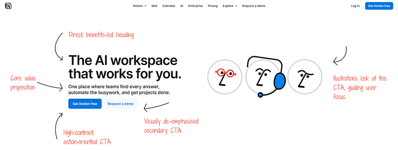
Notion gets it right.
The primary CTA stands out with high contrast and clear action language, making it the first thing your eye lands on.
The illustrations to the right appear to look toward both the headline and CTA, naturally guiding your gaze along the intended reading path, from the key message to the action they want you to take.
One more thing to consider here is that the more elements compete for the same level of visual prominence within your hero, the more you fragment user attention.
Too much decoration in this zone draws attention away from the message, makes it harder for users to recognise what matters, and can reduce conversions.
Keep visuals focused on the core message and action, removing anything that doesn’t directly reinforce them.
⬇️ Invitation to scroll
Your hero is the opening scene of your story.
It’s the first signal to visitors that they’ve landed in the right place and that what follows is worth their time.
Narrative framing research shows that when this opening feels both clear and relevant to their goals, people are far more willing to follow the rest of the journey.
Use your hero to set that journey in motion.
Each element should work in sequence: hook, frame, invite, so the visitor naturally moves forward.
The structure of your hero should also encourage scrolling.
Guide the eye down toward what comes next: the problem you’re solving, how you solve it, and why you can be trusted.
Ultimately, we need to take responsibility for the fact that we own the moment when value of our products is either recognised or dismissed in milliseconds.
The hero section is our first and most visible argument, it needs to resonate instantly, sustain interest, and build immediate trust.
If it fails in these roles, the rest of the page is irrelevant.
Ask yourself what tension your hero resolves, and whether that’s obvious at a glance.
Consider what credibility signals are visible in the first viewport.
Think about how the composition directs attention to a single, compelling action.
And ask if the emotional framing reflects the transformation your product promises.
Because a hero is ultimately the lens through which the entire page is interpreted and whether it’s seen as worthy of the user’s time.
And it’s on us to define what that looks like.
Subscribe on Substack⬇️
If you’ve found this content valuable, here’s how you can show your support.⬇️❤️

You might also like:
📚 Sources & Further Reading
- Justinmind
- Notion
- Website hero section: 6 design best practices
- F-Shaped Pattern For Reading Web Content (Original Study) by NNG
- The Gutenberg Diagram in Design by 3.7Designs
- How to Build a High-Converting Landing Page: Anatomy, Structure & Design by CXL
- 4 Ways to Use Visual Hierarchy to Improve UX and Boost Conversions by CXL
- Trustworthiness in Web Design: 4 Credibility Factors by NNG
- Attention web designers: You have 50 milliseconds to make a good first impression! by Taylor & Francis Group
Share this article: