“I just couldn’t take it anymore. ‘I put an affordance there,’ a participant would say… Affordances this, affordances that. And no data, just opinion. Yikes! What had I unleashed upon the world?”
— Don Norman, “Affordance, Conventions, and Design”
Norman was talking about the misuse of the term “affordance” in design circles.
But there’s another misuse worth examining here too: the overreliance on negative affordances:
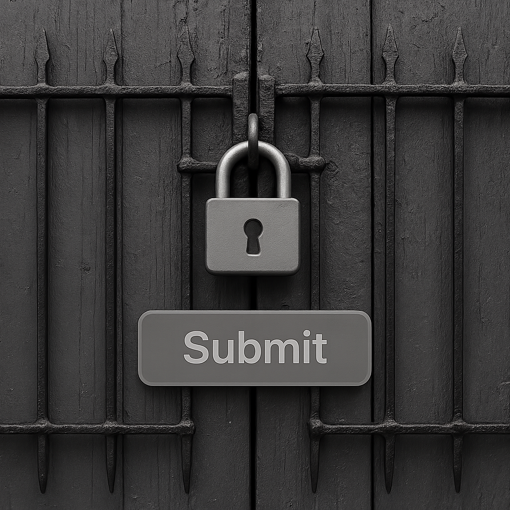
the greyed-out buttons, the locked features, basically the roadblocks we place in users’ paths, thinking we’re helping.
“[Negative affordances] are typically used to discourage specific actions, prevent errors, or show that an element cannot be acted upon at the present instance.”
In theory, they stop users from making mistakes.
They communicate unavailability.
They guide behaviour by showing what can’t be done.
But in practice? They often just confuse people.
Because when we disable buttons, grey out options, or lock features without explanation, we’re creating frustration.
We’re leaving users stranded, wondering what they missed, what they broke, or why they’re suddenly not allowed to proceed.
And the worst part is that we design it that way on purpose.
📌 What’s Inside
- What negative affordances actually are (and why we use them)
- The psychology of being stuck
- The accessibility disasters
- When disabled buttons actually work
- Better alternatives for forms
What negative affordances actually are (and why we use them) 🚫
An affordance, in Don Norman’s words, is a relationship.
“When affordances are taken advantage of, the user knows what to do just by looking: no picture, label, or instruction needed.”
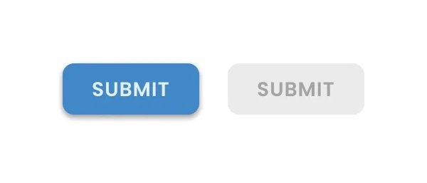
Negative affordances represent inactive design elements.
Greyed-out buttons. Auto-completed fields that can’t be edited. The unhighlighted options in a tab that you haven’t selected yet.
They signal is: “Not now. Not here. Not available.”
The intent might be even noble.
We want to prevent users from submitting incomplete forms.
We want to stop accidental double-clicks during payment processing.
We want to show that certain options aren’t available until prerequisites are met.
But intent and outcome are two very different things.
Because I can’t actually remember the last time a disabled button helped me understand what to do next…
Can you?
The psychology of being stuck 🧠
According to Nielsen Norman Group, disabled buttons often confuse users by appearing clickable but providing no response or feedback.
The problem isn’t just that they don’t work when clicked.
It’s that they don’t communicate.
They sit there, grey and silent, offering zero guidance about: what went wrong, what’s missing and how to fix it (or whether fixing it is even possible).
So, what really happens when you encounter a disabled button?
You start scanning the page, hunting for the error. Have you missed something?
The button wasn’t telling. And that’s a problem. Because it just silently caused deception.
“Don’t make the user think” is the most important usability rule.
This level of confusion can become a major friction point and creates what psychologists call “learned helplessness” — the feeling that no matter what you try, you can’t make progress.
And unfortunately, learned helplessness doesn’t lead to persistence. It leads to abandonment.
So what are we achieving here exactly?
Are we measuring how many users give up before they ever see an error message?
The accessibility disasters ⚠️
Disabled buttons create serious accessibility problems.
They typically have lower contrast ratios to visually signal their inactive state.
Which technically doesn’t break any rules:
“User interface components that are not available for user interaction (e.g., a disabled control in HTML) are not required to meet contrast requirements” (WCAG)
But it still makes them harder to see for users with visual impairments.
Keyboard users can’t tab to disabled buttons either, which breaks the expected navigation flow and causes confusion for anyone relying on keyboard navigation.
Screen readers often skip over disabled elements entirely, or worse, announce them without explaining why they’re disabled.
So we’re giving the users, who already face the most barriers in digital interfaces, even less information to work with.
When disabled buttons actually work ✅
Let’s be fair: there are scenarios where negative affordances make sense. For instance:
Preventing double-submission
This works because:
- The user intended to take the action
- The disabled state confirms the action was received
- There’s a clear cause-and-effect relationship
Showing unavailability
When a product is out of stock, making the “add to cart” button disabled when an option isn’t available is reasonable.
The user isn’t trying to figure out what they did wrong, they’re just learning the item isn’t available.
Requiring selection first
In CMS systems like Google Drive or SharePoint, the ‘Share’ or ‘Download’ buttons are disabled if the user has not selected an item.
This works because the requirement is obvious: you can’t share nothing.
The pattern works when:
- The precondition is immediately visible
- There’s no ambiguity about what needs to be done
- The disabled state makes logical sense
“Only use disabled buttons when there is a strong reason, such as to indicate unavailable actions, prevent duplicate submissions, or signal ongoing processes.”(NNG)
But notice something about all these examples?
They don’t involve forms. They don’t involve complex input validation.
They don’t leave users hunting for invisible errors.
Better alternatives for forms 🛠️
Keep buttons enabled and validate on submit.
Instead of disabling the “Continue” button until everything is perfect, keep it enabled.
When users click it, then show what’s wrong.
Link directly to the errors. Explain what needs to be fixed.
Use inline validation wisely (but don’t rely on it exclusively).
It should never be the only feedback mechanism, and it should never prevent submission.
If inline validation fails but the user still needs to proceed, maybe their address format is unusual, or they’re using a valid-but-uncommon email syntax — let them.
Then handle edge cases on the backend or through customer support.
Make sure that users can proceed even if inline validation fails.
Basically, always provide some sort of a “way out”.
If you absolutely must disable buttons for validation, include an alternative path.
A “Having trouble?” link that sends the user’s partial information to support.
Perhaps a “Skip for now” option that lets them continue without completing every field?
“Most importantly, explain to your users why the button is disabled and how to proceed”
Don’t trap users without giving them no escape route.
Disabling a button results in making the user think about how to make it active.
As architects of their experiences, we really want to avoid making people think more than they really need to.
Are we measuring abandonment before users even see error messages?
Are we tracking how long users stare at disabled buttons before giving up?
So, are we actually preventing errors, or are we preventing progress?
Subscribe on Substack⬇️
You might also like:
📚 Sources
- Don Norman, “Affordance, Conventions, and Design” (Interactions, 1999)
- Don Norman, “Affordances and Design” (JND.org, 2008)
- Nielsen Norman Group, “Button States: Communicate Interaction” (Apr 25, 2025)
- Nielsen Norman Group, Accessibility topic index; video “Why Disabled Buttons Hurt UX (and How to Fix Them)” (Aug 25, 2025)
- MDN Web Docs, “HTML attribute: disabled
- W3C WAI, “Understanding Success Criterion 1.4.11: Non‑text Contrast.”
- APA Dictionary of Psychology, “Learned helplessness.”
- Vitaly Friedman, “Usability Pitfalls of Disabled Buttons, and How To Avoid Them”
- UX Design World “Disabled Buttons UX — Usability Issues and How to Avoid Them” (image)
Share this article:


Excellent breakdown, I like it, nice article. I completely agree with the challenges you described.
Your blog is a beacon of light in the often murky waters of online content. Your thoughtful analysis and insightful commentary never fail to leave a lasting impression. Keep up the amazing work!