
Summary
AI-made UI's are often full of things nobody asked for. Extra buttons, unnecessary functionality, confusing flows and generic copy, all to make a product feel like it's complete without actually making it any easier to use. And because everything looks so convincing, we might overlook how much of it serves no real purpose. Perhaps one of our most valuable design skills now is knowing what to remove.
Why does AI keep adding things we didn't ask for?
There's something quite frustrating about AI generated interfaces.
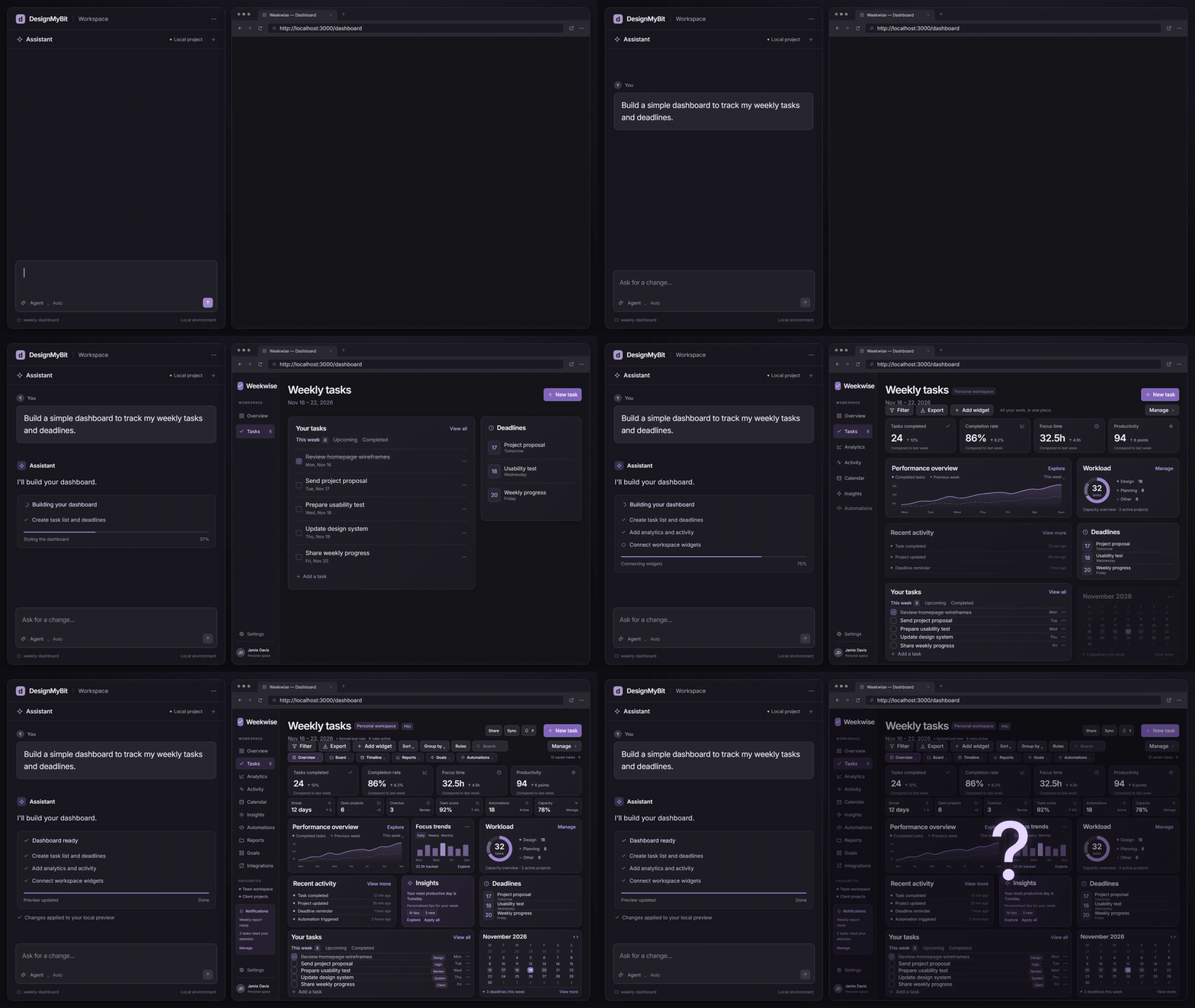
You ask for a relatively straightforward experience, and somehow end up with a dashboard full of cards, quick actions, extra navigation and features that were never part of the original brief.
It looks good.
But what exactly are all these things doing there?
To understand why this happens, we need to look at how large language models actually work.
Most AI coding assistants are built around LLMs trained on enormous amounts of text and code.
During their initial training, these models learn by predicting the next piece of text, known as a token. They make predictions, compare them with the training data and gradually adjust billions of internal parameters.
Over time, they learn relationships between words, concepts, programming languages and patterns commonly found together. This also gives them the ability to reason about problems and generate code they've never encountered before. [1]
But it gets more interesting.
When we ask AI to build a "modern dashboard", we're giving it a relatively vague description of what we want.
The model has learned that dashboards often contain statistics cards, charts, activity feeds, notifications and quick actions.
So those become plausible additions.
And because the prompt hasn't established which of those components are actually needed, the model has room to fill in the details.
There's another part of AI training worth understanding.
After initial training, many models go through additional training to follow instructions. This can involve showing them examples of good responses and using human feedback to reward outputs people consider helpful. [2]
This makes AI much better at responding to our requests.
But a response that looks helpful and complete can still include things we never intended to build.
And that's an important distinction. The model's training helps explain why familiar patterns appear in generated interfaces, although it doesn't tell us exactly why a particular model added a particular button.
Researchers have a name for one part of this problem: prompt underspecification.
It happens when our instructions leave out requirements that matter, forcing the model to make assumptions.
In research published at ACL this year, Carnegie Mellon University researchers found that LLMs correctly inferred unspecified requirements by default only in 41.1% of the cases they evaluated.
Prompts with missing requirements were twice as likely to produce regressions after changes to the prompt or model. [3]
That research covered three LLM tasks rather than interface design specifically.
Still, it helps explain something we regularly encounter when building with AI.
We might get exactly what we want from one prompt, then ask for a small change and suddenly find that other parts of the experience have changed too.
And sometimes the model applies the wrong pattern altogether.
Nielsen Norman Group demonstrated this in a 2025 evaluation of AI prototyping tools.
When asked to create a course attendee's profile page, some tools generated something resembling a social media profile, giving prominence to profile photos and personal information instead of the course content people actually needed. [4]
So, what happened there is that the model recognised the concept of a profile page, but interpreted it in the wrong context.
The same thing can happen with functionality and copy.
An AI agent can generate a button labelled "Manage", a settings section or an entire onboarding flow because those elements fit the kind of product it's building.
But if the requirements don't explain what those actions should accomplish, it may fill in the missing behaviour too.
And even if the generated code runs successfully, that tells us very little about whether the interaction makes sense to someone using the product.
There's also the question of why AI sometimes confidently fills gaps instead of asking us what we want.
A 2025 OpenAI research paper examined this in factual question answering. It found that common training and evaluation methods can reward models for guessing rather than acknowledging it is missing information. [5]
Generating an unnecessary dashboard component is different from inventing a false fact. But both highlight a problem with accepting confident output when important information is missing.
Of course, an AI agent may have access to our project files, existing components, instructions and design standards.
So what it generates depends heavily on the context we provide.
As Nielsen Norman Group explained in its article on UX context design, a model might know what a typical search interface looks like. But it needs information about our users, product and design decisions to produce something specific to our needs. [6]
And I think this is where understanding how AI works becomes particularly useful.
We can start recognising when the model is following our requirements and when it's filling in the gaps with familiar patterns.
Because a dashboard full of polished components might simply reflect what the model has learned dashboards usually contain.
Whether those components belong in our product is a separate question.
Just because a button exists, does it need to?
This is where things get particularly interesting.
AI can generate a convincing interface with buttons, menus and navigation that all look like they belong together.
But an action labelled "Manage" still needs a clear purpose. What exactly are we managing? What happens after clicking it? And does the destination have anything to do with what someone expected?
A button that opens an unrelated page creates confusion. A button that does nothing...well, is just a nightmare.
And even when everything works technically, the flow can still make very little sense.
The problem becomes harder to spot when the interface looks polished enough that we assume the underlying experience has been considered.
Earlier this year, a study involving 62 participants compared human designed interfaces with raw AI generated designs and versions refined using UX constraints.
Across the 12 interface screenshots tested, task accuracy was 63.1% for the raw AI designs, compared with 100% for the other two conditions. [7]
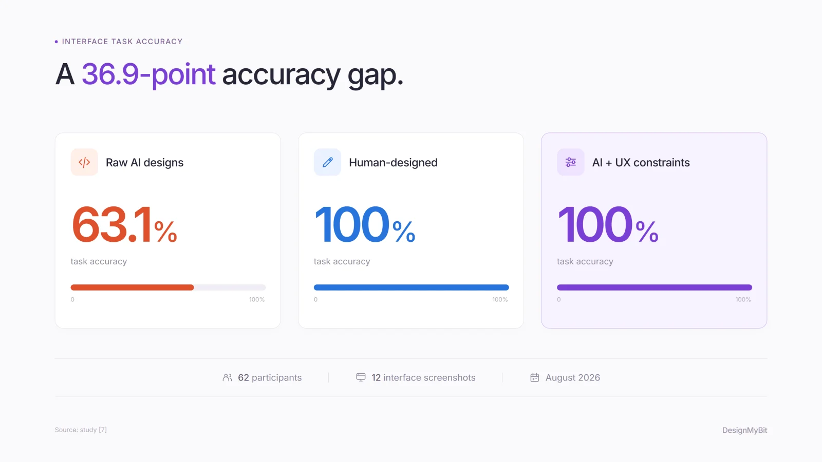
It was a relatively small study of static interfaces, rather than fully functioning products.
But still, it raises an interesting question.
How much are we judging the quality of an AI generated interface by how polished it looks?
And what about all that unnecessary content?
AI generated copy can be just as distracting.
it's everywhere: generic introductions, repeated explanations and paragraphs telling people how simple or powerful the product is...
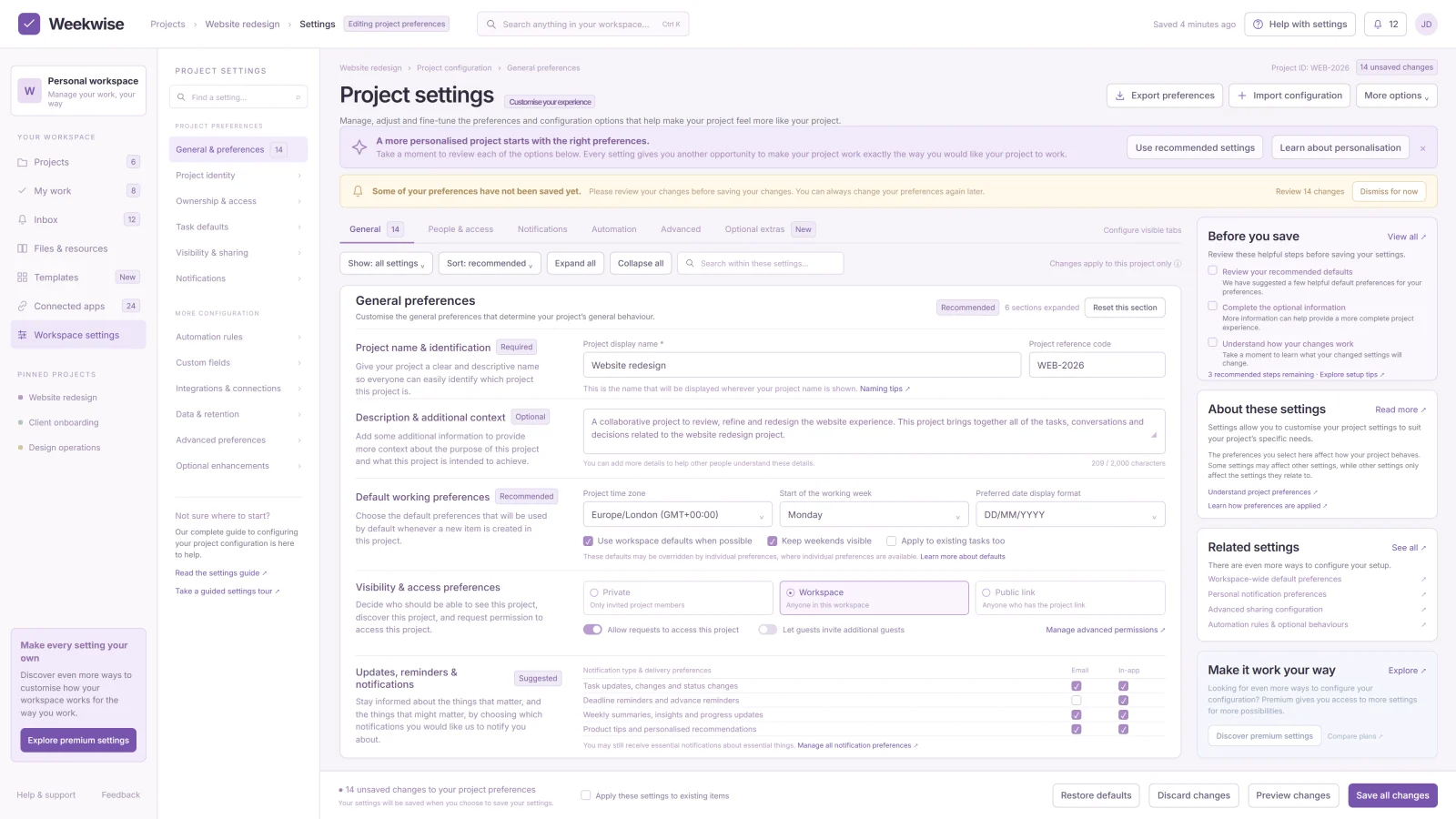
Take this mockup for example. The interface is completely unreadable.
And all that taken up space could be used for information someone actually needs.
This problem extends beyond copy.
NNG's usability guidance has long argued, and for a good reason, that unnecessary information competes with relevant content for attention. [8]
And with AI making it easier to generate entire flows, those decisions become even more important.
Are we spending enough time removing things?
I think this is where our approach to AI assisted design needs to change.
We're getting better at describing what we want AI to build.
But how often do we go through the result and actively question what needs to stay?
Does this section help someone complete a task?
Does this button have a clear and useful outcome?
Is this information necessary at this point in the flow?
And what happens if we remove it?
These are fairly basic UX questions. But they're easy to forget when we're focused on getting a generated interface to look and behave the way we expect.
Sometimes removing a section is a better improvement than redesigning it.
Sometimes an entire flow can disappear because we've realised it doesn't even need to exist.
And sometimes the AI generated copy just needs replacing with a much clearer label that tells people what they're actually doing.
Of course, removing things also requires judgement. We can make an interface too minimal and hide information people need, particularly instructions, feedback and error recovery.
So the decision should come from understanding the task and testing the experience, rather than simply trying to make the screen look cleaner.
Maybe we need to get better at saying no
There's a practical way to approach this.
Before asking AI to refine an interface, review what it has already added.
Go through the navigation, test the actions, read the copy and check whether each part serves an actual user need.
Then remove the things you can't justify and test the experience again.
That kind of review has always been part of good UX design.
But now that generating another component or an entire flow takes so little effort, it's becoming easier to keep adding without properly questioning what already exists.
And I think that's something worth watching.
Because the value of our design judgement may increasingly come from knowing when to stop building, when to simplify, and when to tell AI to delete something entirely.
If we're making interfaces easier to produce, shouldn't we be making sure they're becoming easier to use as well?


Leave a comment