Hey, welcome back!
After a comprehensive look into some of the most common UX psychology principles, today we’re kicking off a series on one of the simplest elements (or so they say) in any UI—buttons.
Now, you might think, “What’s there to discuss about buttons?”.
But trust me, there’s so much more beneath the surface.
Designing an effective button requires a wealth of UX knowledge.
How do we decide how it should look? 💭
Where should we place it? 💭
What copy should it have? 💭
How do we differentiate an action button from a destructive one? 💭
And when is having too many buttons on one screen simply an overkill? 💭
These are the fascinating questions I love to mull over when designing buttons.
If you’re someone who enjoys dissecting things, understanding why we do what we do, and discovering how to make things just perfect, you’re in for a treat.
In this series, I’ll answer all these questions in depth.
But today, let’s start with the basics.
What’s Inside:
- Consistency and Recognisability
- Establishing Visual Hierarchy (Primary vs. Secondary Actions)
- Differentiating Buttons from Links
Buttons might seem like minor UI elements, but trust me, there’s more to it than meets the eye.
Designing effective buttons requires careful thought.
Every critical action—from purchasing a product and submitting a form to navigating to the next step—relies on buttons.
Research shows that improving button design can significantly boost overall usability and even conversion rates.
There was one famous case study involving a large retailer that revamped a confusing “Register” button into a clearer “Continue” button, allowing purchases without forced registration.
The result was an annual revenue increase of $300 million!
It’s a great reminder that effective button design isn’t just about aesthetics but it’s closely linked to cognitive psychology, user trust, and business outcomes.
So, today, we’ll dive into how to maintain visual consistency in button design, establish a hierarchy of actions, and properly distinguish buttons from links.
And, of course, we’ll reflect on why these details matter.
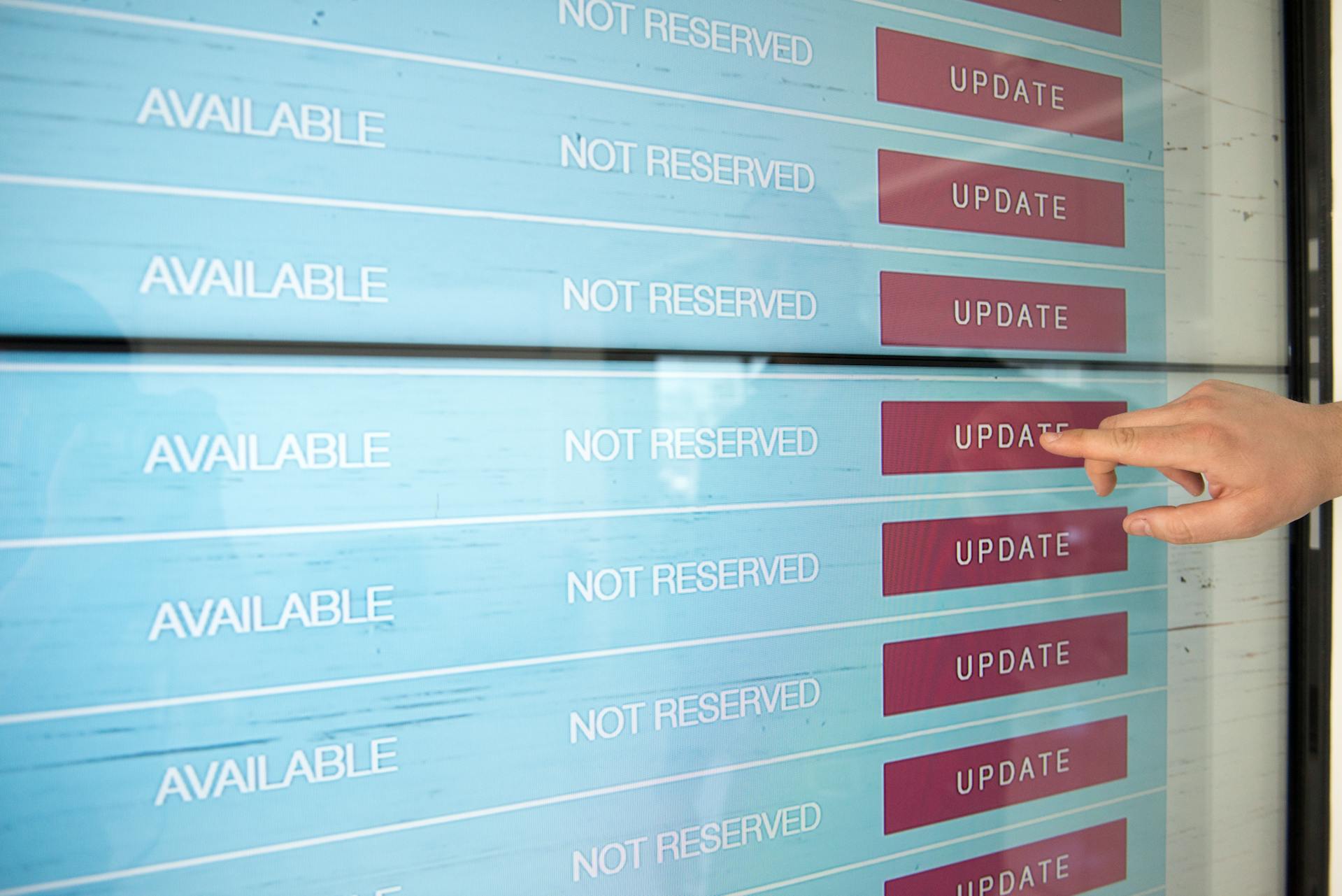
Consistency and Recognisability
Users rely on visual signifiers.
If a button doesn’t look like a button, people might simply miss it or hesitate to click.
In the current trend towards minimalist, “flat” design, many interfaces have stripped away traditional signifiers like shadows, outlines, or gradients.
But this approach doesn’t always work.
In fact, research by the Nielsen Norman Group shows that overly flat designs can suffer from “lost signifiers,” leaving users uncertain about whether something is clickable or not.
On top of that, some of the eye-tracking studies indicated that UIs with weak visual cues demand more effort from users and draw less attention than those with clear 3D-style buttons or underlined links.
So, to ensure your buttons are recognisable, make them look like buttons: ⬇️
- Use consistent styling across your product: colours, shapes, shadows, or outlines, to signal that an element is interactive.
- Avoid styling buttons as plain text or mixing them in with static content.
- As a handy rule of thumb: never treat static text and interactive text the same way visually. For example, if your primary buttons share a unique colour, make sure that colour isn’t used in the background, where it might blend in.
In terms of visual contrast, a button should stand out from its surroundings, having strong contrast in colour and brightness.
This not only signals its interactivity but also meets accessibility guidelines…
This space thrives because of YOU. ❤️
If the resources I share help you grow, a small contribution from you could keep this community strong.
Together, we’re building a space to learn, grow, and support each other.
Every bit helps, and by supporting me, you’re directly helping keep this space alive and growing.❤️⬇️

Or simply scan this QR code ⬇️

Your support means a lot!
You might also like:
Sources:
- Button Design: Best Practices for Optimal UI Buttons – Baymard Institute
- The $300 Million Button — UX Articles by Center Centre
- Don Norman’s Seven Fundamental Design Principles | UX Collective
- Flat-Design Best Practices – Nielsen Norman Group
- THE HIPPER ELEMENT – Flat UI Elements Attract Less Attention and Cause
- Designing for Action: Best Practices for Effective Buttons by Balsamiq
- Understanding Success Criterion 2.5.5: Target Size by WAI – W3C
- Links VS Buttons: A Perennial Problem • DigitalA11Y
- Better Link Labels: 4Ss for Encouraging Clicks by NNG
- Ghost Buttons — Not as Bad as We Thought? – Medium
- Image credit: Buttons vs Links UX Movement
Share this article:


