Welcome back!
Last time, we covered button consistency, hierarchy, and when to use buttons vs. links.
Today, let’s dive into button placement—what works, what doesn’t, and how cognitive load impacts user decisions. ⬇️
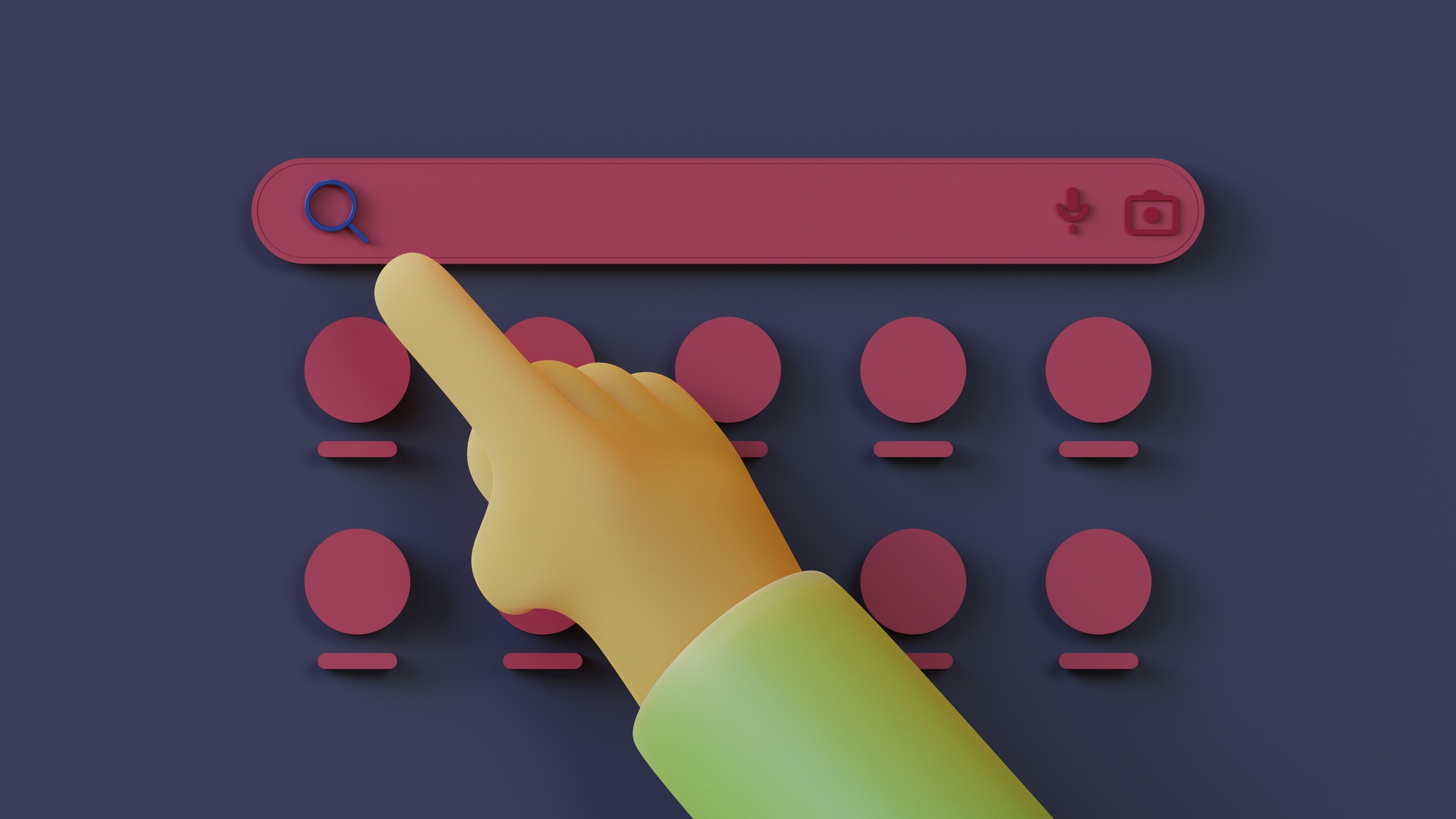
Limiting Primary Actions/Cognitive Load
When designing buttons, clarity should take priority.
While it might seem helpful to offer multiple options (“Save,” “Save As Draft,” “Save and Close,” “Cancel” all at once), too many choices can overwhelm users and slow decision-making.
In cognitive psychology, Hick’s Law quantifies this: the more choices presented, the longer it takes to decide.
Every additional button adds to the cognitive load, making interactions feel harder than they should be.
From a practical standpoint, it’s wise to limit the number of primary actions on a single screen or context.
Often, this means defining one clear primary CTA and treating other actions as secondary.
If you present two or three buttons of equal weight (say “Buy Now,” “Learn More,” and “Share”), users must pause to read each —possibly leading to confusion or indecision.
A user test observation from Baymard noted that when too many similarly styled buttons appeared together, it caused hesitation and missteps.
Users were unsure which path to take, sometimes clicking the wrong action or simply stalling.
This aligns with cognitive load theory: each extra choice or step forces the brain to work harder, increasing the chance of errors or abandonment.
👉 There are strong usability arguments for having only one primary button per screen.
Additional actions can be offered, but they should be visually de-emphasised or tucked into menus if they are not frequently used.
For example, a product page should ideally funnel the user toward “Add to Cart” as the dominant action. Other links like “Add to Wishlist” or “Compare” can be present but toned down visually.
If everything were a bold button, the user might accidentally add to the wishlist when they meant to purchase.
👉 The cognitive phenomenon here is sometimes called the paradox of choice: too many choices can lead to decision paralysis or regret.
In short, presenting a focused set of actions reduces anxiety and speeds up task completion.
After all, our working memory can only juggle so many pieces of information at once.
If a user lands on a page and sees five buttons, they have to parse each label, recall what each might do, and compare them. This overhead can be fatiguing.
“Every step the user takes adds to their cognitive load. Too many unnecessary actions will derail the user’s train of thought or irritate them.”
A practical guideline is to design each screen around a single primary objective whenever possible.
If multiple actions truly must co-exist, use visual hierarchy to imply which is recommended.
Also, consider sequencing: sometimes, you can split actions into steps or progressive disclosure.
Additionally, watch out for duplicate or redundant CTAs. If two buttons essentially lead to the same outcome, pick one. Each extra element competes for attention without adding value.
Finally, limiting primary actions ties closely to conversion optimisation.
In e-commerce, for example, it’s well known that presenting a single clear path to checkout yields better results than offering many off-ramps.
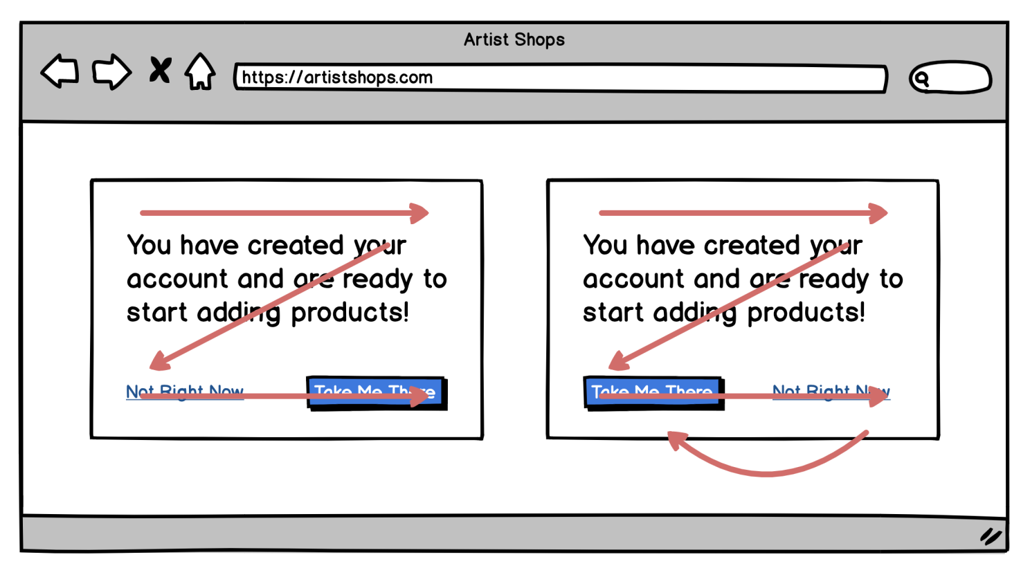
The anecdote about the $300 million button is a testament: the original design essentially had two competing actions at checkout (Login/Register vs. the implicit continue to purchase), which confused and frustrated users.
👉 Removing the extra “Register” action and focusing on “Continue to checkout” led to a 45% increase in purchases!
While that scenario was also about removing an unneeded step, it exemplifies that every additional action asked of the user should be scrutinized.
If it’s not absolutely necessary at that juncture, consider removing or relocating it.
Button Placement
Now, let’s move on to the next interesting point: button placement.
Should they go on the right, centre, or left? What about if they’re inside the forms?
What’s the best spot for usability? ⬇️
Let me start by stating the obvious: users have developed expectations for button placement from years of using software and websites.
Breaking these conventions can slow them down, while aligning with them can make their interactions easier.
Additionally, screen size and device type (desktop vs. mobile) play a big role in this too.
We must also consider accessibility – both in terms of reach (especially on touch devices) and in logical flow order.
👉 On desktop or larger screens, users often scan content in an F-shaped or Z-shaped pattern: focusing first across the top, then down the left side, and sometimes across lower parts of the page.
However, when it comes to forms or dialogues, a more linear flow is common – top to bottom, then to the action buttons.
A general convention for multi-field forms is that the primary submit button is at the bottom of the form, aligned either to the left or right of the form fields.
But which side exactly?
There has been a certain debate and even A/B tests on placing the primary action to the right vs. left in dialogues.
Nielsen Norman Group notes reasonable arguments for both: placing the primary “OK/Submit” on the left follows a left-to-right reading order (and matches platforms like Windows), enabling quicker keyboard navigation.
However, placing it on the right aligns with the idea that the dialogue “concludes” on the rightmost side (and matches macOS guidelines), and it positions the affirmative action where a “Next” button would logically be.
The key is not that one side is universally best but that the order should follow a logical narrative and be consistent within your product.
If your users are primarily accustomed to web or Mac patterns, putting the confirm on the right and cancel on the left may feel more natural; if enterprise Windows applications are the norm, the opposite might hold.
👉 It’s also worth noting that for full-page layouts (desktop) if the page is long or scrollable, it’s vital to consider where the user’s attention will be when they are ready to act.
For example, Balsamiq’s guidelines suggest that on a long page or form that spans a scroll, you should place the primary button directly after the content or form it relates to, (typically left-aligned under the final input).
This is because users reading or filling out content end up near the bottom-left at the end of their task (given left-to-right languages), so putting the button there means they don’t have to shift their focus or pointer far to act.
Eye-tracking insights confirm that users’ visual attention “funnels” toward the point of completion in a task, so aligning the CTA with that funnel would yield a smoother experience.
On small screens (mobile devices), different factors come into play: primarily thumb reach and limited screen real estate.
About 49% of people hold their phones one-handed, and 75% of users rely on their thumbs as the primary means of tapping.
This led to the concept of the “thumb zone” – the areas of the screen that are easiest to reach with the thumb.
Important controls should reside in easy-to-reach zones when possible, especially if you expect one-handed use.
This is why many mobile apps use bottom navigation bars and place key buttons towards the bottom.
👉 For mobile web pages or responsive designs, a common approach is to make primary CTAs either full-width at the bottom or at least prominent and sticky (floating) near the bottom of the viewport.
An example is a sticky “Add to Cart” bar that always sits at the bottom of a product page on mobile so the user doesn’t have to scroll back up or reach to the top to add the item.
This uses the comfortable thumb zone and ensures the action is always accessible.
Baymard’s recommendation echoes this: on small windows, it’s often best to have the primary action at the bottom-right of the content area (for left-to-right languages) so that it’s the last thing in the natural scanning order and within easy reach.
Another best practice: ensure adequate spacing around actionable buttons.
If a primary and secondary button are adjacent (especially on touch screens), give them enough gap so that a user doesn’t accidentally hit the wrong one.
This is part of error prevention, e.g., placing a “Cancel” too close to “Save” without space or a separator could lead to accidental cancels. This is particularly crucial for destructive actions (more on that soon).
Finally, be aware of scrolling and “above the fold” myths.
Users will scroll on both desktop and mobile, but it’s important that when they finish an activity (like filling a form or reading a dialogue), they don’t have to scroll further to find the action.
So, in a sense, each logical section of content should have its CTA visible without extra effort.
In long pages, it can be wise to repeat a primary CTA at both the top and bottom (for example, a “Buy now” at the top for quick deciders and one at the bottom after details for those who scroll).
But ensure these are the same action and styled consistently, otherwise, you risk the multiple-primary confusion we discussed.
Position your buttons where users expect them and where it’s physically easy to click them.
On large screens, that often means near the content’s completion point (bottom of a form, aligned with content flow).
On mobile, leverage the bottom of the screen and thumb-friendly zones.
Keep primary actions in a consistent place across steps, and give secondary actions a logical, less prominent home (often to the left of or below the primary).
Align with users’ natural reading/scanning patterns and ergonomic needs to reduce the effort needed to find and press the button, making the UX feel intuitive and smooth.
Thoughts on this post? 💭 Join the conversation by commenting!
This space thrives because of YOU. ❤️
If the resources I share help you grow, a small contribution from you could keep this community strong.
Together, we’re building a space to learn, grow, and support each other.
Every bit helps, and by supporting me, you’re directly helping keep this space alive and growing.❤️⬇️

Or simply scan this QR code ⬇️

Your support means a lot!
You might also like:
Sources:
- Hick’s Law – The Decision Lab
- Reducing Cognitive Overload For A Better User Experience — Smashing Magazine
- Button Design: Best Practices for Optimal UI Buttons – Baymard
- Designing for action: Best practices for effective buttons by Balsamiq
- The $300 Million Button — UX Articles by Center Centre
Share this article:


For the reason that the admin of this site is working, no uncertainty very quickly it will be renowned, due to its quality contents.
I want to express my appreciation for the writer of this blog post. It’s clear they put a lot of effort and thought into their work, and it shows. From the informative content to the engaging writing style, I thoroughly enjoyed reading it.
You’re so awesome! I don’t believe I have read a single thing like that before. So great to find someone with some original thoughts on this topic. Really.. thank you for starting this up. This website is something that is needed on the internet, someone with a little originality!
Amazing breakdown — the numbered steps made it easy to follow.
Very well presented. Every quote was awesome and thanks for sharing the content. Keep sharing and keep motivating others.