
Trust was always invisible. Until we lost it.
It has always been present in UX. Just quiet.
We relied on it without naming it. A login form looked secure. A progress bar meant something was happening. A CTA didn’t feel like a trap.
But then the internet changed. Content became infinite. Outputs became automated. The authors disappeared.
Now we’re designing in a space where users question everything.
Not because of paranoia. Because the ecosystem taught them to.
With AI-generated content flooding feeds and deepfakes blurring reality, users have learned to approach every interaction with caution. They scrutinise interface elements, question obvious signals, and demand proof.
This is quietly transforming UX into a domain of verification.
And it’s our moment to earn users’ confidence. Not through persuasion, but through radical transparency.
If we choose to reveal our systems’ logic and decision paths, we meet our users where they are: demanding accountability, clarity, and respect.
This is the new landscape of UX.
Trust is no longer a given. It must be designed. Explicitly and visibly.
This forces new questions to the surface: What does a trustworthy interface look like when every visual cue can be faked?
Can design ever earn belief without provenance?
What if the friction we spent decades removing is now the only thing that signals credibility?
And underneath it all: Are we prepared to shift from designing for compliance to designing for critical thinking?
It’s amazing how UX evolves.
We’ve witnessed countless shifts over time. But this one might be the paradigm we genuinely need.
📌 What’s Inside
- Trust in UX: a way to transparent assurance
- Designing for suspicion is mature
- How to design for belief
🔒Trust in UX: a way to transparent assurance
For a long time, trust in digital products was invisible.
Users felt confident because familiar patterns, consistent language, and clear feedback quietly signalled that someone was responsible behind the scenes.
Today, those foundations are gone. Interfaces run on opaque processes and hidden data. Standard cues no longer reassure. Every interaction can trigger doubt.
We must take on a new task: not to restore hidden trust, but to make it visible.
We need to show where content comes from, explain why decisions are made, and offer users choices.
We need to show trust front and centre, which appears in showing context, source, and options. This way, interfaces do more than persuade. They survive users’ doubts because every decision, assumption, and data point is visible and verifiable.
In an era of deepfakes, that resilience becomes proof of respect.
Respect for users’ ability to reason, to verify, and to choose. It signals that the product values their autonomy, acknowledges their scepticism, and refuses to treat them as passive consumers.
Design is no longer about persuading belief but about withstanding examination.
As Don Norman observes,
“Making the invisible visible is the highest duty of design,” reminding us that transparency, not persuasion, must guide every interaction.
This requires a deeper change in mindset.
It means recognising that users are no longer passive participants. They are active interpreters in increasingly adversarial contexts.
When we design for scrutiny, we design not for ease, but for traceability. We accept that clarity may come at the cost of simplicity, and that ambiguity must be surfaced (not smoothed over).
It means designing systems that are comfortable being examined (not just used) and designed to withstand it.
So the focus shifts from projecting authority to being transparent enough to justify it.
This involves surfacing how a decision was made, where the data came from, and what the user can do if they disagree.
The interface must show its reasoning, reveal its assumptions, and remain open to pushback. To design with the expectation that users will question, probe, and cross-reference, and to give them the tools to do so.
Think about it : a trustworthy interface is no longer the one that looks super polished. It’s the one that survives inspection.
The design patterns that support this are small but meaningful: revision history, explorable recommendations, dismissible automation, annotated suggestions etc. They’re the core of a product that respects a user’s right to understand and disagree.
Because trustworthy design today doesn’t come from polish. But from resilience and holding up under pressure.
AI didn’t even invent the trust crisis. It simply exposed it.
It showed us how easily content can be faked. How quickly belief can disappear.
It revealed how fragile digital trust always was and how much design depended on it.
But that’s the point: AI is not the subject here. It’s the stressor.
The real subject is UX. And how it responds to a user who no longer believes what they see.
But trust cannot be reduced to a single interface element. It emerges from a network of signals: small, consistent cues that together convey reliability.
Some of these signals might include:
- Traceability: The ability to follow an action or piece of content back to its origin, ensuring that every change or data point can be verified. It aligns with component provenance and version control, showing exactly which design token or component release introduced a change.
- Intentionality: Clear communication of the rationale behind system actions, so users understand why the interface behaves as it does.
- Ownership: Transparent attribution of authorship or source, distinguishing human input from automated processes.
- Fallibility: Acknowledgement of system limits or uncertainty, inviting user collaboration and correction when necessary.
🧐Designing for suspicion is mature
When suspicion becomes the default, every click carries cognitive weight.
Users instinctively look for inconsistencies, mentally mapping each step against potential risks.
But there’s something we can introduce to intervene in this heightened state: proof loops. They structure verification into predictable cycles and reduce mental friction by externalising trust checks.
With proof loops, the interface prompts an action, then immediately reveals its reasoning and data lineage. Users can accept, adjust, or reject that action, and then see a clear record of the outcome. Over time, these loops become part of the user’s workflow , which serves a trusted framework for making decisions without falling into constant doubt.
They transform an adversarial mindset into a cooperative one, where users and systems work in tandem to validate each step.
First, the UI suggests a change or decision (prompt). Then it explains why (rationale), gives the user control to accept, modify, or reject (action), and finally shows the recorded outcome with links back to source data (trace).
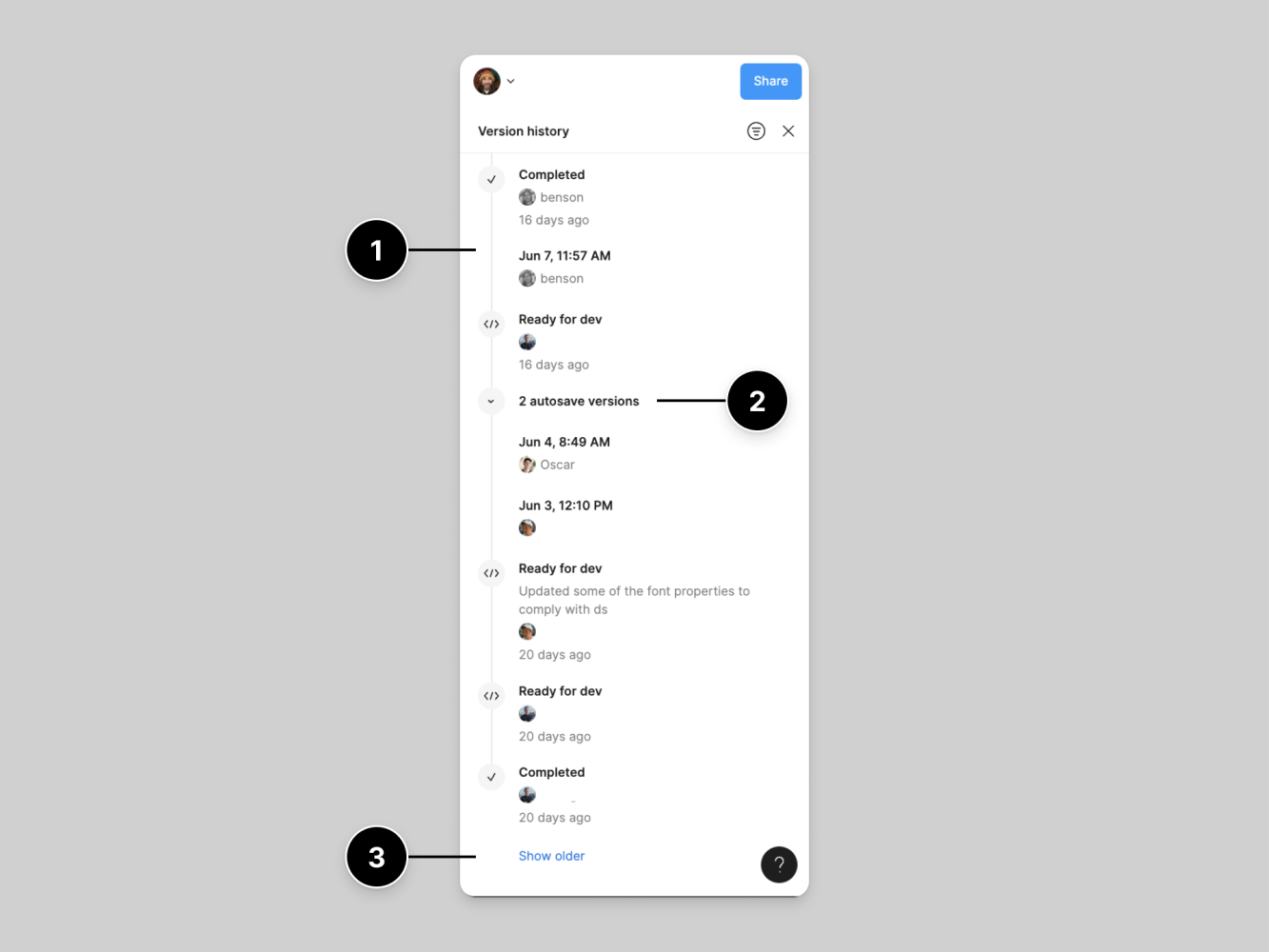
What you see above is Figma’s Version History. It’s a chronological list of every save or change, with author initials, timestamps, and the ability to revert to any previous state.
It relies on traceability and ownership, which are strong trust signals.
Figma invites you to verify exactly who did what and when. You’re never left wondering whether an accidental or malicious change went unchecked. And if doubt arises, you can roll back immediately.
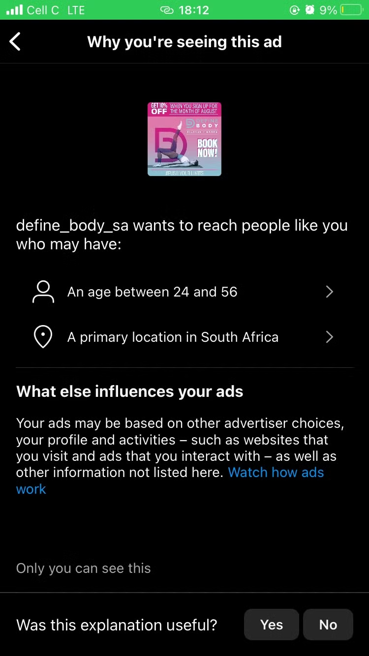
Another example of designing for trust is Instagram’s “Why you’re seeing this ad” notification.
It explains exactly which of your interests, behaviours, or connections triggered that specific sponsored post.
The trust signal used here is intentionality and explainability.
Instead of a faceless algorithm simply delivering ads, Instagram hands you the “why” so you understand the logic driving the recommendation.
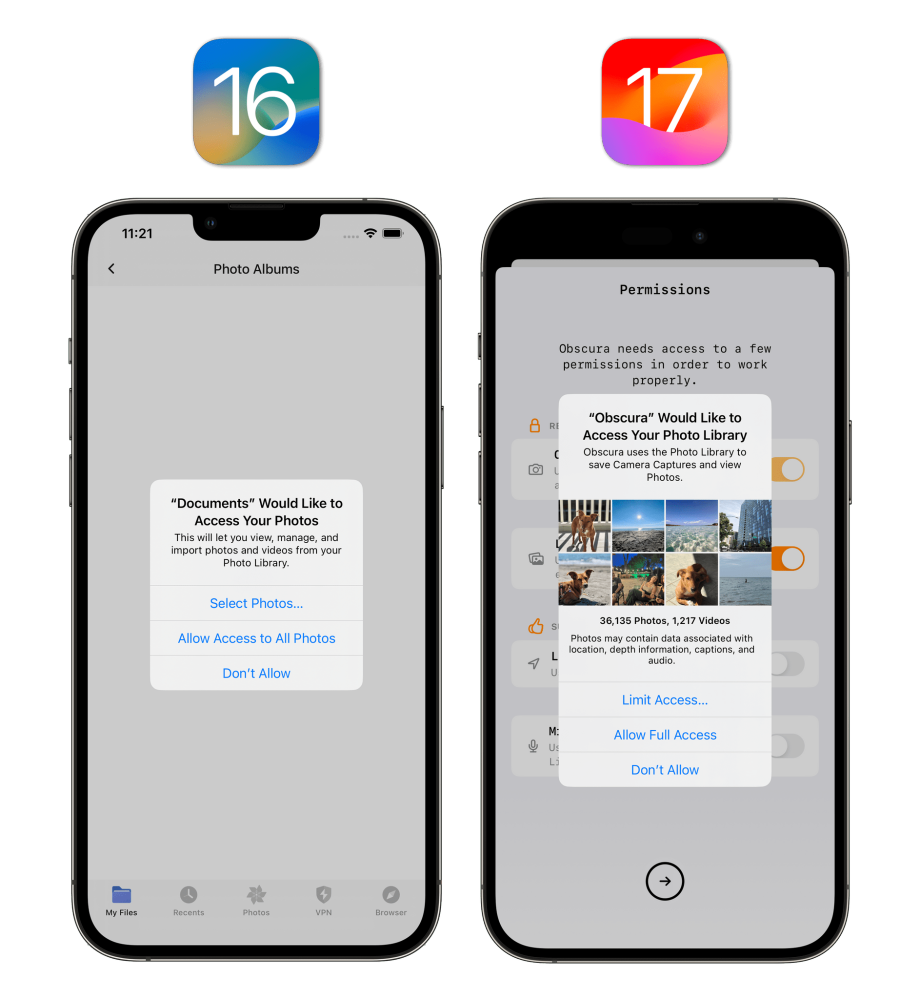
What you’re seeing here is something you’ve probably seen countless times before: permission prompts in iOS 16 and 17.
Why is it a good example? Because it doesn’t just show “Allow” or “Don’t Allow,” but also offers a micro-explanation of why the app wants access (“so we can share your location with friends”) and a persistent link to change that choice later.
Trust is signalled here through contextual explanations, fallibility, and user control.
Apple no longer buries these prompts deep in settings. Instead, every permission is surfaced at the moment of need, with clear rationale and easy reversal.
Each of these designs is built to anticipate doubt.
They acknowledge users’ scepticism by: offering inline explanations when confidence is low; providing undo or revert options at every step; using graded confidence bars or tags to show certainty levels and contextual help that surfaces only when needed.
Instead of hiding complexity, they invite users to probe further. This is the way to turn doubt into a clear path for verification.
🌟How to design for belief
“Users rely on visible origin markers, immediate system feedback, on‑demand explanations, and gradual trust-building steps to feel secure.”
To design for trust, we can integrate origin indicators, immediate feedback, contextual explanations and steeped authority.
- Origin indicators: For example tag content (human, AI, or hybrid) so users immediately know where information starts.
- Immediate feedback: Show confirmation messages (for instance, “Data verified”) right after each action to reassure users continuously.
- Contextual explanations: Embed brief tooltips or links that users can open to see the logic behind suggestions, without overloading the main view.
- Stepped authority: Introduce features in stages: start with low‑risk tasks and let users opt into more powerful functions once they trust the system.
These form a trust infrastructure: how often users feel informed, how quickly they recover from errors, and how willingly they engage without prompting.
Because trust is not a bonus feature. It underpins every interaction.
At the end of the day, the most honest UI is the one that shows upfront what it knows and admits what it doesn’t know.
When trust was abundant, interfaces could pretend to be confident.
Now they need to be honest instead.
Confidence feels manipulative. Certainty feels fake. But what always feels real is humility.
The system that says “I don’t know” feels more trustworthy than the one that bluffs.
Because trust is a relationship.
And like any relationship, it cannot be demanded. It must be earned, protected and sometimes, rebuilt.
We’ve spent years trying to reduce friction.
Now we face a harder problem:
How do you design friction that makes users believe again?
Subscribe on Substack⬇️
If you’ve found this content valuable, here’s how you can show your support.⬇️❤️

You might also like:
📚 Sources & Further Reading
- Building User Trust in UX Design: Proven Strategies for Better Engagement, The Finch Design Agency (Medium), March 2025
- Don Norman, Living with Complexity, MIT Press, 2010
Share this article:


Fantastic article! So glad I found this.