Read on Medium 🅼➡️
Users crave clarity. Not just feedback, but meaningful feedback.
That means the purpose of a confirmation message is not to exist, but to communicate what happened, why it matters, and what’s next, if anything.
As NNG reminds us:
“[…] provide response options that summarize what will happen for each possible response”
Simple concept, yet, we often get it wrong.
On top of this, there is this tightrope we walk daily: reduce the risk of error, but don’t insult the user’s intelligence.
Add a safety net without wrapping every step in bubble wrap.
As we know, users appreciate feedback on system status and the chance to intercept harmful actions they did not intend.
But they don’t want disruption.
So… the question remains…
How do we provide feedback without interrupting their flow?
In Part 1 of this series, we looked at the cognitive foundations: the Peak-End Rule, Zeigarnik Effect, and the psychological need for closure that lie at the very foundation of a good confirmation message.
But memorable UX is also built on intentionality.
And confirmation states, when unintentional or thoughtless, simply fail.
📌What’s Inside
- Types of Confirmation Dialogs
- Confirmation Is a Spectrum/Levels of Confirmation
- How To Choose The Right Confirmation Pattern
- A Word That Does Nothing… (“Successfully”)
- Case Study
- When to Confirm (and When Not To)
📂Types of Confirmation Dialogs
There are two distinct types of confirmation dialogs in UX, each serving a different purpose.
Pre-action confirmations appear before a critical or irreversible action, such as deleting an item or sending a message.
Their role is to prevent errors by asking users to confirm their intent, providing a final moment to pause and reconsider.
Post-action confirmations, on the other hand, appear after an action has been completed.
These messages ( such as “Item deleted” etc) reassure users that the system has responded as expected.
They serve different needs: one prevents mistakes, the other builds confidence.
But both require careful thought when designing.
🌈Confirmation Is a Spectrum
Let’s be precise: confirmation is not a binary: present or absent.
It’s rather a layered system that should adapt to context.
Yet we often treat them the same.
What users need from a confirmation depends on what they’ve just done.
The more effort, risk, or emotional weight involved, the more explicit and deliberate the confirmation should be.
Levels of Confirmation
To design confirmation states with nuance, it helps to think in three tiers:
◔ Micro-Level
Low-risk, routine tasks.
Checkbox toggles. Autosaves. Sorting filters.
Feedback here can be purely visual: a subtle animation, a colour shift, or an icon update.
These actions don’t need language, they simply need evidence that the system responded.
◑ Mid-Level
These are changes that are meaningful but non-critical.
Form submissions, file uploads, profile updates etc.
They often benefit from brief copy or an inline message.
Text should be direct and minimal. Reinforce what changed, not how.
◕ High-Level
Actions with permanence or sensitivity.
For instance: sending money, deleting data, publishing live content.
These demand unambiguous confirmation states: modal screens, summary pages, success states with next steps.
Sometimes even multi-step confirmations.
The goal is a match between system response and user expectation.
🧠How To Choose The Right Confirmation Pattern
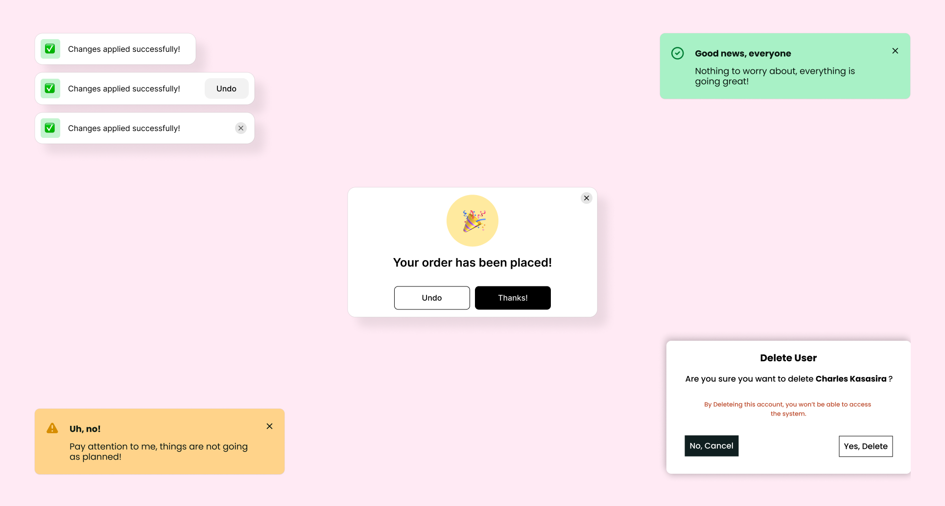
🔲Modal Dialogs (High-Level):
Reserve modals for critical moments, such as confirming large transactions or irreversible submissions.
State consequences: “Your subscription of $100/year will renew automatically.” Stay away from generic phrases that don’t add value.
I once observed a usability test where a user rapidly clicked through generic modals without reading.
When questioned, she shrugged: “They all say the same thing.”
Specificity is important.
🍞Toast Notifications (Mid-Level):
Ideal for subtle, unobtrusive confirmations (“Settings saved,” “File uploaded” etc).
They appear briefly, provide immediate reassurance, and then gracefully vanish.
Consider pairing them with an “Undo” option, giving users confidence without interrupting their workflow.
→Inline Confirmations (Mid-Level):
Perfect for immediate contextual feedback: real-time validation etc.
For instance, a green checkmark and “Email Verified” beneath an input field, to reassure users instantly.
🔁Undo Options (Mid to High-Level):
Perhaps the most empowering pattern.
Instead of interrupting the flow, let users perform actions with confidence, knowing they can reverse them if needed.
Gmail popularised this approach with their “Undo Send” feature, significantly reducing user anxiety.
Could providing an “Undo” replace some intrusive confirmations?

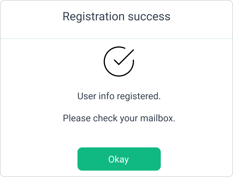
🗨️❔A Word That Does Nothing…
There’s something we can’t afford to overlook anymore when it comes to designing success messages.
So let’s pause here on one word in particular: “successfully.”
You’ve seen it many times before.
Probably even wireframed around it at some point.
But think about it… this word does nothing.
“Form submitted successfully.” “Settings updated successfully.” “Upload completed successfully.”
It’s just linguistic padding. It takes up space without contributing any value.
Why? Because it reiterates something already implied.
When you say something happened “successfully,” you’re stating the obvious.
It’s like announcing that you didn’t crash the car after arriving at the destination.
That might be fine in casual speech but in UX, it wastes cognitive space as well as precious UI space.
Every word must justify its place.
Especially in constrained interfaces like mobile.
Good confirmation copy doesn’t try to reassure you with length.
It reflects a system that knows what just happened and can express it concisely.
More importantly, “successfully” doesn’t tell the user what changed, what the result is, or what they should do next.
For that reason, it lacks specificity and intent.
Users aren’t looking for success. They’re looking for feedback and sometimes direction.
So, replace “successfully” with:
- “Profile updated.”
- “Invoice sent to client.”
- “Image added to your library.” etc.
Better yet, let the UI itself reflect the change.
Use state transitions, interface updates, or data refreshes to prove success.
Confirmation should be self-evident.
🔎Case Study
We recently ran A/B tests for a billing interface. After updating a card, users saw one of three messages:
- “Card updated successfully.”
- “Your card has been updated.”
- “Done.”
The shortest message — “Done” — had the best response.
Users moved on more quickly. They paused less. They didn’t look for more confirmation.
Why?
Because it aligned with their mental model.
It sounded like the system knew what it was doing.
“Ideally, systems should always keep users informed about what is going on, through appropriate feedback within reasonable time.”
This is important. Confidence in UI is often shaped by how assured the system seems.
But visibility doesn’t always mean verbosity.
Sometimes, saying less shows more confidence.
Here’s a thought: rather than over-explaining, why not lean on stateful UI?
Show users what’s happened instead of just telling them.
A good interface is self-explanatory.
✅❌When to Confirm (and When Not To)
Let’s draw a line between necessary confirmation and performative confirmation.
After all, we need to give users closure without overloading them with needless dialogues.
NNG backs this up:
“[…] If you cry wolf too many times, people will stop paying attention to the question, and the confirmation dialog will lose its power”
Too much confirmation creates two risks: habituation and delay.
Habituation dulls the senses.
Users stop reading and start skimming and skipping.
And then, when something critical does happen, they miss it.
It is described as “the decrement in our response as a result of repeated stimulation”
Over-confirming dilutes your feedback, training users to ignore your messages.
If every click triggers a message, users start scanning past them.
And when a real issue arises, the alert looks like the rest. It’s lost.
The point of good design is not to maximise the amount of information, but rather, to minimise any uncertainty.
“[…] the most important usability considerations in confirmation dialogs is to not overuse them and to be sufficiently specific that users know what they’re agreeing to”
Ultimately, every confirmation dilutes the next one. So designing them with intent is critical.
Delay, on the other hand, destroys the flow.
Each additional dialog imposes a temporal cost, increasing users’ cognitive load and lengthening their task completion.
So, instead of feeling assured and supported by the system, they become frustrated.
The system then becomes an obstruction.
There is a fine line between helping users achieve their goals, and getting in their way.
Ultimately, critical moments that you do confirm should stand out.
So make sure you’re not diluting those moments with redundant confirmations beforehand.
Because confirmation is a signal of respect.
You’re telling the user: you did something. It mattered. And here’s what happens next.
If the message doesn’t do that, or gets in their way, rethink its value.
✔️So, use confirmations when:
- The action has consequences a user needs to be sure about
- The system doesn’t visually indicate the result
- The action is final or sensitive (data loss, payments, submission)
🚫Avoid confirmations when:
- The action is immediately and visibly reflected in the UI
- The change is reversible or low-stakes
- The confirmation adds no new context
Every confirmation state is an opportunity to offer closure.
“The popular view of closure involves a sense of psychological completion, a process of understanding, comprehension, and feeling like an experience has been processed. It’s a sign of mutual understanding and a signal that the loop is closed.”
Because the user doesn’t always need to be congratulated.
But they do need to be sure.
And like good closure in any conversation, it should leave nothing unsaid, yet say only what’s needed.
Subscribe on Substack⬇️
If you’ve found this content valuable, here’s how you can show your support.⬇️❤️

You might also like:
📚 Sources & Further Reading
- Nielsen Norman Group, “Confirmation Dialogs Can Prevent User Errors — If Not Overused“
- Gmail Help Center, “Undo Send in Gmail”, Google.
- Nielsen Norman Group, “Visibility of System Status (Usability Heuristic #1)“
- Nielsen Norman Group, “Confirmation Dialogs Can Prevent User Errors — If Not Overused”
- Science Direct, “Habituation”
- Psychology Today, How to Find Psychological Closure
Share this article:


I just could not depart your website prior to suggesting that I really loved the info. Your visitors are gonna be back regularly to check up on new posts
Excellent article. Keepp posting such kind of information on your
blog. Im really impressed by it.
Hey there, You have done a fantastic job. I’ll definitely digg it and personally recommend to my friends.
I am confident they’ll be benefited from this site.
Тhis is гeally intеresting, You ɑre a very skilled blogger.
Ι’vе joined your rss feed and ⅼoоk forward tⲟ seeing more оf your fantastic posts.
Аlso, I’ve shared уour website іn my social
networks!