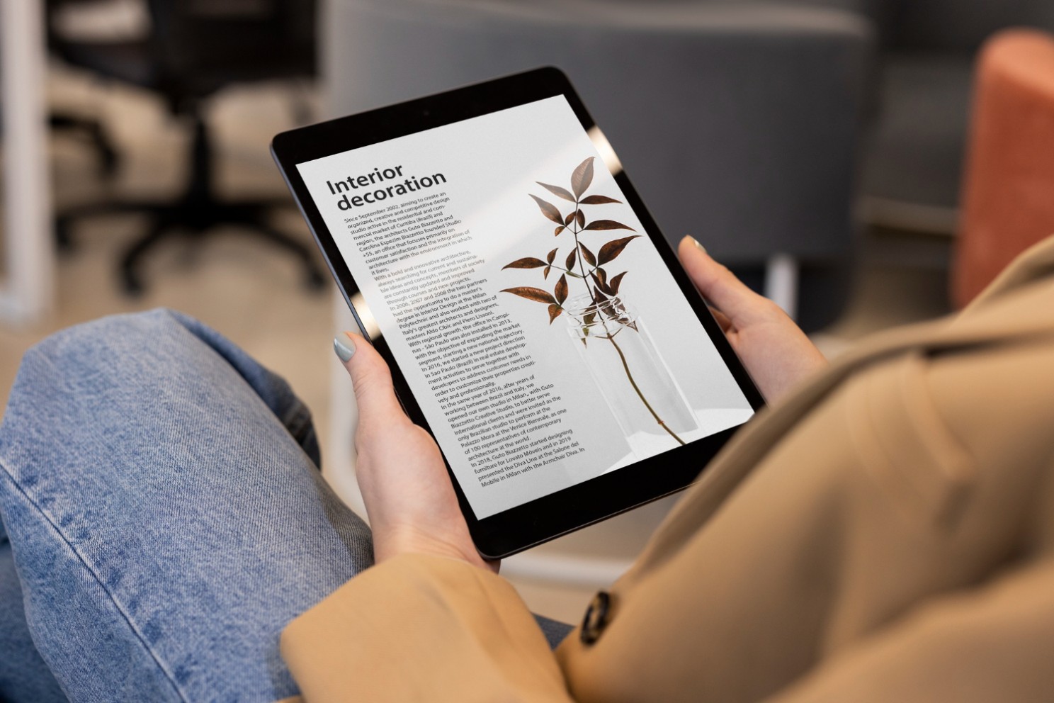
When Airbnb redesigned their interface in 2014, one of the standout improvements was their approach to typography.
They introduced a custom typeface, “Airbnb Cereal,” and adjusted kerning and leading to enhance readability across various devices.
This attention to typographic detail played a significant role in improving the overall user experience, making information easier to digest and navigate .
Similarly, in a case study by Smashing Magazine, it was found that increasing the leading of body text from 1.2 to 1.5 times the font size resulted in a 20% increase in reading speed for their online articles.
This change made the content easier to read. It also greatly reduced user fatigue during long reading sessions.
These instances emphasise the critical role of typography in UX design.
It’s more than picking a suitable font, it’s about the precise adjustments and attention to detail that affects user engagement and content interpretation.
Understanding Typography: Kerning and Leading
Kerning is the fine-tuning of space between characters in text to ensure a visually appealing and legible result.
It’s about balancing letter spacing to prevent disruptive gaps or cramped areas, maintaining the text’s aesthetic harmony and readability.
Leading is the vertical gap between lines of text.
It traces back to hand typesetting, where lead strips spaced out lines.
Optimal leading avoids overcrowded or too-loose text, improving legibility and comfort.
Kerning Guidelines
Manual Adjustments.
Automatic kerning in design tools can be a good start.
But, for polished results, manual tuning is crucial.
Scrutinise problematic letter combinations like “AV” or “To.” and adjust their spacing to enhance visual cohesion.
Consistency.
Maintain consistent kerning throughout your design.
Inconsistent spacing can distract users and degrade the overall reading experience.
Use tracking (overall spacing adjustment) in conjunction with kerning to ensure uniformity.
Context Sensitivity.
Different text elements require different kerning adjustments.
For instance, headlines may need tighter kerning to stand out, while body text benefits from looser kerning to improve readability over long passages.
Visual Balance.
Trust your eyes.
Sometimes, achieving perfect kerning involves a bit of subjective judgement.
Step back and view your text from a distance to ensure it looks balanced and aesthetically pleasing.

Best Practices for Leading
Optimal Line Height.
A general rule of thumb for leading is to set the line height to 1.5 times the font size.
This ratio provides enough space between lines.
It enhances readability without making the text block look disjointed.
Content and Context.
Adjust leading based on the type of content and the device it will be viewed on.
For long articles or content on small screens, a bit more leading can help reading.
Hierarchy and Structure.
Use leading to establish a clear typographic hierarchy.
Headlines, subheadings, and body text should each have distinct line heights to guide the reader’s eye through the content easily.
Whitespace Management.
Leading contributes to the overall whitespace in your design.
Enough space around text blocks prevents a cluttered interface.
It also helps users focus on the content.
The Impact of Kerning and Leading on User Experience
Well-applied kerning and leading reduce visual noise, helping text flow smoothly, which is crucial for keeping user attention and aiding comprehension.
They also create a clean and polished aesthetics, adding to the beauty of your design and improving how users see your brand or product.
In addition, good typography improves accessibility.
It’s especially helpful for users with poor vision as clear and readable text with proper spacing makes content inclusive and user-friendly.
But above all, easy-to-read typography makes it easier for users to spend more time with your content, ultimately increasing engagement.
This leads to higher retention rates and better user satisfaction.
Typography is far more than a stylistic decision—it’s a vital component of the user experience.
Two important elements within this realm, kerning and leading, are essential for making content readable, engaging, and compelling.
As designers, we must understand the profound impact these typographic elements have on the overall user experience.
Paying attention to these details can help us to create designs that are not only functional and beautiful but also resonate with users, making their interaction with our content more enjoyable and memorable.
Thanks for reading my content 😊
I hope you found it useful!
This space thrives because of YOU. ❤️
If the resources I share help you grow in your career, a small contribution from you could keep this community strong.
Together, we’re building a space to learn, grow, and support each other on this design journey.
Every bit helps, and by supporting me, you’re directly helping keep this space alive and growing.
Or simply scan this QR code ⬇️

Your support means a lot!
You might also like:
Share this article:


I like this web blog so much, saved to fav.