On an average web page, people read at most 28% of the words — 20% is more likely.
Instead of consuming every line, users often scan in a pattern that resembles the letter “F.”
This was first observed by the Nielsen Norman Group in eye-tracking studies back in 2006.
If you design or write content for the web, it’s a peek into your users’ reading behaviour and a guide for making content more engaging and effective.
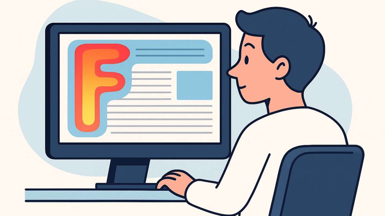
What is the F-Shaped Pattern?
It describes how users’ eyes move when they scan through text-heavy content online.
They tend to read across the top part of the content area, then drop down and read across a bit further down, and finally scan vertically down the left side.
In essence, users form two horizontal stripes (the top and a lower one) and one vertical stripe on the left — tracing out an “F” shape.
This happens largely because in Western languages we read left-to-right, top-to-bottom, and when presented with a lot of information, we skim for what stands out.
The first few lines get the most attention, and as users move down, they increasingly just glance at the beginnings of lines or paragraphs for keywords of interest.
Eye-tracking heatmaps from usability studies show the F-shaped reading pattern below:
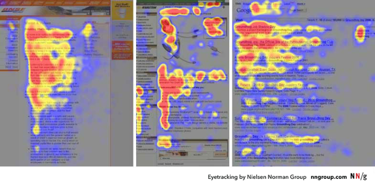
Red areas indicate where users looked the most, yellow less so, and blue the least.
Notice how the top content and the left margin of text attract the most views, forming an “F” on the page.
Why do people read this way?
Simply put, because they’re often in a hurry.
We all do this; I do, and you probably do too, often without noticing it.
Jakob Nielsen famously summed it up as “F for fast” — users’ eyes move at amazing speeds, hunting for what’s relevant.
They’re not reading for pleasure or academic study, they’re trying to extract value as quickly as possible.
Large blocks of text get sliced through by the eyes.
Our natural reading habits (scanning titles, bold text, and the start of lines), combined with the reality of limited attention spans, means that users default to scanning unless something compels them to slow down.
Research by Nielsen Norman Group found that 79% of users scan new pages, while only 16% read word-by-word.
This behaviour isn’t limited to desktop screens; even on mobile, where screen width is smaller, users exhibit similar scanning patterns.
The F-shape is just one common pattern, but it tends to emerge on text-heavy pages like news articles, search results, blog posts, or any page with a wall of text or list of items.
Why Design for the F-Pattern
If users are going to scan like this no matter what, we should work with this behaviour rather than against it.
Designing with the F-pattern in mind means structuring content so that your most important information sits where their eyes are likely to linger.
So, if readers only truly pay attention to the first few lines and the first few words of subsequent lines, then those spots are your prime real-estate.
Important, must-see content needs to be positioned where it can’t be missed during an F-pattern scan.
If it’s buried in the middle of a paragraph or far to the right, there’s a good chance a scanner will overlook it.
This has a direct impact on usability and business outcomes (after all, if the user doesn’t see the value or the call to action because it’s literally out of their sight path, it may as well not exist).
We must earn every second of a user’s attention.
If we don’t front-load the good stuff, it might never be seen.
And so, to give you a good idea, one of the most popular sites designed for the F-pattern (and a personal favourite) is the BBC News website.
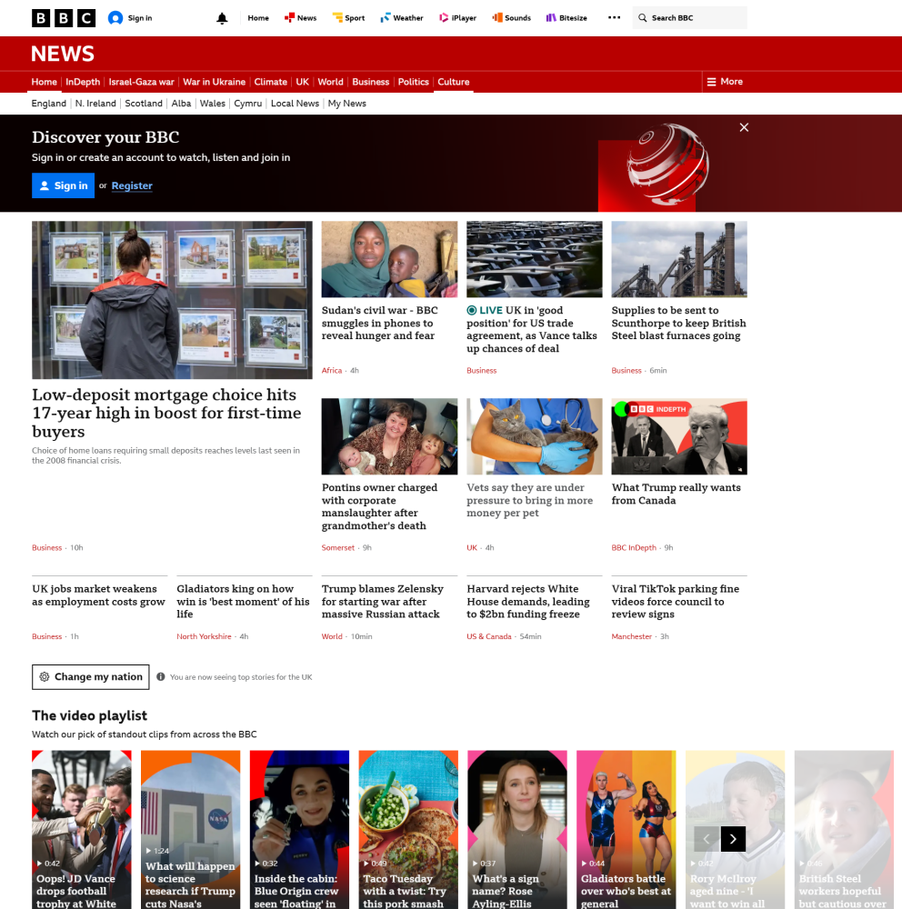
If you’ve ever browsed it (especially the desktop site), you’ve likely experienced the F-shaped scan without even realising it…
This space thrives because of YOU. ❤️
If the resources I share help you grow, a small contribution from you could keep this community strong.
Every bit helps, and by supporting me, you’re directly helping keep this space alive and growing.❤️⬇️

Or simply scan this QR code ⬇️

Your support means a lot!
You might also like:
Sources:
1.Nielsen Norman Group — F-Shaped Pattern For Reading Web Content
3. Nielsen Norman Group — How Little Do Users Read?
4. Nielsen Norman Group — How People Read on the Web: The Eyetracking Evidence (Report Summary)
5. Nielsen Norman Group — How Users Read on the Web
6. Nielsen Norman Group — Scanning vs Reading: Why Users Tend to Scan Content
7. Nielsen Norman Group — Website Reading: It (Still) Follows the F-Pattern
8. Nielsen Norman Group — Layer-Cake Pattern: Scanning Behaviour on the Web
9. Nielsen Norman Group — Inverted Pyramid Writing Style
10. BBC News Lab Blog — How BBC News Articles Are Structured for Digital Reading
11 .BBC Internet Blog — Why the BBC News Site Redesign in 2010 Worked
12. Jakob Nielsen’s Alertbox Archives
13. BBC News website (image)
Share this article:


