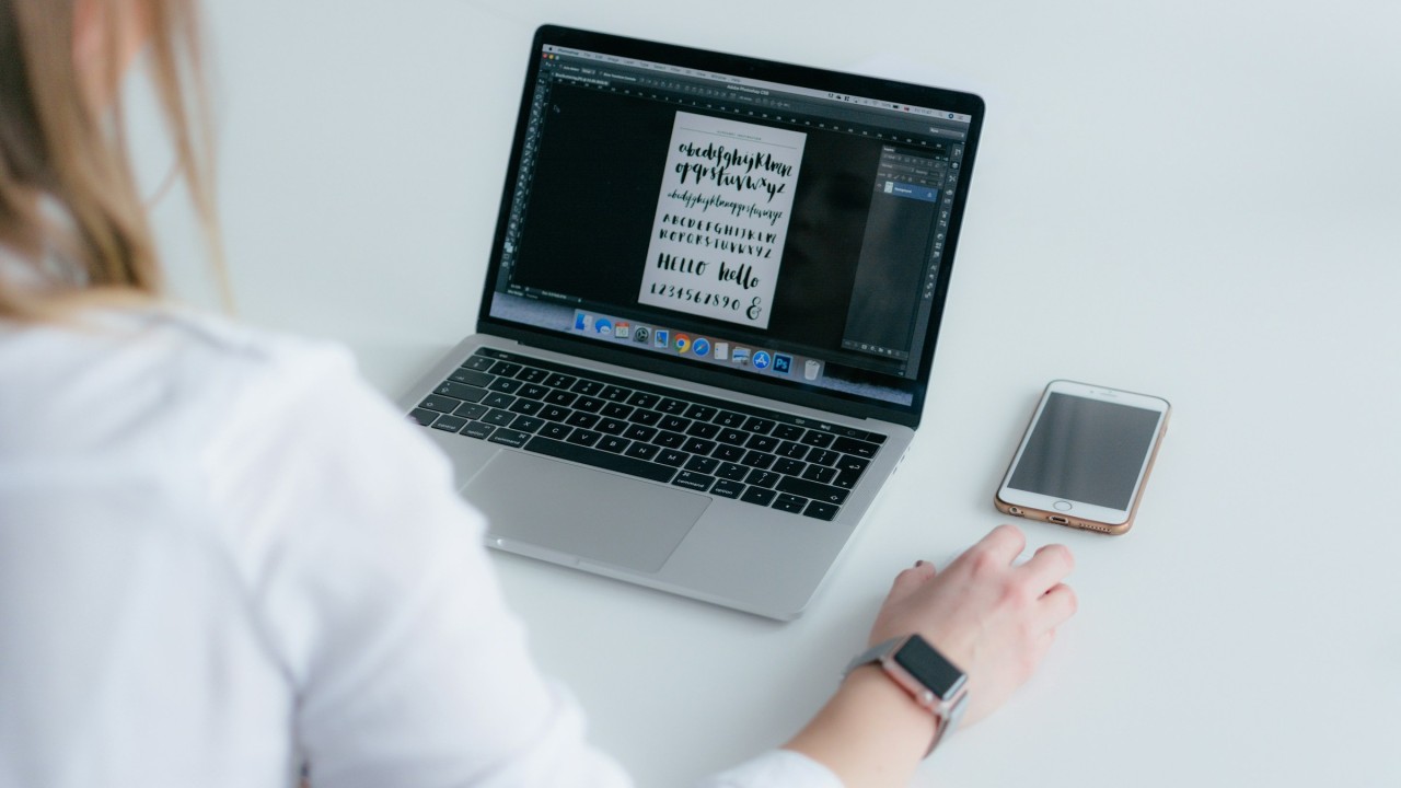
Typography is one of the most important tools in designing interfaces.
It shapes how users feel, how they interact, and how they perceive a brand.
Every letter and every word you see is there for a reason.
Whether it’s to guide you, inform you, or prompt you to take action, it’s the invisible force that makes interfaces usable and enjoyable.
Think about it—when you open an app or browse a website, you don’t usually notice the fonts unless they’re bad, right?
That’s because good typography blends into the experience.
It works behind the scenes, making sure everything feels easy and intuitive.
When you nail it, typography becomes more than just functional but also a part of the brand’s identity, reinforcing the message you want to send to your audience.
✨The Role of Typography
Typography isn’t just about making text readable.
Sure, that’s a big part of it, but there’s more.
It’s also about creating a tone and a mood.
The typeface you choose helps users subconsciously understand what kind of experience they’re in for.
Are you aiming for playful or professional? Friendly or serious?
The right typeface can communicate all that before someone reads a single word.
✨The Basics
At the core of good typography is readability and legibility.
If users have to squint or struggle to read your text, they’ll check out fast.
That’s why sans-serif fonts are so popular in digital interfaces.
They’re clean, and simple, and work great across different screen sizes and resolutions.
👉A good example is Google, which uses Roboto as the main typeface.
Roboto is a modern sans-serif font that balances geometric shapes with softer, natural curves.
It’s highly legible and versatile, making it a solid choice for a global platform that serves millions of users on a variety of devices.
It feels neutral but friendly, professional but approachable—a perfect fit for Google’s brand.
✨Emotional Impact
In addition to conveying information, you can also use typography to evoke certain emotions.
Different typefaces have different personalities, and brands use this to their advantage.
👉Take Coca-Cola, for example.
Their Spencerian Script font is instantly recognisable.
It’s not the most practical font for a UI, but Coca-Cola doesn’t need practicality here.
The font’s flowing, cursive style is nostalgic and full of personality.
It speaks to the brand’s rich history, tradition, and emotional warmth.
You don’t see it everywhere on their digital presence—just in the right places to remind you of the brand’s iconic image.
👉On the flip side, we have Apple, with their San Francisco typeface.
Apple is all about minimalism and precision, and San Francisco reflects that perfectly.
It’s clean, modern, and extremely easy to read, whether you’re using a small iPhone or a massive iMac.
There’s no need for flashy flourishes or elaborate strokes.
It’s straight to the point, just like Apple’s “it just works” philosophy.
✨Typography as a Branding Tool
Typography is one of the most powerful ways to solidify a brand’s identity.
It’s a visual representation of what a company stands for.
👉Look at Netflix and their use of Graphik.
This font is bold, confident, and demands attention—much like Netflix itself.
As soon as you see that bold typography, you’re reminded of the vast content library they offer.
The no-nonsense font is a reflection of the brand’s direct approach: sit back, relax, and enjoy the show.
👉Then there’s Airbnb with their custom font Cereal.
It’s soft, rounded, and approachable—perfect for a company that wants to promote a sense of belonging.
The typeface helps users feel welcome and at ease, mirroring the brand’s values of trust and community.
It works hand-in-hand with their UI, creating a space that feels comfortable and inclusive.
✨Visual Hierarchy and UX
Good typography is also about guiding users through a product.
This is where visual hierarchy comes into play.
By using different weights, sizes, and spacing, you can subtly point users to the most important elements on the page.
👉Spotify is great at this.
Their use of the Circular typeface is both functional and fun.
It’s modern and highly readable, with wide letter spacing and open shapes.
But what Spotify does best is create a clear visual hierarchy.
Larger, bolder versions of Circular lead the user’s eye to key information, like playlist titles or recommendations, while lighter, smaller versions are used for secondary details.
It’s all so smooth that users don’t even realise they’re being guided—it just feels natural.
💡Remember, there’s a lot more at play than just picking the font that looks good.
A good typeface is functional, readable, and serves your user’s needs.
But it also needs to align with your brand’s identity and communicate the right emotions.
It’s about creating a hierarchy that guides users through the interface without them even realising it.
In the end, typography works quietly in the background, making sure everything feels cohesive, intuitive, and true to your brand.
So don’t overlook it.
Typography is a key part of the user experience.
Get it right, and your users won’t even notice it—get it wrong, and it’s all they’ll see.
Thanks for reading ✨
I hope you found it useful!
This space thrives because of YOU. ❤️
If the resources I share help you grow in your career, a small contribution from you could keep this community strong.
Together, we’re building a space to learn, grow, and support each other on this design journey.
Every bit helps, and by supporting me, you’re directly helping keep this space alive and growing.
Or simply scan this QR code ⬇️

Your support means a lot!
You might also like:
Share this article:


