“If you want to encourage a behaviour, make it the default.”
We know this works in UX because we are wired to conserve mental energy.
Defaults exploit our tendency to satisfice, to accept ‘good enough’ over ‘optimal’ when cognitive resources are low.
That makes the default one of our most powerful tools in UX.
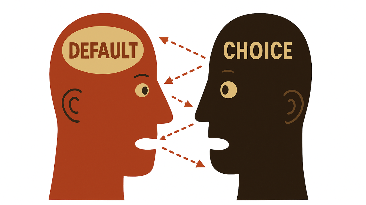
When users don’t act, it becomes the experience by default.
So, instead of thinking of inaction as an absence, we should think about it as delegation.
Users outsource the decision to us. This is precisely what makes defaults powerful.
We are wired to avoid unnecessary decisions, especially when time is short or the consequences are unclear. Defaults, therefore, fill the void of choice with a presumption of intent.
That is why they are so potent in UX. Because instead of asking, they assume.
Cass Sunstein, co-author of Nudge, said:
“Default rules are often sticky. People tend to go with them, even if they have a lot to lose, and even if switching would be easy.”
📌 What’s Inside
- We don’t choose. We accept.
- Studies and hidden ethics of “set and forget”
- Defaults as operational architecture
- Darker side of defaults
- Designing defaults that reduce errors
🧠We don’t choose. We accept.
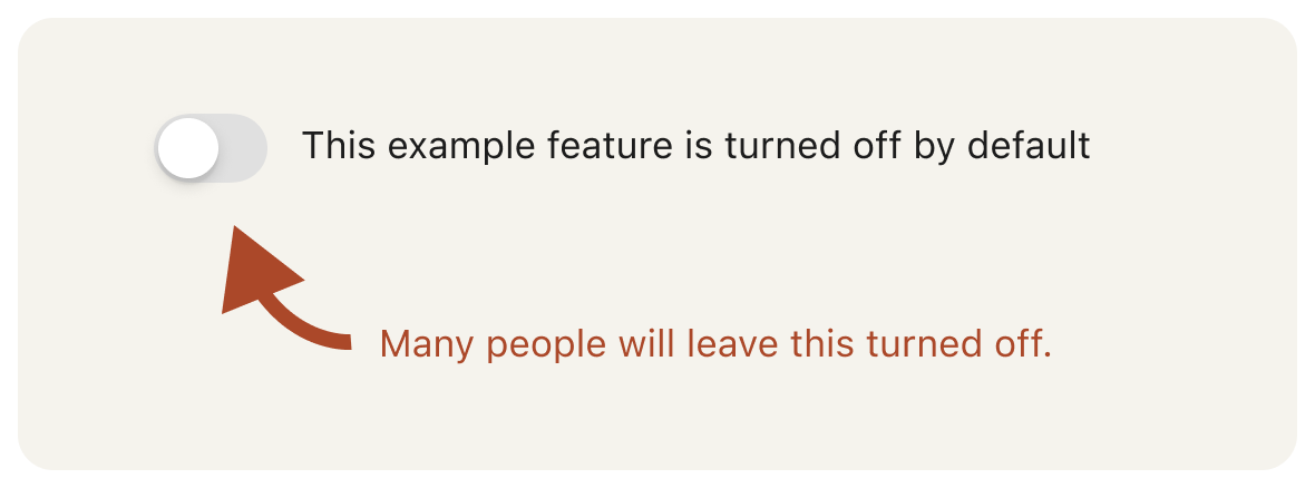
Default bias, also called the Status Quo bias, is a cognitive shortcut. It reduces friction. It saves time. It tells our brains, “This has already been decided.”
In 1988, Samuelson and Zeckhauser conducted experiments showing that individuals, when presented with a default option, strongly favoured it over other alternatives, even if the alternative was objectively superior.
The psychological mechanisms are well understood: loss aversion, decision fatigue, and cognitive load.
When presented with a pre-selected choice, our brains instinctively avoid the mental cost of weighing alternatives. It’s neural efficiency.
Kahneman explains this through his dual-system theory: System 1, the fast, automatic, and intuitive part of the brain, handles most daily decisions with minimal effort.
It relies on pattern recognition, heuristics, and emotional cues.
When a default is presented, System 1 steps in and responds reflexively, preferring the pre-selected option because it appears safe, common, and endorsed.
It avoids triggering System 2, the slower, deliberate, and analytical part of the brain that demands effort, attention, and energy.
System 2 is responsible for scrutiny and rational evaluation, but it only activates when something appears unusual or risky.
Defaults rarely meet that threshold, so they slip past deeper analysis.
Built for Mars Ltd Built for Mars Ltd This interplay makes default bias so effective: System 1 favours ease, and System 2 is too passive to intervene unless prodded.
The default is perceived as the path of least resistance and often interpreted as a recommended or safe choice.
Neurologically, the brain prefers this route because evaluating alternatives requires glucose-intensive processing.
This is where default bias takes root, in our cognitive tendency to conserve energy, minimise effort, and avoid regret. We choose the default not because it is better, but because our brains are wired to believe that if it’s already chosen, it must be acceptable.
This is the foundation of behavioural design: making the easiest option the most aligned. Ease in UX simplifies action.
⚖️Studies and hidden ethics of “set and forget”
We also see this in real-world compliance. In a 2011 study, people given a default green energy provider were significantly less likely to switch away, even if it cost slightly more.
The default framed the decision as ethical, and very few questioned it.
The organ donation study remains definitive here, too.
In opt-out countries (Austria), consent exceeds 99%. In opt-in (Germany), it stays around 12%. Identical populations. Different defaults. Radically different outcomes.
Do we accept what it implies? The moment we set a default, we shape action through inaction.
This is about designing the outcome when the user stays silent.
So we must ask: whose interest does our default serve?
Apple defaulted to disabling cross-app tracking. A privacy-first stance.
LinkedIn defaulted to auto-import contacts. A data-first stance. These are value judgements encoded in the interface.
There is no neutral ground. Defaults imply norms. They teach users what’s expected, what’s safe, and what’s assumed. And users, trusting the interface, comply.
We can’t treat defaults as secondary. They are the primary communication in UX design. The passive interface users never actively negotiate with.
That makes our responsibility absolute. If most people won’t touch a setting, we are designing their future, not just their screen.

🏗️Defaults as operational architecture
Defaults become invisible infrastructure, the behavioural patterns users follow because we told them to.
When only 5% of users ever change their privacy settings, the default is the experience. Not a fallback. The experience.
We might imagine settings pages as spaces of control, but for most users, they’re dead zones. Every toggle, checkbox, and pricing tier is a message.
Facebook’s defaults on data sharing. Google’s on ad personalisation. These dictate whether personal data becomes a corporate asset. The checkbox is policy.
At scale, defaults become cultural.
What starts as convenience ossifies into convention. Defaults ultimately become the architecture users operate within. They set constraints, often unspoken, that guide what feels permissible or expected.
If enough people follow a pattern long enough, it becomes the path of least resistance, regardless of whether it’s the most effective.
Defaults harden into systems not because they were the best solution, but because they were the first one left unchallenged.
And is this ethically wrong? Not necessarily.
The ethical weight of defaults depends on their intent and impact.
If it reduces cognitive load, protects user data, or encourages better outcomes, it can be an act of care, not coercion.
We are not removing choice but shaping a starting point. It becomes unethical only when defaults obscure, manipulate, or entrap users. When they are honest and reversible, they serve the user, not control them.
There are many ways to balance business needs with ethical default use.
We often see this in the pricing models UX, where service default plans are set to their mid-tier offers.
The “default” plan is often visually emphasised, sometimes pre-selected, and frequently labelled “Most Popular.”
Research in Judgment and Decision Making (2013) shows we favour defaults even without evidence of their benefit.
This is anchoring. We follow the suggestion because it looks endorsed.
For us, architecting the UX landscape, this means there are two paths we can take with this knowledge.
One is to exploit the trust users place in defaults, guiding them toward options that serve business goals but not their needs.
The other is to design defaults that balance both, offering a plan that reflects what most users actually want, not just what benefits the bottom line.
When we choose the latter, we can use defaults to align with user intentions while supporting business strategy.
In e-commerce, setting standard shipping as the default avoids pushing users toward unnecessary upgrades. In SaaS, offering a pre-selected plan that meets the needs of most users reduces confusion and prevents churn.
Defaults like these reduce decision friction, lower support volume, and build user trust without relying on manipulative patterns. The result is still commercially viable, but earned through clarity, not pressure.
The goal is mutual alignment. A good default anticipates need without enforcing it. It suggests, but does not lock users into one option.
🕳️Darker side of defaults
Things become darker, though, when default pricing is designed for business optimisation, not mutual fit.
At times, you’ll see mid-tier plans being highlighted not because they suit most users, but because they maximise lifetime value.
Additionally, we might also see low-tier plans positioned as a poor fit, which makes the default plan seem more reasonable.
This is decoy pricing, a manipulation of expectations, using the default to push users where we want them to land, without necessarily taking their best interest into account.
The behavioural calculus here is the following: influence decision, extract value, suppress any doubt.
Is that right, you might ask? I’ll let you decide.
Does it work?
Sometimes, yes.
But short-term conversions built on deception don’t last. Users eventually recognise manipulation, and once trust is gone, it rarely returns.
The cost of exploiting defaults is long-term credibility. And that’s rarely worth the gain.
🛠️Designing defaults that reduce errors
If we accept that most users won’t change defaults, then the default itself becomes a form of instruction.
It guides action by modelling what’s typical, safe, or expected. This is where we can leverage defaults to reduce errors and cognitive load by pre-populating fields or configurations based on context.
For instance,
“In forms and applications, pre-populate fields with the most common value if you can determine it in advance.”
Beyond that, design defaults that reflect a user’s previous behaviour, such as pre-selecting their most-used payment method or preferred language.
Use geolocation or device settings to pre-fill location or currency fields.
When asking users to schedule, offer times that align with their historical usage patterns. When presenting filter or sort settings, remember their last choice.
These types of defaults save time and signal understanding. And they minimise missteps by reducing the need for users to reassert intent every time they return.
But defaults should reflect actual usage patterns. They should be context-aware, reversible, and clear.
The point isn’t just to make choices easier. It’s to make the right path easy without obscuring the presence of alternatives.
Default bias shouldn’t be a trick we exploit.
It’s how human cognition operates.
It reflects our tendency to avoid unnecessary effort and to treat presented options as implicitly recommended.
Designing UX with defaults is about acknowledging that most users won’t act, and taking responsibility for what happens when they don’t.
It’s about anticipating passive behaviour and making sure that inaction still leads to a reasonable, ethical outcome for all.
Because when we set the default, we choose the path most will take.
Through belief, not deliberate choice.
And the weight of that belief is always ours to carry.
Subscribe on Substack⬇️
If you’ve found this content valuable, here’s how you can show your support.⬇️❤️

You might also like:
📚 Sources & Further Reading
- Samuelson & Zeckhauser, “Status Quo Bias in Decision Making” (Journal of Risk and Uncertainty, 1988)
- Kahneman, Thinking, Fast and Slow
- Sunstein & Thaler, Nudge
- Dinner, Johnson et al., “Partitioning Default Effects: Why People Choose Not to Choose” (Journal of Experimental Psychology, 2011)
- NN/g: The Power of Defaults
- Built for Mars: Default Bias UX Glossary
- growth.design: 106 Cognitive Biases & Principles
Share this article:


