Why do certain tasks linger in your mind long after you’ve put them down?
What makes unfinished business so hard to forget?
Am I the only one who keeps a mental record of unticked tasks?
Probably not.
Psychology suggests that we all have this tendency, known as the Zeigarnik Effect.
It’s a powerful psychological insight that shows how our brains cling to incomplete tasks.
For those in UX, it’s an opportunity to drive engagement, guide behaviour, and ultimately, create memorable experiences.
The Origin of The Zeigarnik Effect
Back in the 1920s, psychologist Bluma Zeigarnik made a simple but interesting observation.
She noticed that waiters could remember open orders much better than closed ones.
In her experiments, people recalled tasks they hadn’t finished more clearly than the ones they completed.
Later studies confirmed this idea.
It’s just the way our brains work, pushing us to wrap things up.
Her experiments also confirmed that unfinished tasks generate a kind of mental tension, urging us to complete them and making them more memorable.
“Uncompleted tasks are remembered better than completed ones because they create a state of tension.” [1]
This isn’t about laziness, it’s hardwired into our psychology.
Grasping this effect unlocks a world of opportunities.
Here are a few ideas to bring it into your projects:
1️⃣ Progress Indicators: The Visual Nudge
How It Works: Progress bars and percentage completions create an open loop in the user’s mind. When users see they’re only 70% done, that 30% gap becomes a motivator.
Examples: LinkedIn: Their profile completeness meter subtly pushes you to add just a bit more information.
Duolingo: The clear progress path for daily lessons compels users to keep going.
Tip: Ensure your progress indicators are realistic. Too slow, and you risk demotivation. Too fast, and the satisfaction is fleeting.
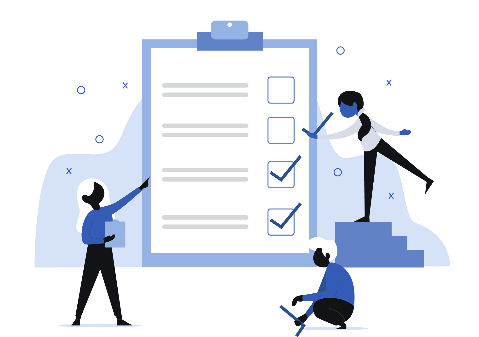
2️⃣ Interactive Checklists and Onboarding Flows
How It Works: A visible checklist taps into our need to “close the loop.” Users naturally feel compelled to mark off every item.
Examples: Notion and Slack. Their onboarding flows are designed as step-by-step checklists, making the setup process feel both manageable and rewarding.
Tip: Incorporate micro-interactions—subtle animations or sound cues, to celebrate each completed step. It makes the experience engaging without overwhelming the user.
3️⃣ Cart Abandonment and Reminder Nudges
How It Works: When a user leaves an online store without completing a purchase, the lingering sense of unfinished business can be a powerful trigger.
Examples: E-commerce Sites. A gentle “Forgot something?” email taps into the Zeigarnik Effect, coaxing users back to complete their orders.
Tip: Keep the tone light and helpful. Avoid aggressive sales tactics; instead, remind users that their cart is waiting patiently.
4️⃣ Content Teasers and Cliffhangers
How It Works: Leaving something unfinished invites curiosity. It’s the digital equivalent of a cliffhanger that compels users to click “Read More.”
Examples: Medium and Substack. They often show a snippet of an article, enticing you to dive in for the full story.
Netflix: Strategic pauses and episode cuts encourage binge-watching.
Tip: Provide just enough to hook the user without resorting to clickbait. Authenticity wins in the long run.
5️⃣ Gamification and Streaks
How It Works: Gamification leverages the Zeigarnik Effect by showing users how close they are to a goal, be it a badge, a streak, or a level-up.
Examples: Duolingo and Fitness Apps: Displaying a near-complete streak or a barely-missed milestone creates a strong incentive to engage.
Tip: Communicate the next step clearly. “Just one more lesson to hit your daily goal!” is a concise, effective call to action.
🤝Ethical Considerations
Even though the Zeigarnik Effect works great, we need to use it wisely.
Be subtle, think of open loops as gentle hints, not pushy traps.
Let users feel welcomed, not cornered.
The Zeigarnik Effect shows us that leaving something a bit unfinished can boost engagement.
When you design experiences with a few open pieces, users naturally want to see it through.
This often leads to interfaces that feel natural, work well, and connect with people.
A few things to consider in your next project:
💡 Which elements of your design can benefit from an open loop?
💡 How can you present progress in a way that feels natural and rewarding?
💡 What small, satisfying rewards can you offer along the way?
The answers to these questions will help you build experiences that are both effective and delightful.
📌💡Just a quick side note—in UX, we’re always learning and growing.
Luckily, there are loads of online courses that keep us on our toes and open up new career doors.
If you want to level up your UI/UX skills, check out Uxcel.
It’s a solid choice to boost your skills and your job market appeal.
Right now, you can snag 25% off a Pro Yearly membership when you sign up through my link. ⬆️
Thoughts on this post? 💭 Join the conversation by commenting!
👉🏻 Don’t forget to hit subscribe for fresh content weekly! 📰
👉🏻 I’m open to new opportunities in UX/UI and Product Design. Let’s chat! 💼
This space thrives because of YOU. ❤️
If the resources I share help you grow in your career, a small contribution from you could keep this community strong.
Together, we’re building a space to learn, grow, and support each other on this design journey.
Every bit helps, and by supporting me, you’re directly helping keep this space alive and growing.❤️⬇️

Or simply scan this QR code ⬇️

Your support means a lot!
You might also like:
Sources:
- Zeigarnik effect by Wikipedia
- How to Use the Zeigarnik Effect in UX by Nielsen Norman Group (video)
Join UX conversations here too:
💬 Threads
🌐 Blog
Share this article:


