Welcome back! 👋
In our last discussion, we looked at grouping elements and the Gestalt principles of proximity, similarity, and common region.
We explored how these principles impact visual hierarchy within a design.
Today, we’re exploring why certain elements stand out visually from the other, what makes us notice them more and what roles colour and contrast play in driving engagement and improving the usability of a product.
Let’s get into it →
What’s Inside:
- How We See Colors
- Contrast and Attention
- Accessibility
- Why It Matters to Visual Hierarchy
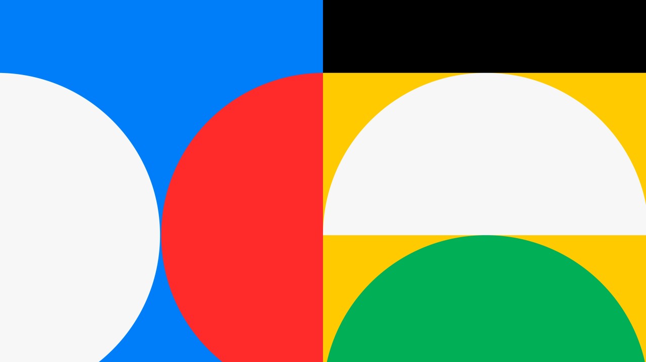
There are certain things that, in the principles of visual design, help elements stand out; some of them are colour and contrast.
👉 Industry experts define contrast as the pairing of two visually distinct elements.
💡 According to Nielsen Norman Group, contrast happens “[…] when your eyes notice the difference between two objects and that difference emphasises that they are distinct.”
How we see colour and contrast is rooted in science on how our brain is wired and how our eyes perceive light and colour.
↓
💡 Colour and contrast are the foundation on which human beings perceive and interpret the world.
The science of colour perception and contrast is grounded in the biology of our eyes and the cognitive pathways of our brains.
That natural wiring evolved to help us survive by recognizing differences in the environment, distinguishing between objects, and pinpointing what’s important. 📰💡
For designers, this is where science and art come together.
The way we perceive colour and contrast is not arbitrary, it’s been honed through millions of years of evolution.
🧠📚 Our eyes can sense even slight changes in brightness and colour thanks to special cells in the retina called cones and rods that work together to send this information to the brain.
Then, the brain gives meaning to these visual signals, helping us make quick judgments and connections.
In UX, these biological and cognitive processes hold immense power.
Knowing how the brain sees visual things can help us use colour and contrast to grab attention, set up a visual order, and make a product easier to use.
Let’s break it down: ↓
🧐🎨How We See Colours
The human eye has two types of light-sensing cells: rods and cones.
Rods show whether things are bright or dark. Cones show colour.
There are three types of cone cells that sense three types of light: short (blue), medium (green), and long (red).
Together they help us see a million colours.
All this visual information travels by the optic nerve to the brain’s visual cortex, where it is turned into a clear image.
However, research proves that how we perceive colours is more than just what the eyes do; the brain gives meaning to colours based on the situation, past experiences, and feelings connected to them. 💡
We recognise bananas are “yellow” even though they change colour as they ripen.
This association demonstrates how colour conveys meaning and helps us recognise objects faster.
So by the time we see a colour, say yellow for a banana, we register not only the colour but also years of learned connections and contextual clues.
This is how people create mental models.
They are fabricated from past experiences, knowledge, and expectations, all of which influence users’ perceptions and use of products.
In the same way that we come to associate the colour yellow with bananas through cultural and situational experiences, users make the same kinds of associations—like perceiving success states in green and error states in red, based on familiar design patterns and societal norms.
This means we can use these learned associations to help them navigate our products faster and with greater confidence.
⚫⚪Contrast and Focus
Contrast plays a pivotal role in drawing attention.
👉The human eye naturally seeks out light and colour differences.
Strong contrast between elements, such as between text and background, makes it easier for people to read and recognize important details.
For instance, dark text on a light background is easier to understand due to the strong contrast, which requires less cognitive effort to process.
The phenomenon is explained by the brain’s preference for contrast, which helps distinguish objects from their surroundings and again, is rooted in evolutionary survival.
💡 Studies show that the brain processes contrasting elements faster, making them appear more “important” to the viewer.
We can use this knowledge to guide user behaviour and improve interaction flow.
For example, when you use high contrast between buttons and their background, it makes those buttons stand out, instantly drawing users’ attention.
This is why critical elements like call-to-actions, form fields, or alerts should be designed with high contrast to help users navigate directly to the most important tasks.
This way you can establish clearer visual hierarchies, allowing users to scan and understand the content structure more easily.
Sometimes, you might want to lower the contrast between elements to make them less noticeable, as in the case of actions that aren’t as important.
❗ But don’t take it too far.
If you make something too hard to spot on purpose, it could start feeling like a dark pattern, where you’re trying to trick the user.
It’s always best to keep things clear and honest, without being deceptive.
👉Ultimately, the sooner the brain can observe differences between elements, the simpler it is for users to perceive them and take action.
This results in the design feeling more straightforward to use.
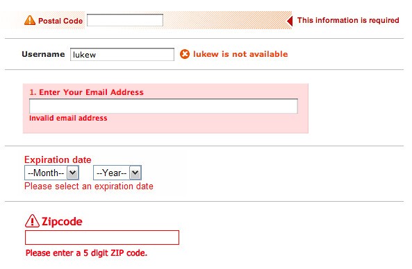
📖🦻Accessibility
👉Not everyone perceives colours the same way—approximately 8% of men and 0.5% of women experience some form of colour blindness.
This means that colour-coded information may not be seen by all.
Here, contrast is very important.
Use colour contrast checkers to ensure your designs can be used by everybody.
There are tons of free online tools and software plugins that will help you run the colour combination to see if it meets the right contrast ratio.
📐📄Visual hierarchy
👉Knowing how our brains perceive colour and contrast helps to establish a clear visual order because it relates to how we instinctively prioritise information.
Our brains have evolved to perceive differences in light and colour quickly.
This ability evolved for survival and allows us to rapidly identify what’s most important around us.
Knowing this, when designing, we can structure information in a way that makes sense instinctively.
As a result, the design becomes more organised, reducing cognitive effort and making it easier for users to navigate without confusion or hesitation.
✨Takeaways:
1️⃣Use Color Associations
People recognize colours based on their associations with them, like red for errors and green for successes. Stick to these colour norms to help them understand your design faster.
2️⃣ High Contrast for Key Elements
High contrast helps users spot important things more easily. Make primary actions stand out by using strong contrast, like dark text on a light background.
3️⃣Create a Clear Hierarchy
Contrast helps show what’s important and what is less so. Use strong contrast for key items and play around with softer contrast for less important content to make the page easier to scan.
4️⃣Check for Accessibility
Some users have colour blindness. Test your colours with contrast checkers to make sure everyone can see your design.
5️⃣Don’t Overuse Low Contrast
Too little contrast can make things hard to find. Keep important content easy to see, even if you use low contrast for background elements.
Our biological and evolutionary underpinnings contribute greatly to how we interact with digital products.
Our brains are wired to perceive differences in light and colour.
It is a survival mechanism that enables us to locate certain things around us quickly.
The brain then assigns meanings to colours based on our experiences and cultural contexts.
Understanding this can help us design products that reduce cognitive load and help users make decisions quicker.
Bringing together contrast and colour associations creates a natural visual hierarchy, where things just “flow” and users “get it.”
Thanks to this balance they can navigate easily and know exactly where to focus.
Let’s not make it harder for them than it needs to be—clarity is always the goal.
Thoughts? 💭
Comment below and let’s chat! 😉
See you next week 👋
This space thrives because of YOU. ❤️
If the resources I share help you grow in your career, a small contribution from you could keep this community strong.
Together, we’re building a space to learn, grow, and support each other on this design journey.
Every bit helps, and by supporting me, you’re directly helping keep this space alive and growing.

Or simply scan this QR code ⬇️

Your support means a lot!
You might also like:
Share this article:


