The Principle of Visual Hierarchy: Guiding the eye on the page so that it attends to different design elements in the order of their importance. – Nielsen Norman Group
Have you ever stared at a form and couldn’t figure out which label belonged to which field? Or landed on a page so cluttered you had no idea where to start?
That’s design failing at its most fundamental job: showing you what belongs together.
Visual hierarchy helps us direct users’ attention so they can focus on the most important elements in the correct order.
Proper visual hierarchy improves usability, enhances user experience, and helps users complete their tasks.
💡 “Implicit and explicit groupings help us see the bones or the structure of a page and allow us to direct attention to those areas of the screen that are likely to be relevant to our goal.” [2]
Grouping helps us show how elements are related, making it easier for users to see how different pieces of information connect.
It usually happens by being close together and in the same area (also called enclosure).
This concept aligns closely with principles from Gestalt psychology, which studies how humans perceive patterns and structure in visual information.
The Gestalt laws of proximity, similarity, and common region can help us understand how grouping influences visual hierarchy and how to apply it in design.
✨What grouping really does (and why it matters)
Grouping is how we show relationships between elements. It’s the difference between a page that makes sense and a page that feels like visual chaos.
When elements are grouped properly, users can scan a page and instantly understand what’s related. They don’t need to read everything. They don’t need to decode your intentions. The structure reveals itself.
But when grouping fails, every interaction becomes a puzzle. Which button goes with which section? Does this text belong to the image above it or below it? Should I read left to right or top to bottom?
You’re not just making users work harder. You’re making them guess. And users shouldn’t have to guess.
How many times have you lost a user not because they didn’t want what you offered, but because they couldn’t figure out what belonged together?
How Gestalt Principles influence grouping
Proximity ✨
The principle of proximity indicates that when elements are positioned close to one another, we tend to perceive them as belonging to the same group.
For instance, if you encounter a list of items that are closely arranged, you naturally recognise that they are related in some manner.
👉Proximity is often used to enhance the user experience by minimising the effort required to interpret the content.
When you group related elements together, you’re allowing users to scan and process them as a cohesive unit, which facilitates easier navigation and comprehension.
For example, in a form, fields like “First Name” and “Last Name” should be placed near each other, while unrelated fields such as “Phone Number” or “Email” should be kept apart.
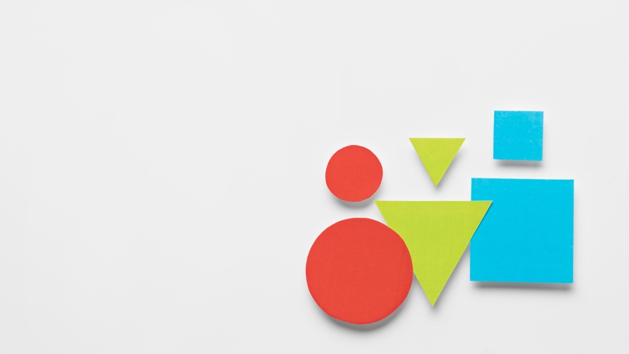
Similarity ✨
The principle of similarity suggests that elements that share common visual characteristics—such as colour, size, shape, or typeface—are perceived as part of the same group.
For example, if there are multiple buttons on a page, those that share the same colour or shape will be instinctively grouped together by users, even if they are spaced apart.
This reinforces the relationships between elements, even when proximity is not as evident.
👉In practice, similarity can be used to highlight sections or actions that share a common purpose.
For example, all primary CTAs might be the same colour and style, making them visually distinct from secondary buttons, even if they’re scattered across the page.
Common Region (Enclosure) ✨
👉The common region principle, or enclosure, suggests that items placed within a specific boundary are perceived as a group.
For instance, when a product card is surrounded by a box, it visually indicates that the title, image, description, and price all relate to the same product.
Utilising a common region can be particularly effective for emphasising certain areas on a page. For example, by enclosing a sidebar within a box, you effectively separate it from the main content, highlighting its unique purpose.
This technique is also beneficial for differentiating various content sections.
Take a news website, for example; each article is often presented within its own box, making it easier for users to scan through and identify which pieces of content are related.
✨Tips
1️⃣ Use Proximity to Create Logical Groupings
Make sure related elements are placed close together to help users quickly grasp how information is connected. For instance, group fields like “First Name” and “Last Name” together, and keep instructions or error messages nearby for easy reference.
2️⃣ Use Common Region for Visual Separation
Surround related elements with boxes, coloured backgrounds, or lines to visually group them. This technique is especially effective for differentiating sections such as headers, navigation menus, or footers.
3️⃣ Use Similarity to Reinforce Grouping
Employ consistent visual styles—like colour, font, or shape—to visually link related elements, even if they aren’t physically close. For example, all buttons that serve similar functions (like primary CTAs) could share the same colour.
4️⃣ Create a Balance Between Grouping and Negative Space
Ensure there’s sufficient negative space between unrelated groups to avoid visual clutter. Too little space can make the design feel cramped, while excessive space between related elements can disrupt their connection.
5️⃣ Be Consistent with Grouping Across the Design
Apply the same principles of proximity, similarity, and enclosure uniformly throughout your design.
Great grouping doesn’t call attention to itself. It just works. Users don’t think “wow, excellent use of proximity.” They think “this makes sense.”
And “this makes sense” is the highest compliment a design can receive.
The designers who understand this aren’t the ones adding more boxes, more colors, more visual flourishes. They’re the ones ruthlessly editing. Simplifying. Creating structure through restraint.
Because the goal isn’t to make every group obvious through heavy-handed boundaries. The goal is to create relationships so clear that users don’t have to think about them at all.
When grouping works, users flow through your interface effortlessly. They understand at a glance. They complete tasks without friction. They don’t abandon in confusion.
That’s not magic. That’s just respecting how brains work.
Thanks for reading ✨
I hope you found it useful!


You might also like:
Share this article:


