Welcome Back! 👋
I’ve been thinking a lot lately about something I learned while studying art at university.
One of the key lessons our professors always stressed was the power of repetition.
Regardless of where it appeared, in repeated brushstrokes in a painting, themes in music, or movements in dance, we were taught to recognise repetition and understand how it adds meaning and depth to art.
We studied it over and over again.
Sometimes, we would look at recordings of dance performances, picking apart each movement to understand where repetition showed up and why it mattered.
Repetition, wherever you encounter it, is often there for a good reason.
It helps you make connections, spot subtle changes, and recognise patterns in the context they appear.
It is no different in design.
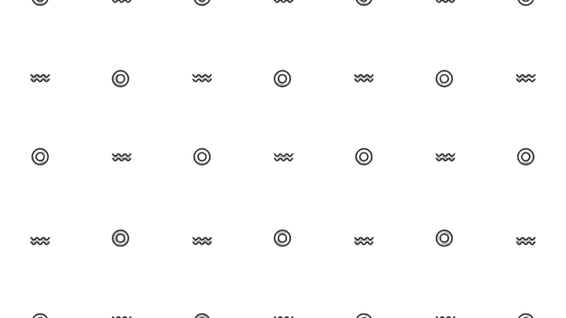
Simply put, repetition helps users understand how it works.
When things are repeated, you create a natural rhythm that guides users through the interface without them even realising it.
This makes it easier for them to understand where to go and what to do, instinctively, boosting their confidence in navigating the system.
But there’s so much more to it. So let’s get into it →
What’s inside:
- How Repetition Reduces Learning
- The Rhythm (and Emotions) That It Creates
- How to Use It to Build Visual Hierarchy
- Takeaways
✨How Repetition Reduces Learning
Users don’t want to learn new things.
They just want to stick with what they know instead.
It’s based on human psychology.
Familiarity feels safe. It’s our survival instinct to avoid risks that might end in failure—or worse.
In design, that means repetition isn’t just useful but it’s necessary as it helps people learn.
Users don’t start at the beginning when they open a new interface.
They rely on patterns they’ve seen previously—the patterns they have learned already, like navigation, button styles, or where to find a contact form.
They know that a magnifying glass means “search” and that a cart icon means shopping.
Using these patterns is not lazy—it’s smart.
And how did users learn them in the first place?
By repeatedly encountering them across interfaces and recognising their consistent functions.
As NNG research proves, learning is an ongoing process.
It’s not simply about “knowing” or “not knowing” something.
Users improve their understanding through repeated exposure.
If they’ve encountered something elsewhere, they’re likely to feel more comfortable when they see it on your interface as well.
It’s not about memorisation.
Repetition makes thinking less effortful so users do not have to work through things again.
👉Don’t go against what has been learned already.
Utilise universal, established patterns to minimise the learning curve as well as provide immediate comfort of familiarity. [3]
Whether we like it or not, repetition is impressionable. It’s human nature to find comfort and attraction to familiarity.
✨The Rhythm (and Emotions) That It Creates
In addition to using universal, established patterns, you’ll likely incorporate your own unique patterns within the interface as well.
Once you nail the first, you’ll have more freedom to experiment with the latter without risking to overwhelm the user’s memory.
Whenever I venture through any encountered interface, I cannot help but notice the rhythm that repeated elements create.
They guide the eye from one part to the next, making connections feel more natural.
There’s something soothing and comforting about it.
It feels pleasant.
When you repeat the elements and styles you have chosen for your interface, carefully and with intent, your design will feel smooth and easy to navigate.
👉Repeating design elements or styles helps to control the speed at which a user goes through the interface.
This gives us the power (and even more so-responsibility) to make users feel at ease, calm, and confident.
But when it’s off, we are risking to stress and overwhelm them.
Imagine a website where every page looks completely different—buttons in odd shapes, fonts clashing, and layouts that are hard to predict.
It would be a jarring experience, like a cultural shock for the user.
Now, when a design has buttons that look alike, headings follow a pattern, and the spacing is consistent, it becomes soothing.
You don’t even have to think—you just move through it.
That fluidity is due to planning repetition.
✨How to Use It to Build Visual Hierarchy
1️⃣ Reinforce What’s Important
Use repeated styles to draw attention to important elements.
2️⃣ Teach users your interface by repeating styles and patterns.
This helps them recognise elements quickly, knowing what they mean and where to go next.
3️⃣ Establish Familiarity.
Repeating familiar patterns builds trust.
Users do not think twice if they have seen the same icon or button style before.
4️⃣ Reduce Friction
Recognisable elements make interactions smoother.
There is no guessing, things flow easier and errors are reduced.
5️⃣ Create Structure
Establish a clear repetition of styles in typography, spacing, and colour schemes to create structure.
It keeps things clear and focused.
Even the tiniest details, like padding and margins, repeated consistently, help things look well together.
Things like borders or background patterns also connect the different parts of a design, making it all feel coherent.
👉Repetition also brings clarity to actions.
For example, use the same dotted lines or bold text to emphasise navigation or a sequence of steps.
That kind of design consistency makes things easy to understand and do.
Users can navigate without confusion since they immediately perceive the flow of the design.
👉And most importantly, by using repetition, you build a cohesive brand experience.
Using the same colours and styles across a product strengthens brand identity.
It’s how users recognise your design.
✨Takeaways
1️⃣ Consistency.
Buttons, headings, and layouts should ideally follow the same styles.
This way, users will quickly understand your design.
2️⃣ Make key actions prominent.
Apply consistent styling to significant elements.
3️⃣ Balance Repetition and Variety.
Too much repetition is boring.
Change it up in small ways, like with colour or size, to keep it interesting.
4️⃣ Follow Standards.
Make use of design patterns that people know.
They simplify your design.
5️⃣ Test.
Watch users using your design.
Are they following repeated patterns as you intended?
Iterate if they’re not.
Repetition serves a purpose across various industries and contexts, always adding value and meaning wherever it’s applied.
In design, it has the power to tie different parts of it together, creating a cohesive story for your interface.
It also makes complex patterns simpler to convey and creates a natural, easy-to-follow flow.
Repetition makes navigation smoother, and keeps users engaged, making their journey ( and your design process) easier.
For brands, it leads to faster recognition and a stronger sense of familiarity with consumers.
So, ask yourself: Are you using repetition to help your users?
Are you using it to make a smooth and familiar experience?
After all, repetition is not boring. It’s how good design works.
This space thrives because of YOU. ❤️
If the resources I share help you grow in your career, a small contribution from you could keep this community strong.
Together, we’re building a space to learn, grow, and support each other on this design journey.
Every bit helps, and by supporting me, you’re directly helping keep this space alive and growing.

Or simply scan this QR code ⬇️

Your support means a lot!
You might also like:
Sources:
- Fresh vs. Familiar: How Aggressively to Redesign by Jakob Nielsen (Nielsen Norman Group)
- The Power Law of Learning: Consistency vs. Innovation in User Interfaces by Raluca Budiu (Nielsen Norman Group)
- Repetition Principle of Design by 245-online
Share this article:


