Where do users’ eyes go first when they open your site, and why?
How do you direct their focus toward essential elements to encourage the actions you want them to take?
Understanding how to guide user focus is key to successful design. It’s not easy, it requires careful thought and planning. But it’s necessary if you want your site to succeed.
So then, what is visual hierarchy?
What does it mean to you?
Let’s think of it this way: it is how we arrange objects on the screen to communicate their importance.
Visual hierarchy helps users understand where to focus when they land on a page, controlling the flow of information and guiding their attention to where it matters most.
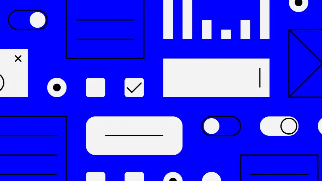
There are many components and best practices for creating an effective visual hierarchy, each helping to guide users toward desired actions.
✨Key elements that I’ll talk about over the next few weeks are:
- size and scale
- grouping/proximity
- colour and contrast
- whitespace
- style and texture
- repetition
- and alignment
Today, we’re focusing on size and scale.
Next week, I’ll explore grouping, with more elements to follow in the weeks ahead.
Stay tuned.
✨Size and Scale
💡 Research into human visual perception consistently shows that our eyes gravitate toward larger elements first. 💡
This response is rooted in our evolutionary psychology.
👉Larger objects have historically been associated with significance, whether it’s a source of food, a potential threat, or a notable feature in our environment.
When we see a large element, our brain flags it as important, making us instinctively focus on it.
We can use this natural tendency to establish a visual hierarchy on a page and guide users to where we want them to go.
Additionally, eye-tracking studies conducted by usability researchers, like the Nielsen Norman Group, highlight that users tend to scan pages in predictable patterns, often focusing first on the largest elements.
In many Western cultures, this pattern aligns with the “Z-pattern” or “F-pattern” of scanning, where users move their gaze from the top left to the bottom right of a page.
👉So another thing to remember is that placing larger, important elements along these paths—especially at the beginning or end—can create a more intuitive user journey.
When applied strategically, size and scale can be powerful tools for enhancing user experience.
Here are some practical tips to help you use size and scale in your designs:
1️⃣Prioritise Key Actions with Size
One of the most effective ways to guide users’ focus is to emphasise critical actions by making them larger.
For instance, primary calls to action buttons should visually dominate secondary actions on the page.
If a button is significantly larger than other elements, users are more likely to notice it quickly and take action.
👉But remember that size doesn’t need to be extreme—just enough of a difference to make it clear that this is the most important element on the page.
Also, consistency in emphasising CTAs builds a recognisable pattern across your site, so use this to train your users to follow your intended journey.
2️⃣Use a Scaled Visual Path to Guide Flow
Another technique is to use a descending scale to create a visual path.
Start with the largest, most important element at the top, followed by slightly smaller elements, and continue to decrease the scale of elements as the user scrolls down or moves across the page.
This hierarchy aligns with the natural scanning patterns in many Western cultures, where people read left to right, top to bottom.
This not only establishes a clear flow but also helps organise information in a digestible way.
On a product page, for example, you might start with a large product image and title, followed by slightly smaller sections for details, price, and reviews.
👉When you gradually reduce scale, you create a logical progression that helps absorb information more easily.
3️⃣Be Selective
While large elements naturally attract attention, overusing size can lead to visual overload.
Too many large elements create competition for attention and can cause users to feel overwhelmed and uncertain about where to focus.
👉Reserve larger sizes for one or two primary elements on each screen.
For example, on a homepage, you might choose to make the header image and main CTA large, while keeping other elements smaller to create breathing space.
This approach, often called visual “weight,” is essential for balancing a design.
If you manage the size of elements well, you give users the visual cues they need to focus without bombarding them with too much information.
A hierarchy built on size and scale creates an experience that feels natural and unforced.
Users are guided intuitively to what matters most without needing to hunt for key information. It creates an effect that is both easy on the eyes and also functional.
We can make digital spaces more accessible, engaging, and effective at helping users accomplish their goals if we only understand and respect how the human eye processes information.
But using size and scale isn’t about making everything big: it’s about making the right things stand out.
Understanding this is a key part of being a successful designer, especially in a world where users’ attention spans are shorter than ever.
When you apply size and scale effectively, users’ attention flows naturally and smoothly through each interaction.
Don’t forget to check back next week for more principles and best practices on visual hierarchy.
Thanks for reading ✨
I hope you found it useful!
This space thrives because of YOU. ❤️
If the resources I share help you grow in your career, a small contribution from you could keep this community strong.
Together, we’re building a space to learn, grow, and support each other on this design journey.
Every bit helps, and by supporting me, you’re directly helping keep this space alive and growing.

Or simply scan this QR code ⬇️

Your support means a lot!
You might also like:
Sources:
- Tufte, E. R. (1983). The Visual Display of Quantitative Information. Cheshire, Conn.: Graphics Press.
- Nielsen, J., & Pernice, K. (2009). Eyetracking Web Usability. New Riders.
Share this article:


