If you’re like me, nothing’s more frustrating than feeling overwhelmed by visuals competing for your attention when you open a site.
That’s what cluttered design does—it overwhelms, making it impossible to focus on anything meaningful.
As UX professionals, we know that every element serves a purpose and is probably there for a good reason.
But how do we keep the message clear and the design inviting, without sacrificing what’s important?
The answer lies in the effective use of whitespace.
Often called negative space, whitespace is the empty space around your content—the margins, the space between lines of text, and the gaps between elements.
And while it might seem insignificant, it is a vast topic to explore and understand on its own.
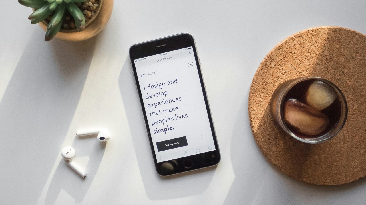
✨Focus & Visual Hierarchy
Whitespace is very useful for setting a visual hierarchy.
When you surround an element with whitespace, you’re telling the user that it’s important.
Apple’s website, for example, uses tons of whitespace to draw attention to products without overwhelming the viewer with other distractions.
Here’s what I like to think about it: If everything shouts, nothing gets heard.
If you use whitespace strategically, you can ensure that the most crucial elements—like headlines, buttons, images, whatever it is that you need users to pay attention to—get noticed first.
✨Readability
Good whitespace management makes text so much easier to read.
Personally, I love when digital content just flows—no squinting, no losing my place, no re-reading because I got lost. It’s a simple pleasure that makes all the difference.
When lines of text are too close together or lack padding, users may feel cramped.
👉 Tip: Adjust the line height (leading) and letter spacing for body text to improve readability.
A comfortable amount of space between lines keeps the reader’s eyes from getting tired, thus making the content feel more inviting.
✨Cognitive Load
Cognitive load is essentially the mental effort needed to process information.
More clutter means a higher cognitive load, which can overwhelm users and push them to abandon your site.
Whitespace simplifies things, guiding users from one element to the next without making them work too hard to understand what they’re seeing.
You might be familiar with Hick’s Law, which states that as the number of choices increases, the time it takes for users to make a decision also goes up.
👉 When your design is packed with elements and you can’t afford to eliminate any, whitespace becomes your ally.
It helps users concentrate on one item at a time, making decisions simpler and quicker.
✨Luxury
Ever noticed how high-end brands tend to have a lot of empty space around their products?
That’s not a coincidence.
Whitespace has a psychological effect—it creates a sense of luxury and quality.
Think of it as the digital equivalent of an upscale store with a few curated items instead of shelves crammed with products. Less is more.
👉 When you intentionally leave space around elements, you’re pretty much saying that your content is worth their attention.
It adds to the perceived value of your design.
✨Micro vs. Macro Whitespace
Not all whitespace is created equal.
Micro whitespace is the small space between elements like text lines or icons.
This improves readability and clarity on a detailed level.
Macro whitespace, on the other hand, is the large empty space around major sections or components.
Macro whitespace is what gives a design its airy, open feel.
Both types are essential.
👉 Micro whitespace ensures your content is digestible, while macro whitespace keeps the layout visually appealing.
✨Active vs. Passive Whitespace
Active whitespace is intentional—it’s the space you add around key elements to draw attention to them.
Passive whitespace, meanwhile, is the default space that comes with a clean layout or is added through padding and margins.
❗ 🚫 Common Mistakes
1️⃣ Too Much Compact Content
Designers often try to fit as much as possible into a single screen to avoid scrolling.
But cramming everything can have the opposite effect.
Sometimes we need to make choices and prioritise what’s essential.
2️⃣ Uneven Spacing
Uneven spacing can make a design feel chaotic.
Aim for uniform padding and margins to make your design feel cohesive.
3️⃣ Ignoring Mobile
Smaller screens mean there’s less room for elements to breathe, which means you can’t apply the same measurements from desktop to mobile.
Test your design on different devices and adjust the spacing as needed.
Whitespace becomes especially vital on smaller screens.
While it can be tempting to fill every corner with content, sometimes embracing minimalism can yield far better results.
When uncertain, remember that allowing elements to breathe can significantly improve clarity and the whole user experience.
Don’t think of it as just aesthetics, but rather as a thoughtful choice that helps users digest content easier.
Take the time to evaluate your use of space. Give it the attention it deserves, and you’ll see it work wonders for your designs.
This space thrives because of YOU. ❤️
If the resources I share help you grow in your career, a small contribution from you could keep this community strong.
Together, we’re building a space to learn, grow, and support each other on this design journey.
Every bit helps, and by supporting me, you’re directly helping keep this space alive and growing.

Or simply scan this QR code ⬇️

Your support means a lot!
You might also like:
Share this article:


