6 min 0 Blog Design with AI: The CARE framework for better prompts Aleksandra Smith 25 November 2025 What if you could design the perfect conversation with an intelligence that can solve almost… Read More
6 min 0 Blog Is your menu UX hurting your product? A practical guide to simpler navigation Aleksandra Smith 19 November 2025 What happens when you try to navigate a long menu? Your eyes dart back and… Read More
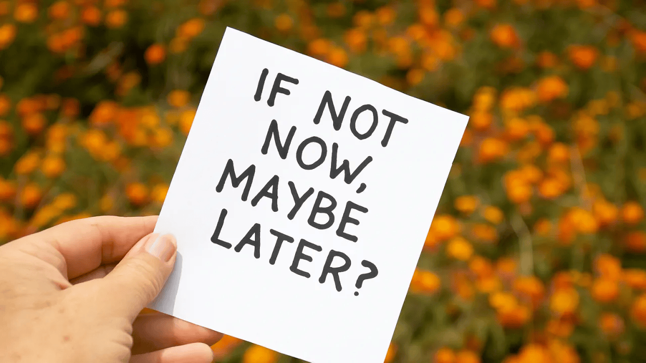
7 min 1 Blog The subtle power of “Maybe Later” in Design Aleksandra Smith 29 October 2025 We’ve become experts at demanding things NOW. Sign up now. Subscribe now. Enable notifications now. Create… Read More
3 min 0 Blog Do dropdown menus still belong in modern UX? Aleksandra Smith 23 October 2025 Dropdown menus are one of the most widely used interface patterns. They’ve earned their popularity… Read More
7 min 0 Blog Conversational UX: Why conversation demands different design thinking Aleksandra Smith 23 October 2025 Conversational UX is the design of systems (powered by AI or not) that communicate with… Read More
5 min 1 Blog Why “You are not the user” isn’t always true in UX Aleksandra Smith 15 August 2025 “You are not the user” shaped how designers worked. It forced humility, removed ego, discouraged… Read More
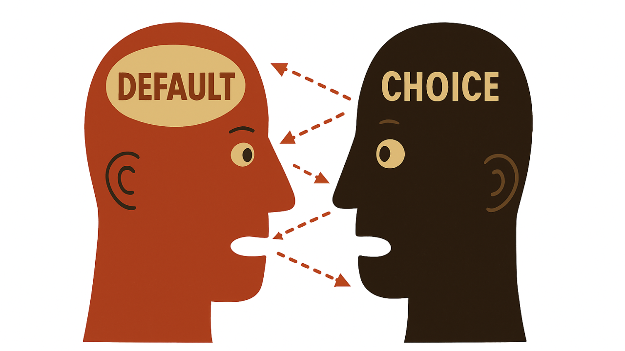
9 min 0 Blog The choice you never made. Designing for Default Bias in UX Aleksandra Smith 31 July 2025 “If you want to encourage a behaviour, make it the default.” We know this works… Read More
9 min 1 Blog Designing for a world where no one trusts anything anymore Aleksandra Smith 31 July 2025 Trust was always invisible. Until we lost it. It has always been present in UX.… Read More
9 min 0 Blog Designing for a world where no one trusts anything anymore Aleksandra Smith 15 July 2025 Trust was always invisible. Until we lost it… It has always been present in UX.… Read More
9 min 0 Blog Synthetic Users: The Future of UX Research? Aleksandra Smith 4 July 2025 UX research has never been a fixed discipline. But in 2025, it is being reshaped… Read More