6 min 0 Blog Design with AI: The CARE framework for better prompts Aleksandra Smith 25 November 2025 What if you could design the perfect conversation with an intelligence that can solve almost… Read More
7 min 1 Blog The subtle power of “Maybe Later” in Design Aleksandra Smith 29 October 2025 We’ve become experts at demanding things NOW. Sign up now. Subscribe now. Enable notifications now. Create… Read More
7 min 0 Blog The Sunk Cost Fallacy: Why we fear letting go of ideas Aleksandra Smith 23 October 2025 Have you ever defended a decision long past the point when you knew it wasn’t… Read More
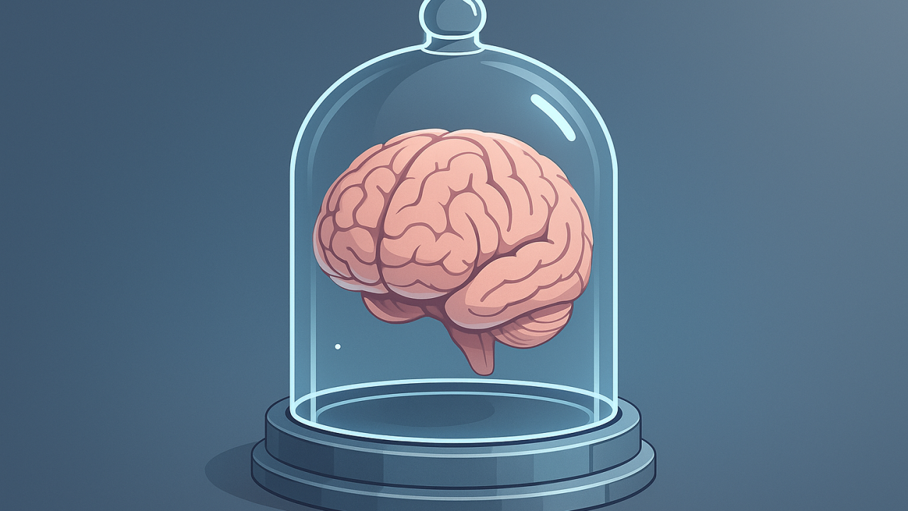
7 min 0 Blog Is AI quietly dismantling our creative capacity? Aleksandra Smith 23 October 2025 You’re working late at night, staring at a blank Figma canvas. The clock’s ticking and… Read More
3 min 0 Blog Do dropdown menus still belong in modern UX? Aleksandra Smith 23 October 2025 Dropdown menus are one of the most widely used interface patterns. They’ve earned their popularity… Read More
7 min 0 Blog Conversational UX: Why conversation demands different design thinking Aleksandra Smith 23 October 2025 Conversational UX is the design of systems (powered by AI or not) that communicate with… Read More
6 min 0 Blog AI-generated UX and the growing accessibility debt (+ how to fix it) Aleksandra Smith 23 October 2025 We’ve gotten comfortable with AI-generated interfaces. We use them regularly. The efficiency gains are undeniable.… Read More
5 min 0 Blog Designing high-performance forms: 5 research-backed UX principles Aleksandra Smith 23 October 2025 Forms often cause more abandonment than any other UI component. UX research quantifies this: many… Read More
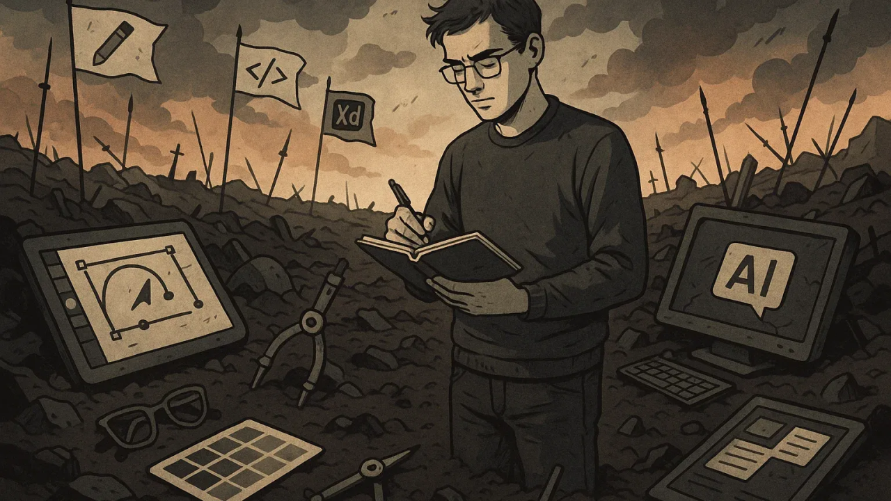
6 min 1 Blog The post-AI UX professional: Who will be left standing and why Aleksandra Smith 2 October 2025 Everyone’s asking the wrong question. It’s not “will AI replace us?” It’s “what do I… Read More
7 min 0 Blog You are shipping AI hallucinations. Here’s how to stop. Aleksandra Smith 3 September 2025 When the AI hallucinates, whose mistake is it? It’s easy to point at the model.… Read More